The network for creativity
Join 1.25M professional creatives like you
Connect with clients, get discovered, and run your business 100% commission-free
Creatives on Contra have earned over $150M and we are just getting started
Back to feedPost

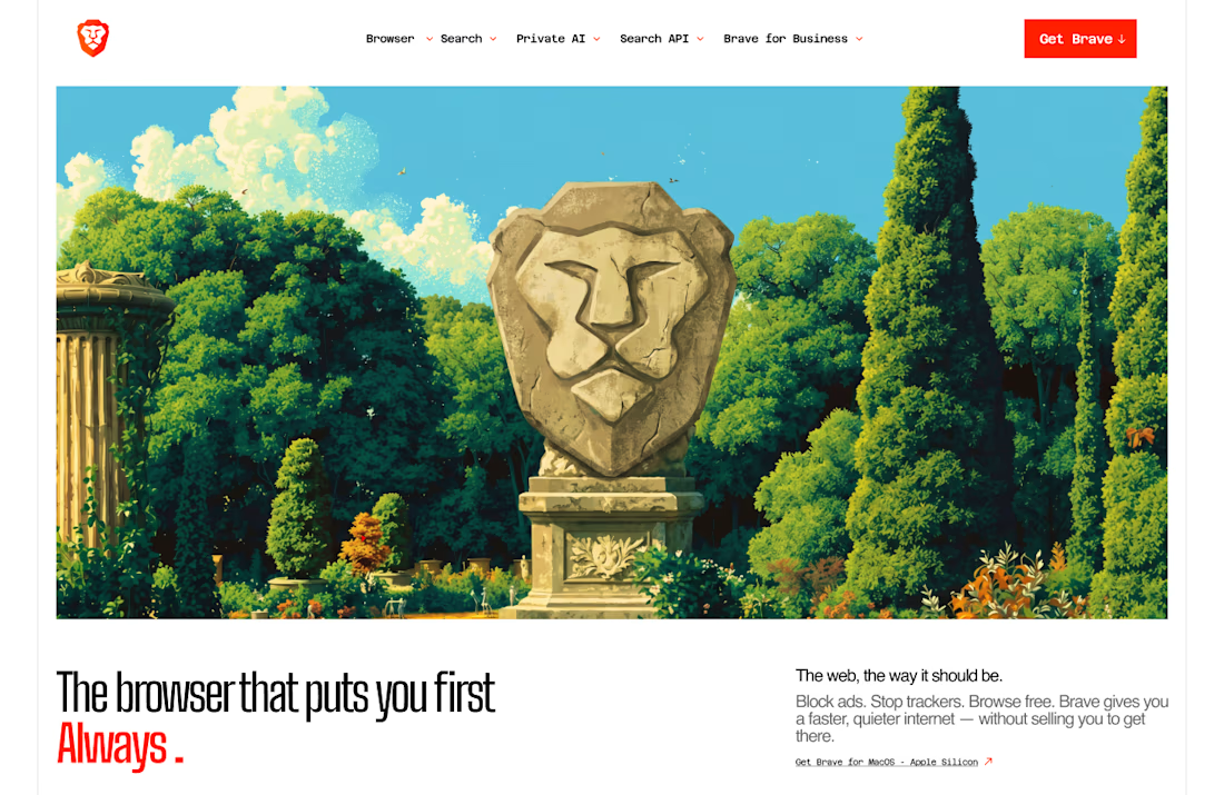
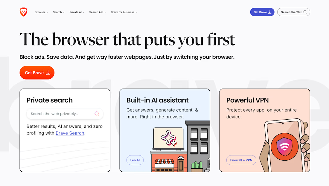
I reinstalled Windows last week and the first thing I downloaded was Brave. But while I was on their site I found myself staring at the homepage longer than the actual browser.
It's not bad. It's just safe. For a browser built around taking the internet back, the website doesn't really feel like it.
So I decided to redesign it.
The direction I went with is dark and cinematic. A dreamy surrealist mood where privacy feels less like a feature checklist and more like an actual feeling. Warm amber bleeding into cool blue. Editorial typography that makes you slow down and read. Organic and atmospheric, the kind of visual language that makes you want to live inside it.
Same structure as the original. Nav, hero, features, shields, CTA. Just made to feel like it belongs to a brand with a real point of view.
Started from boredom and a fresh Windows install. Ended up being one of my favourite concepts this year.
The network for creativity
Join 1.25M professional creatives like you
Connect with clients, get discovered, and run your business 100% commission-free
Creatives on Contra have earned over $150M and we are just getting started

Challenges
View all


Related posts

Luxury Fashion E-commerce Landing Page
A premium e-commerce website concept created for a modern luxury fashion brand. The experience focuses on elegant visuals, refined typography, and an intuitive shopping journey that reflects the brand's premium identity.
Project Goal💯
The objective was to design a sophisticated online shopping experience that combines visual storytelling with seamless product discovery. Every section was crafted to highlight the brand's quality, build trust, and encourage conversions while maintaining a clean, minimal aesthetic.


Stunning work


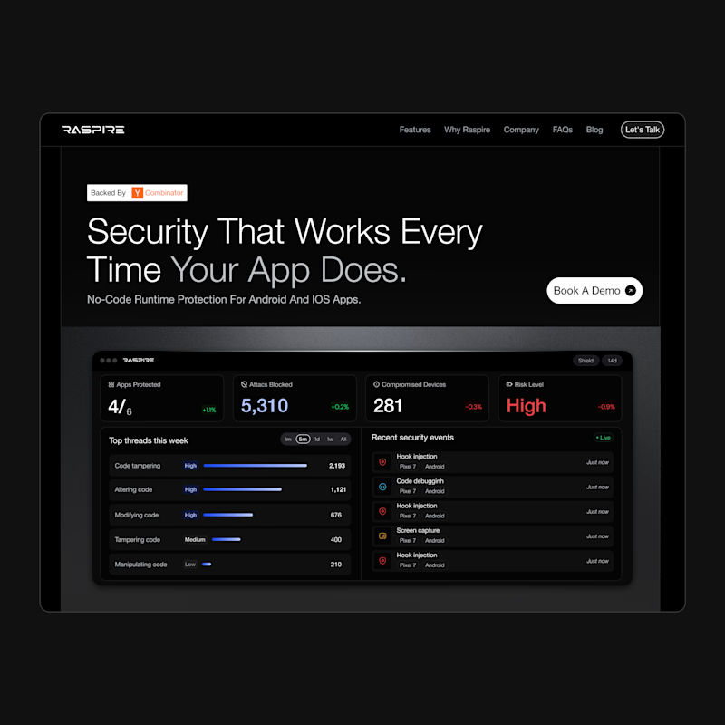
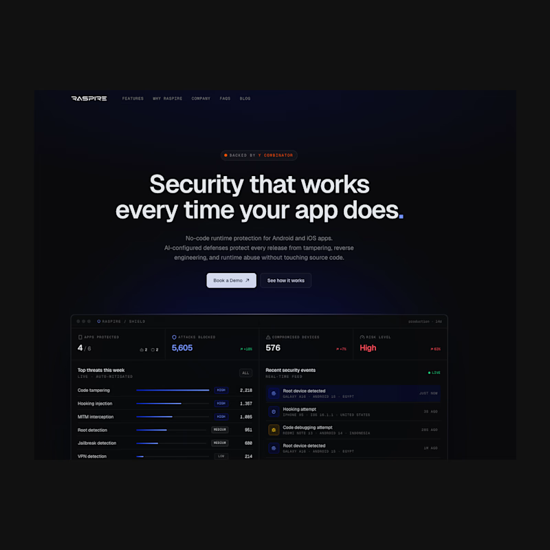

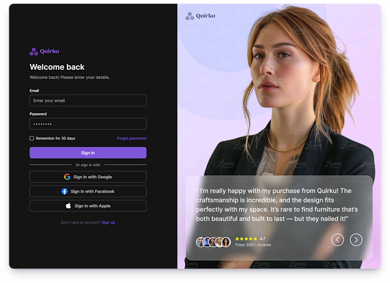
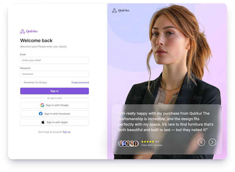
Which one works better for you — Light or Dark? 👀
11 voted
46%
13 voted
54%
24 votes
Closed

Both of them are great ❤️❤️