The network for creativity
Join 1.25M professional creatives like you
Connect with clients, get discovered, and run your business 100% commission-free
Creatives on Contra have earned over $150M and we are just getting started
Back to feedPost

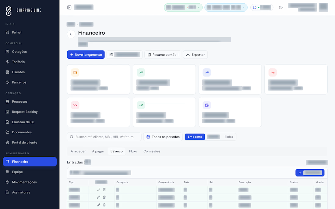
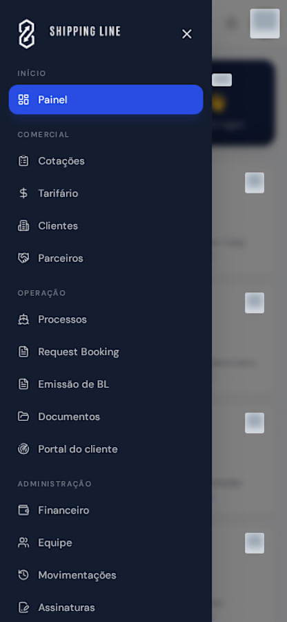
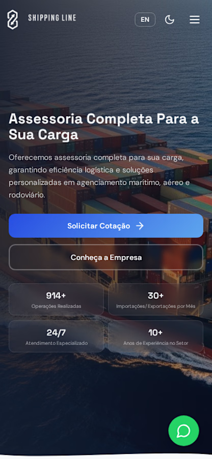
Developed for Shipping Line, the platform connects the company’s public website with its commercial, operational, and financial workflows. The project combines a bilingual corporate website with an internal management workspace accessible on desktop and mobile.
The workflow begins with a quote request and continues through shipment tracking and financial management. Client information, proposals, shipments, and documents remain connected, reducing the need to switch between spreadsheets and separate tools.
Key Features
Bilingual corporate website: company information, services, quote requests, and contact channels in Portuguese and English.
Sales management: client records, list and board views for quotations, negotiation tracking, and PDF proposal generation.
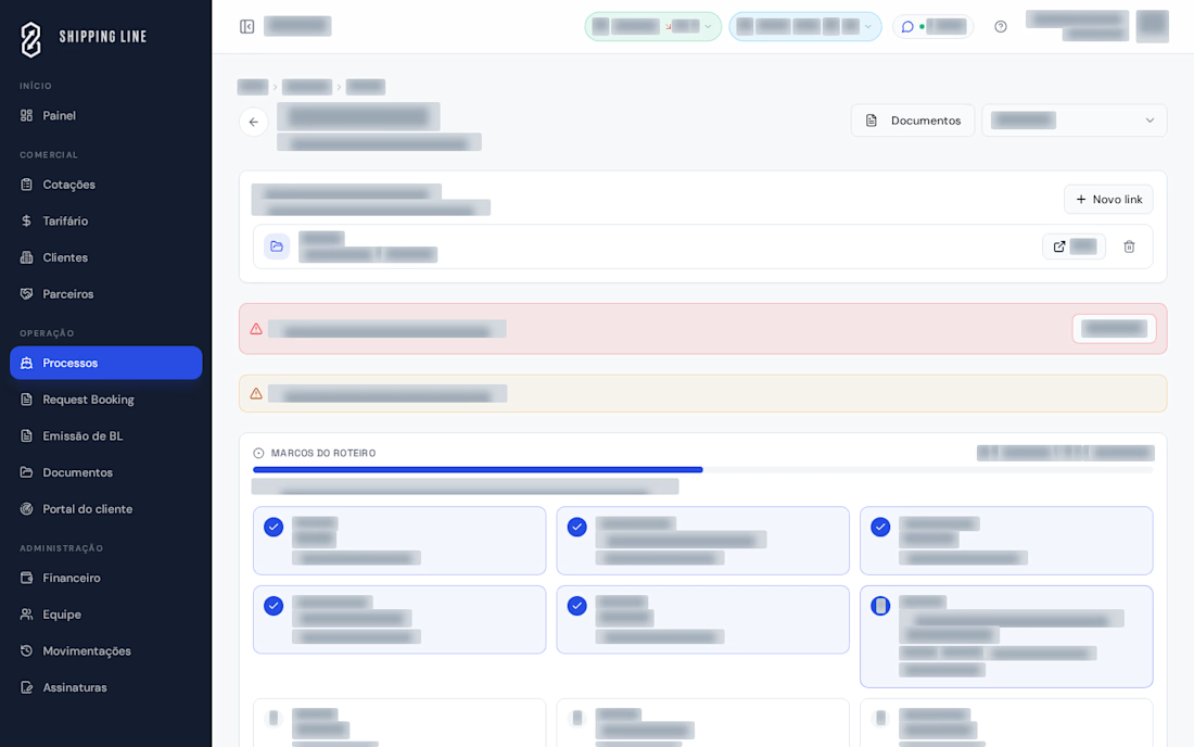
Operations management: shipments organized by stage, with schedules, deadlines, booking requests, and documents.
Shipping documentation: generation of Bills of Lading and booking request PDFs, with document identification and verification.
Integrated financial management: accounts receivable and payable, invoicing in multiple currencies, bank account selection per invoice, cash flow tracking, and commission calculations.
Client communication: shipment tracking links, document access, and email updates.
Team collaboration and oversight: internal chat, individual access permissions, and an activity history.
What Makes This Project Different
Rather than simply bringing features together in a dashboard, the platform was built around the company’s actual workflows. A quotation can become a shipment and generate related financial records, maintaining a shared reference across stages and making information easier to reconcile.
The result is a tailored solution that organizes daily operations, reduces duplicate work, and gives both the team and its clients greater visibility.


The network for creativity
Join 1.25M professional creatives like you
Connect with clients, get discovered, and run your business 100% commission-free
Creatives on Contra have earned over $150M and we are just getting started








Related posts


Fresh case study 🚀🚀🚀
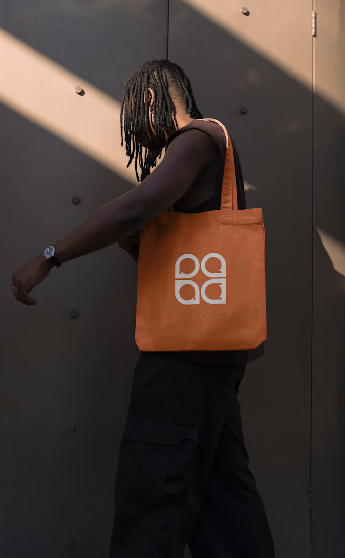
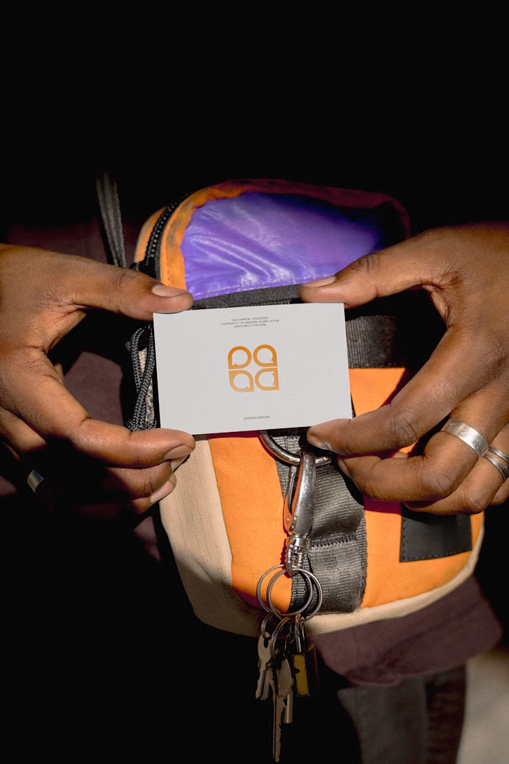
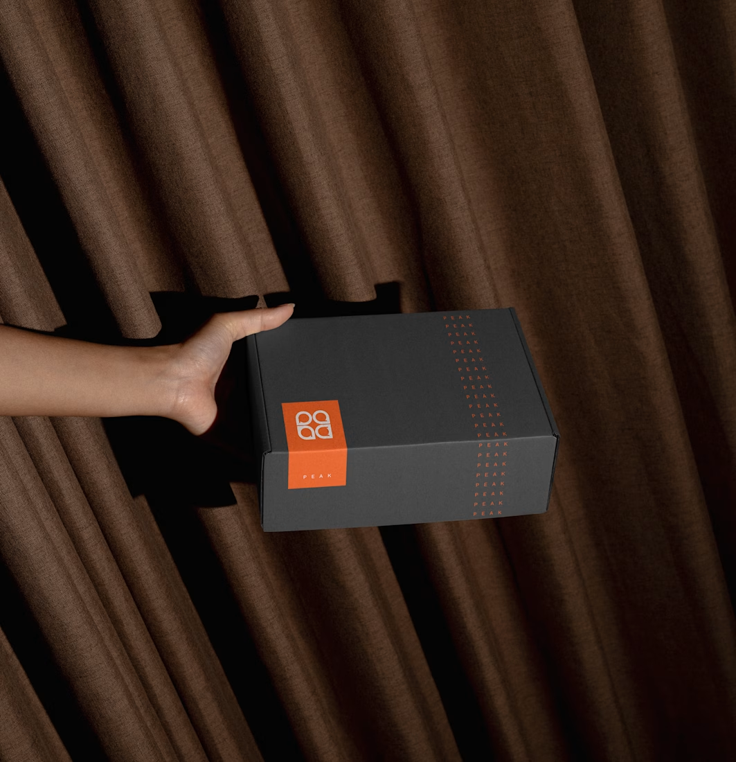
Brand identity for Peak, an all-in-one website builder for WordPress that I design and build. A four-letter mark, a warm paper-and-ember palette and one system that runs from the favicon to the packaging.

A four-letter mark that has to hold from favicon to packaging is a tough constraint. Did you draw one letterform first and build the other three from it, or design them together as a set from the start?


Beautyy

Recovery Brand Identity / Logo & Visual Direction
A new identity project for a recovery-focused brand that wanted to move away from the conventional clinical look of its category.
The direction combines clinical credibility with a more modern, movement- and performance-driven visual language.
First look at the logo. Full identity coming next.
Logo design and creative direction by Lepisov Branding
Social media Branding: collab with Mike Creative Mints


