The network for creativity
Join 1.25M professional creatives like you
Connect with clients, get discovered, and run your business 100% commission-free
Creatives on Contra have earned over $150M and we are just getting started
Back to feedPost

Omnibot started as a logo concept that never got picked. I liked it too much to leave it in the archive, so I built a world around it to see how it would look live.

The network for creativity
Join 1.25M professional creatives like you
Connect with clients, get discovered, and run your business 100% commission-free
Creatives on Contra have earned over $150M and we are just getting started
Related posts

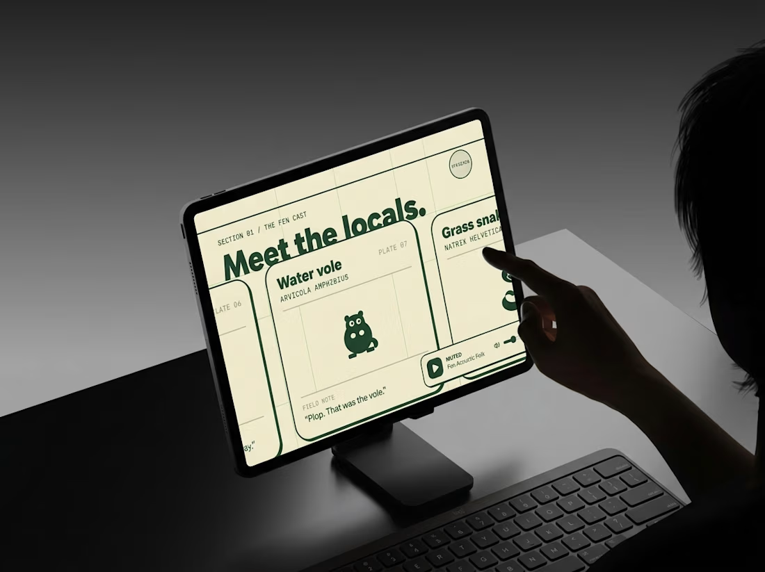
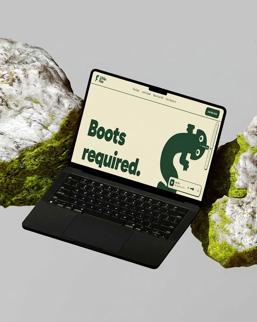
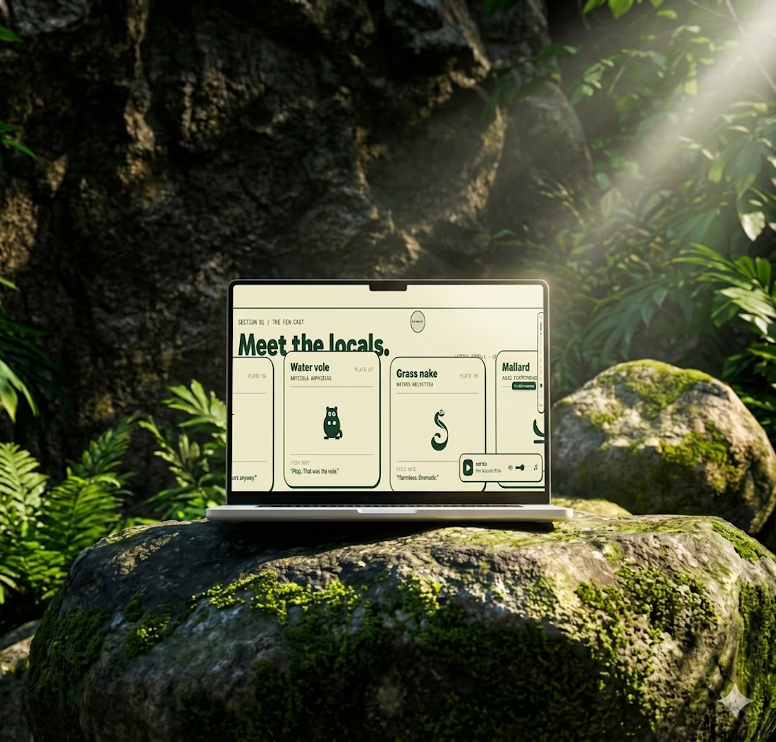
Most websites open with “Welcome.”
This one opens with “Boots required.”
Little Fen’s site is a field guide: locals with Latin names and a heron soundtrack.
Go meet the vole.


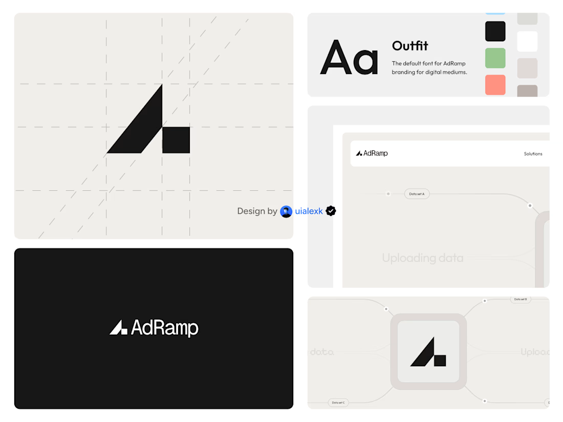

The A mark built on a diagonal grid, with the ramp stepping up on the right, is simple and holds up on the black AdRamp card. My challenge: the palette shows green and salmon swatches next to the black, but every application tile is black, white or grey. If the accent colours...

A little more about the inspiration behind Tindara.
I wanted the identity to have a connection to Tindari, Sicily. The Madonna di Tindari statue was the starting point for the symbol, while Sicilian decorative patterns inspired the graphics around it.
For the colors, I chose mustard yellow, deep green, and burgundy, balanced with cream. I wanted to bring some of that warmth and richness into the packaging, while keeping the different elements comfortable together.
For me, these references are what give the project its character and sense of place.

