The network for creativity
Join 1.25M professional creatives like you
Connect with clients, get discovered, and run your business 100% commission-free
Creatives on Contra have earned over $150M and we are just getting started
Back to feedPost

Gabbstickk Visuals: Brand Identity for a Photography Studio
Gabbstickk Visuals is a photography studio built on one belief: moments fade, but stories remain. They didn't want another camera logo. They wanted an identity as considered as their frames.
What I created
Logomark: One continuous abstract shape fusing the lowercase "g" and "s", with negative space separating the letters. It works as an icon, a lockup, a cropped edge graphic and a social avatar.
Colour system: Cream (#F2EADD), chestnut (#775039) and charcoal (#151516), plus a soft brown gradient for covers and backdrops.
Typography: Bebas for bold headlines, Poppins for clear body copy and Fontellina Migenta for sparing emotional accents.
Pattern: The logomark itself tiled as a brand texture, with rules for placing it on photography as a signature overlay.
Photography direction: Warm skin tones, soft directional light and natural, filmic editing across portraiture, lifestyle, events and creative work.
Applications: Apparel, stationery, social profiles, campaign layouts and presentation slides, all kept recognisably Gabbstickk.
The result
A complete visual brand guideline that keeps every frame, post and printed touchpoint feeling like the same studio, and gives the team clear rules as they grow.
Role: Brand Designer
Tools: Adobe Illustrator, Adobe Photoshop

omolasoyevictor.com
Gabbstickk — Visual Brand Guidelines | Brand Design Case Study
Gabbstickk Visuals is a photography studio built on a simple belief: moments fade, but stories remain. This project shaped a complete visual identity for the studio, from an abstract logomark that fuses the lowercase letters “g” and “s” to a warm, earthy colour system, editorial typography, a logo-led pattern and a full set of brand applications. The result is a guideline that keeps every frame, post and printed touchpoint feeling like the same studio.
The network for creativity
Join 1.25M professional creatives like you
Connect with clients, get discovered, and run your business 100% commission-free
Creatives on Contra have earned over $150M and we are just getting started





Related posts


Good design tells you where to look first.
Visual hierarchy isn’t just about making some elements bigger than others.
It’s about creating a clear path through the design — so the viewer knows what matters, what comes next, and where to take action.
01 – Main message
The first thing your eye should understand.
02 – Supporting content
Information that adds context without competing with the main message.
03 – Visual focus
Imagery, contrast, spacing, or composition that guides attention.
04 – Action
A clear next step that feels natural within the hierarchy.
When everything is competing for attention, nothing feels important.
Good design creates focus, flow, and intention.
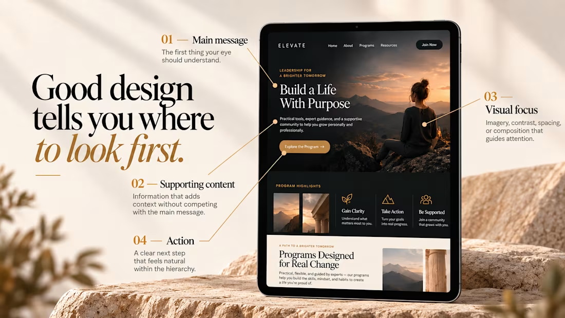

"Where to look first" is the simplest way to explain hierarchy to clients. Clear breakdown, Serge.

A refined visual identity for BCG, bringing bold typography, earthy tones, and an editorial approach to residential building design.


refined is the right word

Another very cool brand Identity project I got to work on this year for Elio Mortgage.
Bringing warmth and love to a brand that is usually cold and stressful. Elio are doing things differently to make mortgages easier to deal with. We made a brand that felt more approachable.
Full case study here:


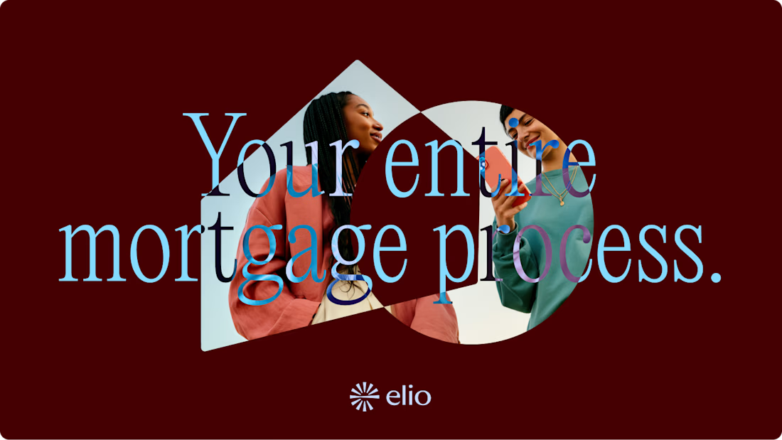
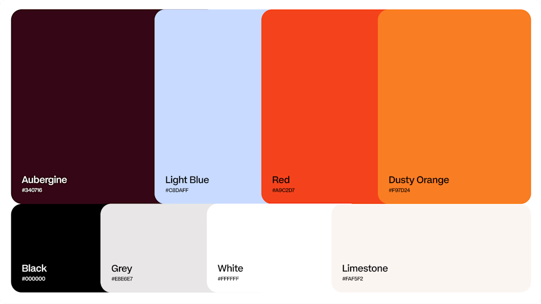
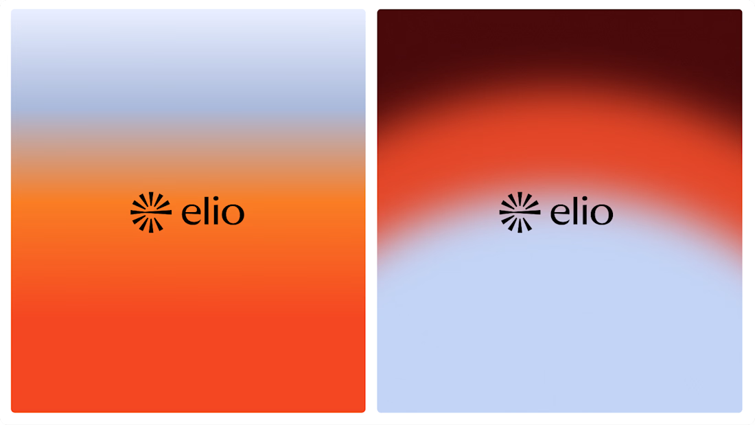

Warm, approachable identity for stressful mortgages.


