The network for creativity
Join 1.25M professional creatives like you
Connect with clients, get discovered, and run your business 100% commission-free
Creatives on Contra have earned over $150M and we are just getting started
Back to feedPost

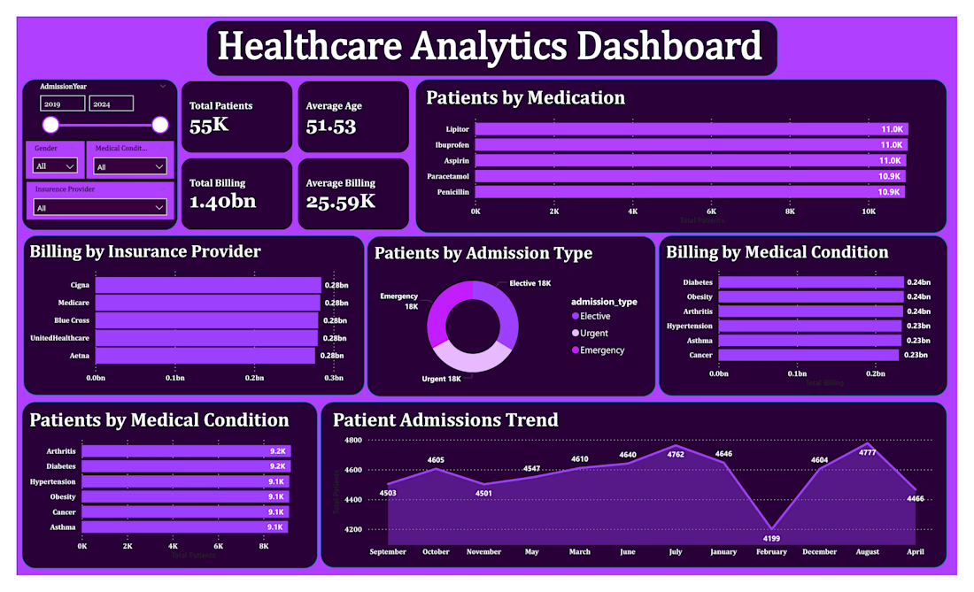
Finally completed my Healthcare Analytics project! 📊
I’ve just finished building the Power BI dashboard for this project.
I started with data cleaning and EDA in Python, then worked on SQL queries, and finally brought everything together in Power BI.
The dashboard covers patient demographics, admission trends, medical conditions, billing, insurance providers, and medication analysis.
Tools I used:
Python | Pandas | SQL | MySQL | Power BI
It was a good experience working through the project step by step and turning the data into something actually useful and easy to understand.
I’ve also uploaded the project to GitHub.
I’m open to Data Analytics freelance work, projects, and collaborations. Feel free to reach out.
#PowerBI #DataAnalytics #DataAnalyst #SQL #Python #HealthcareAnalytics #DataVisualization
The network for creativity
Join 1.25M professional creatives like you
Connect with clients, get discovered, and run your business 100% commission-free
Creatives on Contra have earned over $150M and we are just getting started





Related posts

Hotel Booking Analytics Dashboard
Developed an interactive Power BI dashboard to analyze hotel booking performance, revenue trends, cancellations, and key business metrics.
The project involved cleaning and transforming raw booking data using Power Query, creating calculated measures with DAX, and designing an interactive dashboard to make key insights easy to understand.
Key highlights:
Analyzed booking and cancellation trends
Tracked revenue and key performance indicators
Created interactive visuals and filters
Cleaned and transformed raw data using Power Query
Used DAX to create calculated metrics
Presented insights through a clear, user-friendly dashboard
Tools: Power BI • Power Query • DAX • Data Analysis • Data Visualization
Project type: Personal Portfolio Project


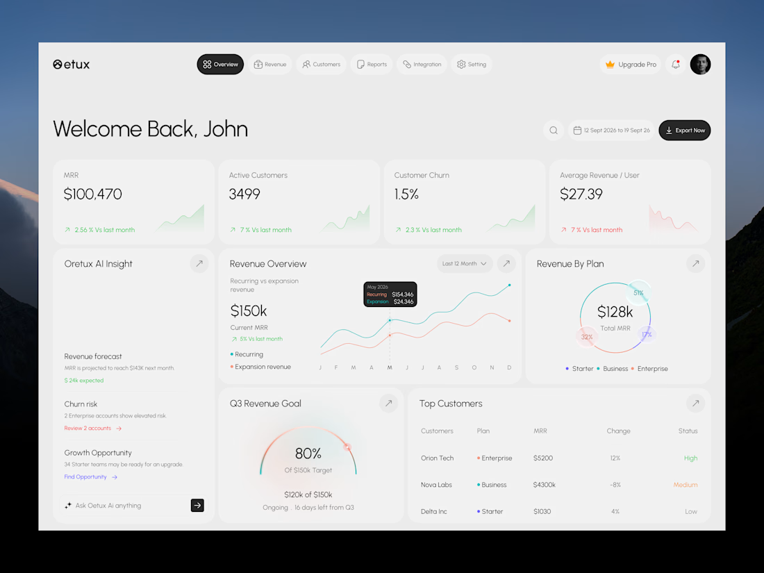
Oetux – SaaS Revenue Analytics Dashboard
The client had a lot of data, but the real problem was making sense of it.
MRR, revenue, churn, active customers, growth, customer performance, goals. Every metric was important, but when everything gets the same attention, users don’t know where to look first.
The existing experience made users spend too much time switching between information and trying to connect the numbers.
So we focused on how SaaS teams actually read their business data. We structured Oetux around the questions that matter most.
How is revenue performing?
Are we growing?
Are customers staying?
Where are we losing revenue?
What needs attention right now?
Then we organized KPIs, revenue trends, customer performance, churn insights, goals, and AI powered insights into one clear experience.
The goal wasn’t to remove data.
It was to organize the data so users could understand it faster.
That’s what we solved with Oetux.
Turning a data heavy SaaS dashboard into an experience that helps teams see their business clearly and make better decisions.



Love the clean layout.
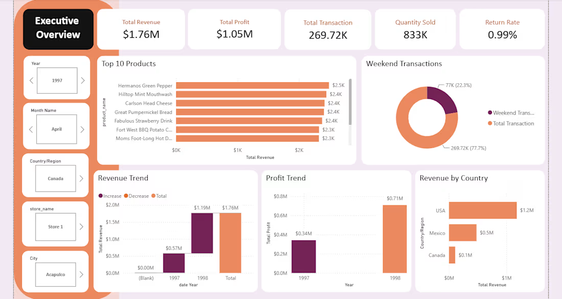
Maven Market Sales & Performance Dashboard
Developed an interactive Power BI dashboard to analyze Maven Market’s retail performance across sales, products, customers, and stores.
The project involved cleaning and transforming raw data using Power Query, creating calculated measures with DAX, and building interactive visualizations to identify trends, performance patterns, and key business insights.
Key highlights:
Analyzed overall sales and revenue performance
Evaluated product and brand performance
Explored customer purchasing behavior
Compared store and regional performance
Created interactive KPIs, charts, and filters
Built a structured data model for efficient analysis
Presented insights through a clean and user-friendly dashboard
Tools: Power BI • Power Query • DAX • Data Analysis • Data Visualization
Project type: Personal Portfolio Project