The network for creativity
Join 1.25M professional creatives like you
Connect with clients, get discovered, and run your business 100% commission-free
Creatives on Contra have earned over $150M and we are just getting started
Back to feedPost
Taste Test

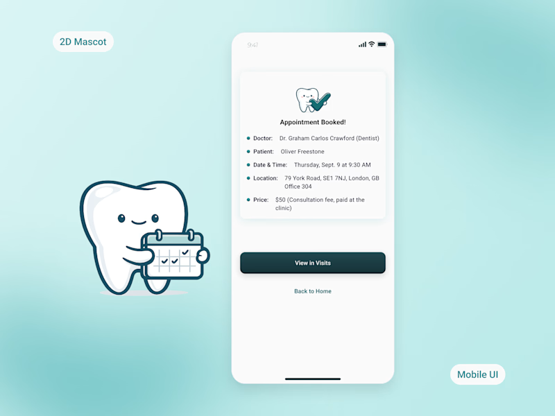
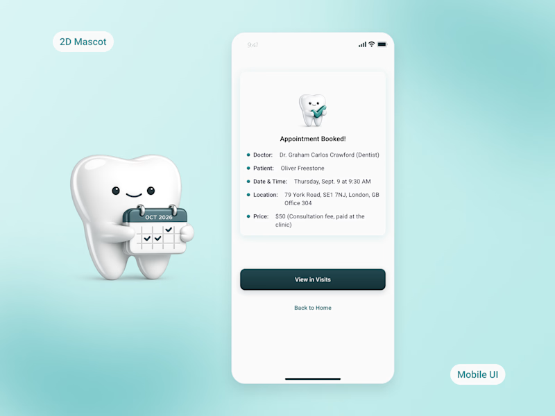
2D vs. 3D: Which Mascot Fits a Dental App Better? 🦷
Medical apps can sometimes feel cold or intimidating. While designing a mobile app for a local dental clinic, I wanted to create an experience that feels welcoming, trustworthy, and less stressful.
One idea was to introduce a friendly tooth mascot throughout the booking flow and appointment journey. Now I'm deciding between two visual styles.
🩵 Option A — 2D
Clean, minimal, and lightweight. It blends naturally into the interface and keeps the focus on the user experience.
💙 Option B — 3D
More expressive and playful, adding personality and visual depth.
If you were designing a modern, family-friendly dental app, which direction would you choose?
👇 Vote in the comments!
I'd love to hear not only your choice, but why.
13 votes
Ends in 1d



The network for creativity
Join 1.25M professional creatives like you
Connect with clients, get discovered, and run your business 100% commission-free
Creatives on Contra have earned over $150M and we are just getting started
Related posts


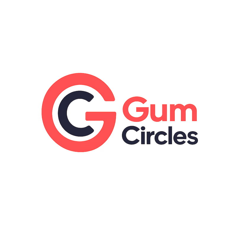
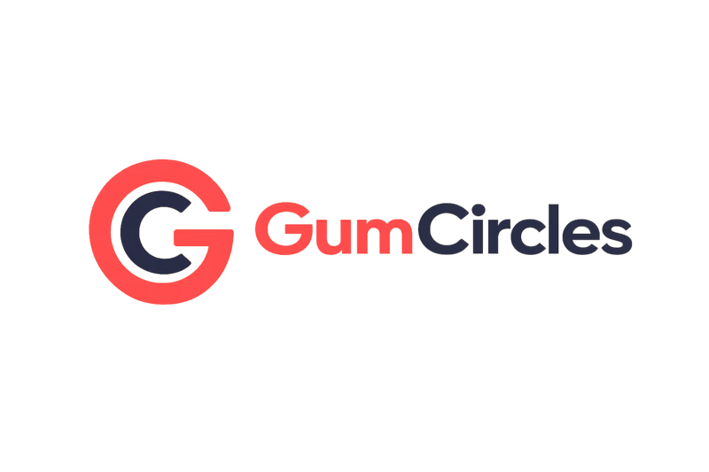
Which logo feels stronger for a marketplace called GumCircles?
I'm building GumCircles, a marketplace where Gumroad creators can showcase their products and affiliates can discover products to promote.
Which logo would you trust more as a brand?
I'd love to hear why you chose V1 or V2. Your feedback will help shape the final identity. 🙌

4 voted
44%
5 voted
56%
9 votes
Closed

Nagaraj both are amazing but v2 is slightly better

Quick design question for fellow designers and founders.
Which dashboard feels more premium to you?
☀️ A = Light Mode
🌙 B = Dark Mode
Let me know your choice.

5 voted
56%

4 voted
44%

9 votes
Closed

I choose dark mode

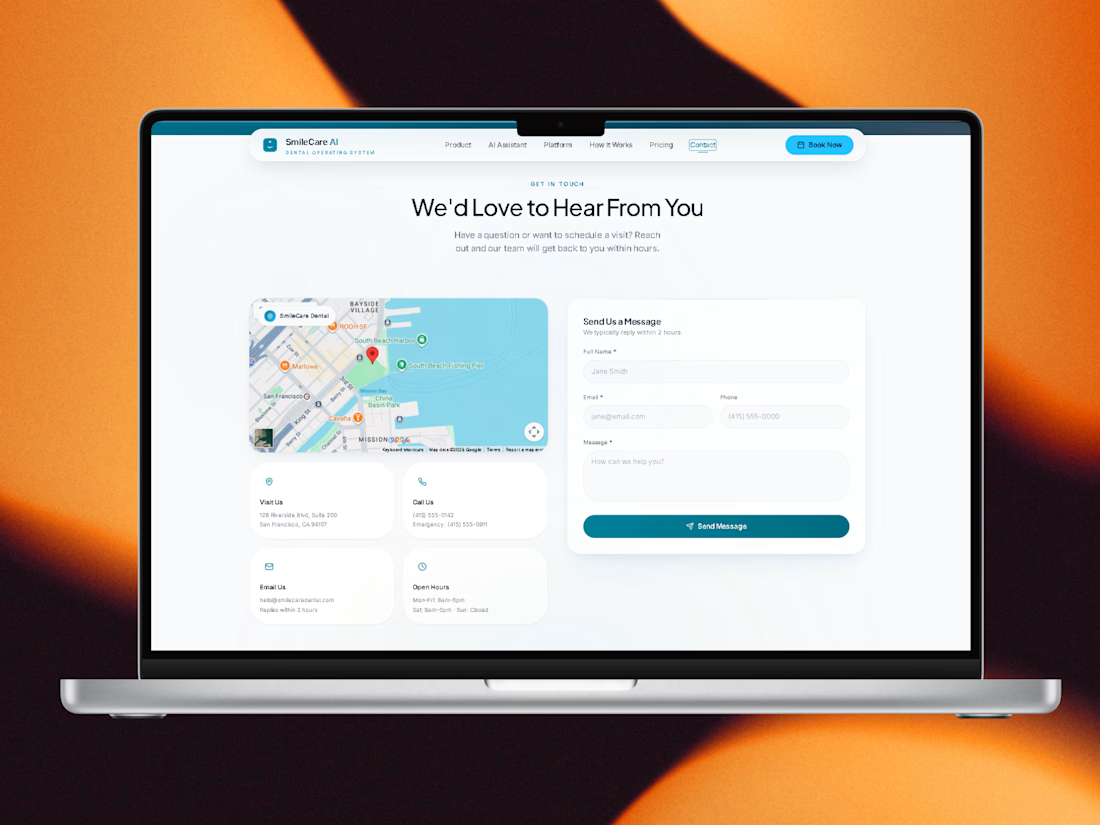
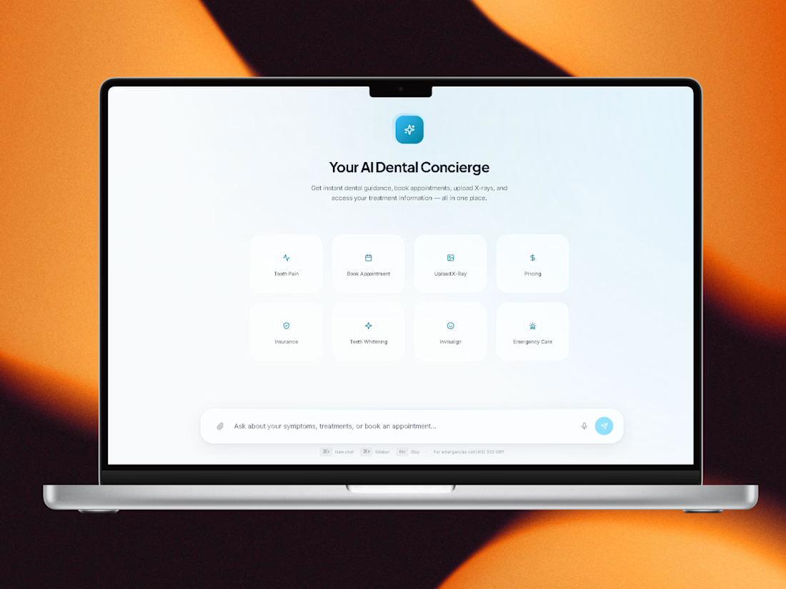
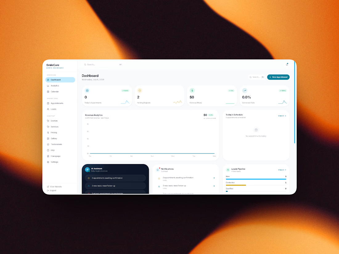
day-3 _ Small update 🚀
Today's focus wasn't new features—it was polish.
I refined the visual hierarchy, spacing, interactions, and overall feel to make SmileCare AI look and behave like a real production product.
Live Preview 👇
https://dashing-smile-care-flow.base44.app
Next step: the complete chat experience.
Feedback is always welcome! ✨
#Base44 #GiveItAGlow #BuildInPublic #AI #UI #UX #Healthcare


can't wait to see the final build!







Trending

Claude
Claude has entered the design space. How are you using Claude Design?

Contra University
Learn from expert creatives how to earn more using next-gen AI tools.
fifaworldcup2026
The World Cup is here and the whole world's watching. How are you designing for the world stage?
creativeaiflow
Creative AI workflows are evolving. What tools do you use, and what are their strengths and weaknesses?
freelancerlife
Freelancer life is wins, pivots, and everything in between. What’s yours right now?