The network for creativity
Join 1.25M professional creatives like you
Connect with clients, get discovered, and run your business 100% commission-free
Creatives on Contra have earned over $150M and we are just getting started
Back to feedPost
New project in the works 🖤
E-commerce homepage for a dreadlocks brand — dark theme, bold serif typography, editorial photography front and center.

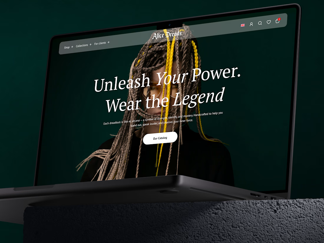

Wow, the background photo is stunning and creates the premium mysterious mood 😍

Thank you! 🙏 That mood was exactly the goal — glad it's coming through


Great job!
Thank you! 🙏

Looking great already! The dark theme creates a premium feel, and the typography adds so much character.😍
Thanks a ton! Getting that premium feel right with the dark aesthetic and type hierarchy took some experimenting, so your feedback means a lot! 🚀🔥

Love the overall direction, the dark aesthetic looks premium and the hero section has a strong visual impact😍
One small suggestion: I'd consider moving the search a bit. At the concept stage, it's not entirely clear how it will behave. If the search field expands on click, it...
Thank you so much! Your comment is incredibly spot-on, and I love that you caught this. You are 100% right — expanding it inside the nav bar would break the layout constraints.
I actually anticipated this and designed the search to trigger as a clean modal overlay right in the...
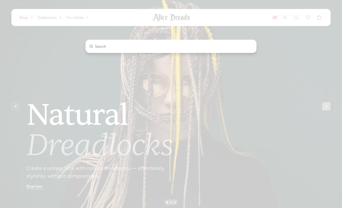
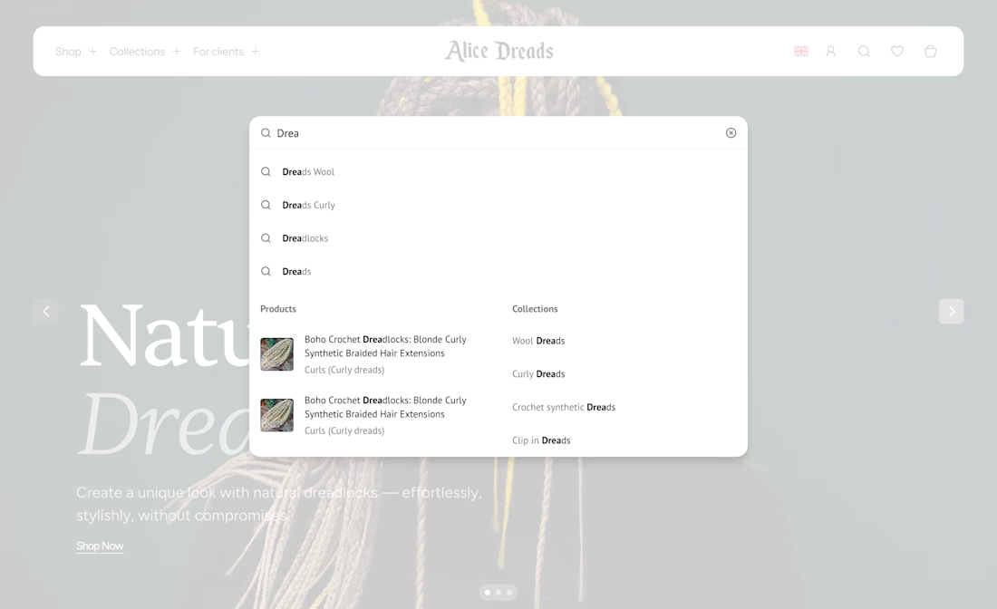
I like this solution a lot. Using a modal keeps the interface clean and avoids compromising the navigation. Great UX thinking
Thank you! 🙏

The preview looks amazing!
Thank you!

Amazing as usual😍
I also really like the mockups you use by the way!
Thanks a lot! Getting a compliment on the mockups is a nice bonus — finding the right ones really helps bring the design to life. Appreciate the ongoing support! 🥂

stunning hero screen 🔥🚀
Thanks a ton! Thrilled that the hero screen caught your eye. Appreciate the energy! 🚀

Really nice work! The visual style feels premium, and I like how the typography and imagery complement each other. Excited to see the finished project🔥
Thanks a ton! Glad the visual combination hits the mark. Looking forward to dropping the finished project soon — stay tuned! 🚀
The network for creativity
Join 1.25M professional creatives like you
Connect with clients, get discovered, and run your business 100% commission-free
Creatives on Contra have earned over $150M and we are just getting started











Related posts

A little peek at the brand work we did for Elio Mortgage.
A warm, approachable identity full of warm vibrant colors paired with soft sun rising inspired gradients, inner glows and custom illustrations & more. Loved this direction!
Full case study coming soon, from process to final identity.
Plenty of logo explorations to share too!


That color palette takes the whole identity to a different level!! I loove it.

FOCUS — Creative Portfolio & Digital Art Website 🌸✨
A visually expressive website concept for a creative portfolio, built around digital art, bold imagery, and visual storytelling
The design combines vibrant pink tones, soft gradients, experimental typography, and immersive photography to create a distinctive editorial experience
Special attention was given to:
• Bold editorial hero composition
• Vibrant pink and dark color palette
• Experimental typography and visual details
• Immersive photography and digital artwork
• Creative project gallery and navigation
• Responsive mobile experience
• Clean layouts with a strong visual identity
The result is an expressive digital experience that puts creativity, emotion, and visual storytelling at the center of every screen 💗
Looking to create a standout portfolio or website for a creative brand? Let’s connect 🚀






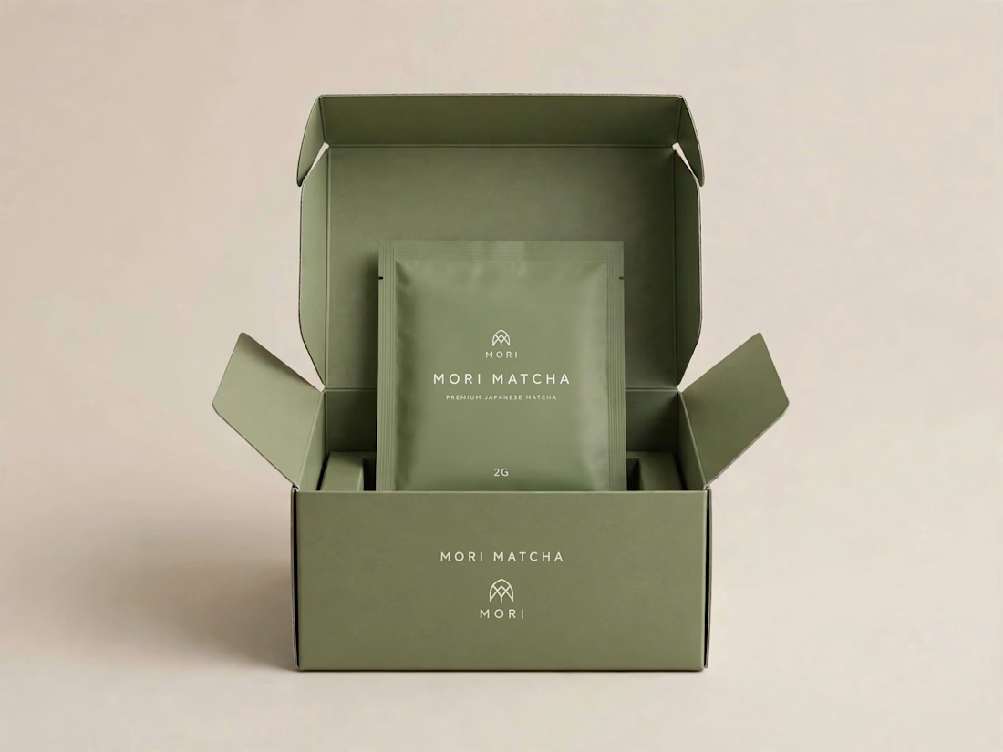
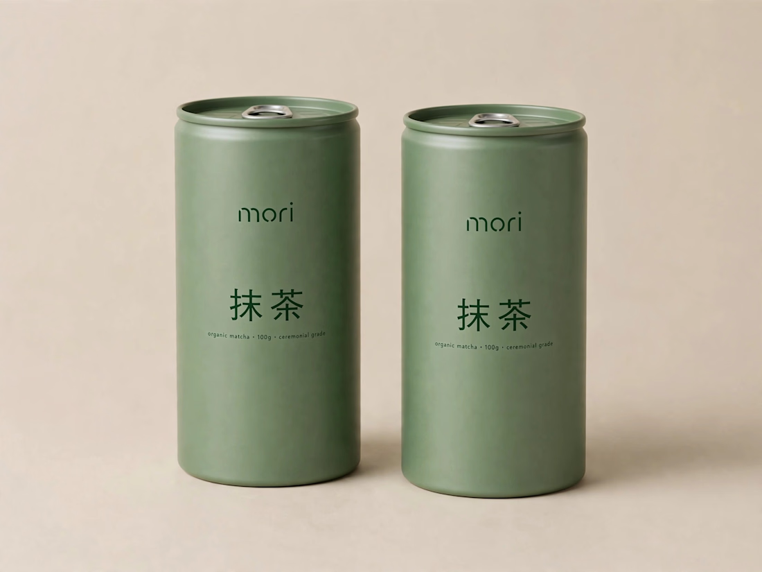
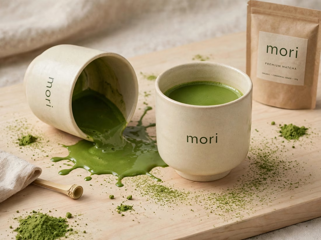
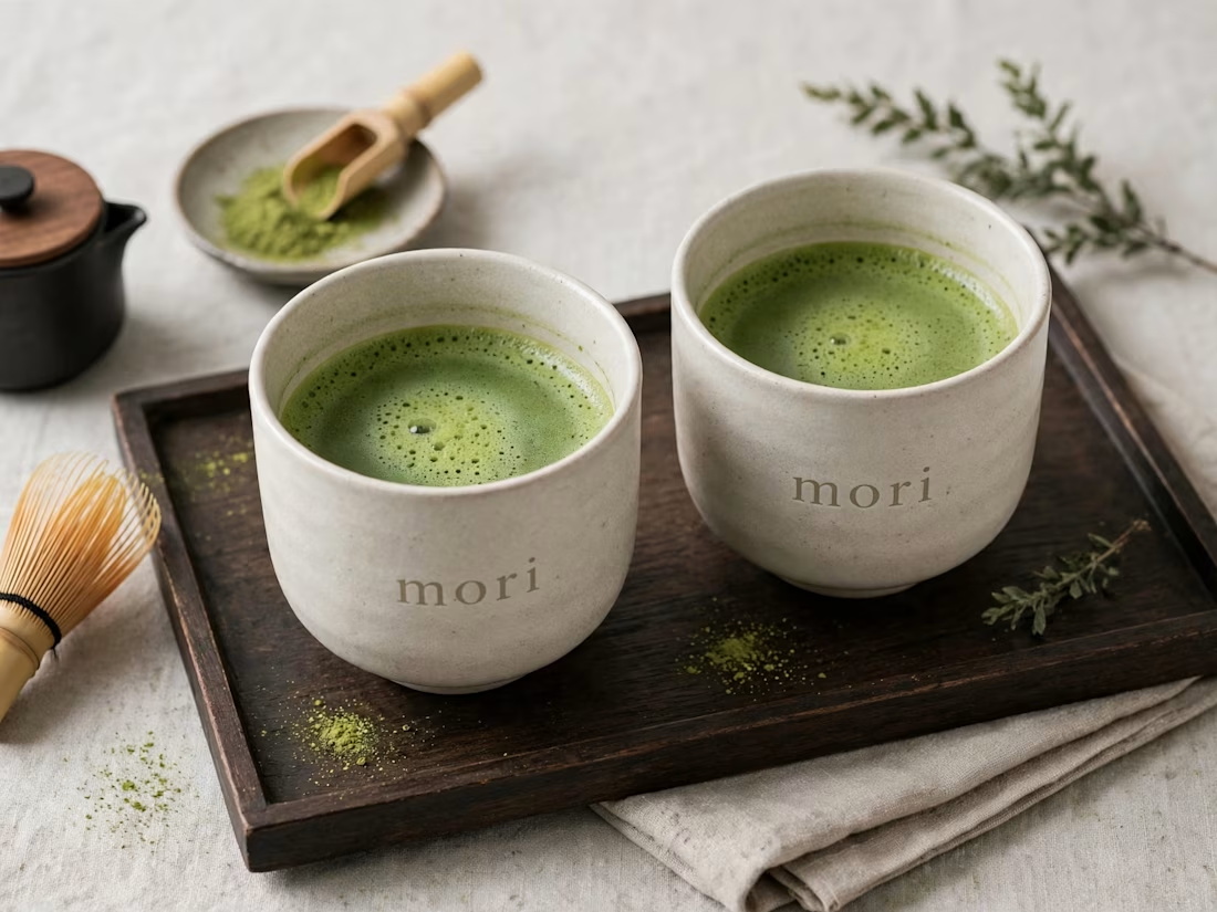
more visuals from my latest project — mori matcha 🍵
explored minimal Japanese packaging with earthy greens and calm typography.
focusing on premium ceramic cups and clean can design.
#branddesign #packagingdesign #visualidentity #brandstrategy #matcha #minimaldesign #japanesedesign #figma #mockup #branding