The network for creativity
Join 1.25M professional creatives like you
Connect with clients, get discovered, and run your business 100% commission-free
Creatives on Contra have earned over $150M and we are just getting started
Back to feedPost

📊 Excel & Data Analytics Services | Affordable & Reliable
Need help turning your raw data into clean, organized and meaningful reports?
I can help you with:
🔹 Excel
• Data Cleaning & Formatting
• Formulas & Functions
• Pivot Tables
• Charts & Reports
• Data Entry & Organization
• Custom Excel Templates
🔹 Data Analysis
• Sales & Expense Analysis
• Business Reports
• KPI Tracking
• Data Summaries
• Insights from Raw Data
🔹 Power BI
• Interactive Dashboards
• Data Visualization
• KPI Dashboards
• Basic Business Reports
💼 Small project? That’s absolutely fine!
I’m open to working on small projects with a budget-friendly commission.
✨ Whether you need a simple Excel report or a basic dashboard, I’ll focus on making your data clean, understandable and useful.
📩 Have a project in mind? Send me a message and let’s discuss it!
The network for creativity
Join 1.25M professional creatives like you
Connect with clients, get discovered, and run your business 100% commission-free
Creatives on Contra have earned over $150M and we are just getting started





Related posts

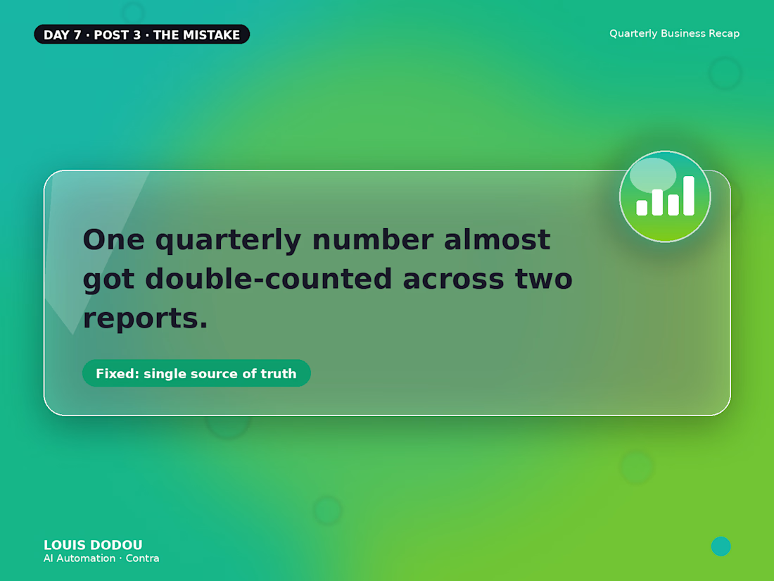
One quarterly number almost got double-counted across two reports.
Two dashboards were quietly tracking overlapping data. Caught before it went out now there's one source of truth the reports pull from, not two that can disagree.
→ A good number is only as good as the one place it actually comes from



Great catch before it shipped. I like the “one source of truth” framing - pulling reports from one validated source makes it much harder for a duplicate dashboard to quietly skew the number again.

Threadly is a SaaS dashboard for independent sellers who need one clear workspace for products, orders, stores, and sales performance.
We focused on making commerce data feel approachable: key metrics are easy to scan, top products stay visible, recent orders are structured clearly, and product quick views give sellers deeper context without interrupting their workflow.
See the design:
https://dribbble.com/shots/27777724-Dashboard-E-commerce


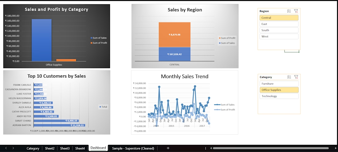
Created an interactive Excel sales dashboard using cleaned Superstore data. Used PivotTables, charts, slicers, and data analysis to track sales, profit, regional performance, top customers, and monthly trends.