The network for creativity
Join 1.25M professional creatives like you
Connect with clients, get discovered, and run your business 100% commission-free
Creatives on Contra have earned over $150M and we are just getting started
Back to feedPost
MINDLY - Brand Identity
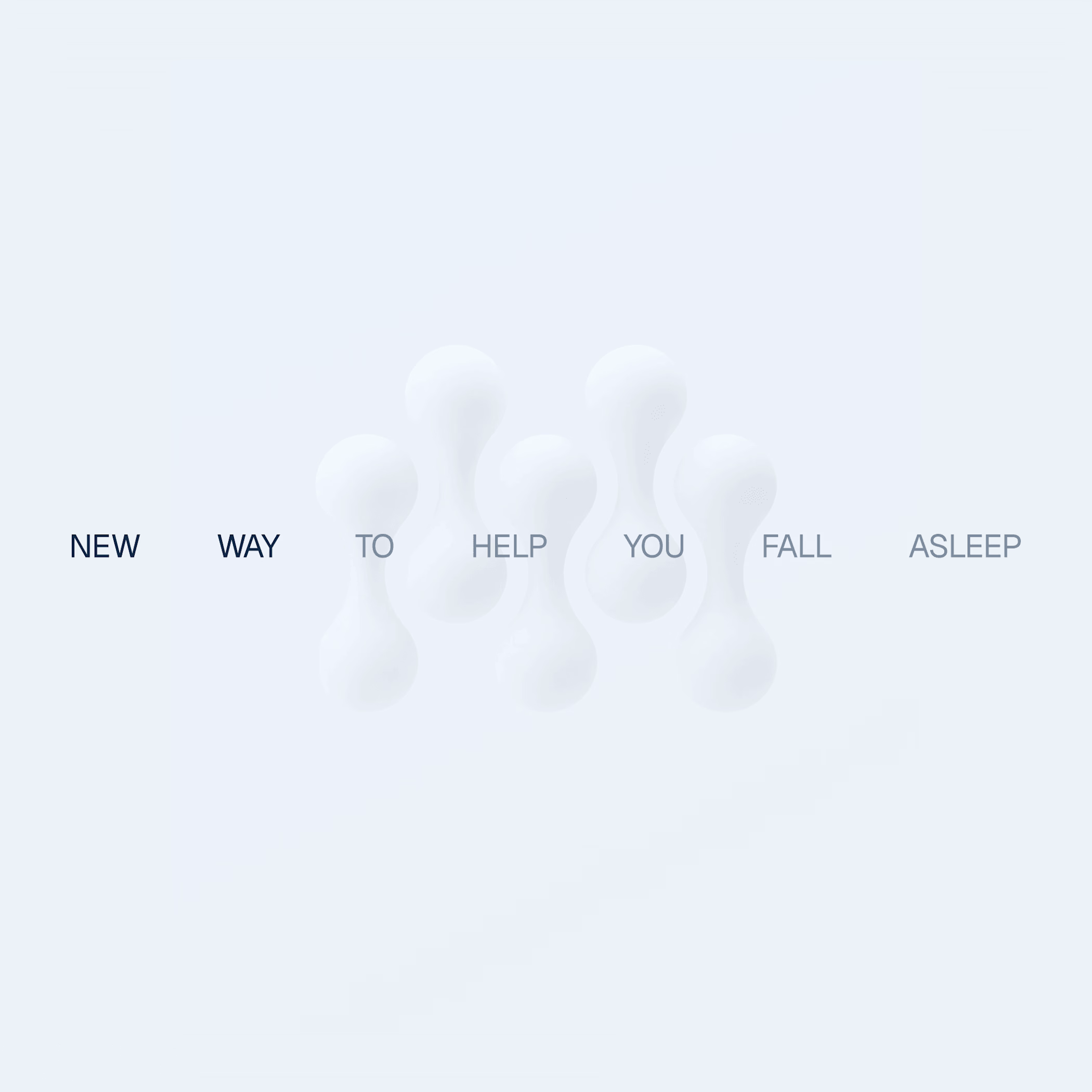
Mindly explores how technology can support the body's recovery processes rather than override them. The goal was to create a brand identity that feels both calming and scientifically grounded, combining wellness design with emerging technologies to support better sleep and recovery. The visual system balances clinical credibility with emotional softness.
Unlike many sleep brands that rely on dark, dreamy aesthetics, Mindly uses high contrast, generous white space, and restrained blue tones to create a sense of clarity and trust.
The symbol draws inspiration from neural connections and the organic flow of the nervous system. Abstract forms resemble interconnected neurons while subtly forming the letter “M,” reinforcing the brand name.
Beyond functioning as a logo, the shape expands into patterns and graphic elements across the identity system.



Clean work!

What I was striving for! Thanks @Bella Brillantes
The network for creativity
Join 1.25M professional creatives like you
Connect with clients, get discovered, and run your business 100% commission-free
Creatives on Contra have earned over $150M and we are just getting started



Related posts


Follow for More Job posts!

wow Dada, Please do share for accountants as well😊

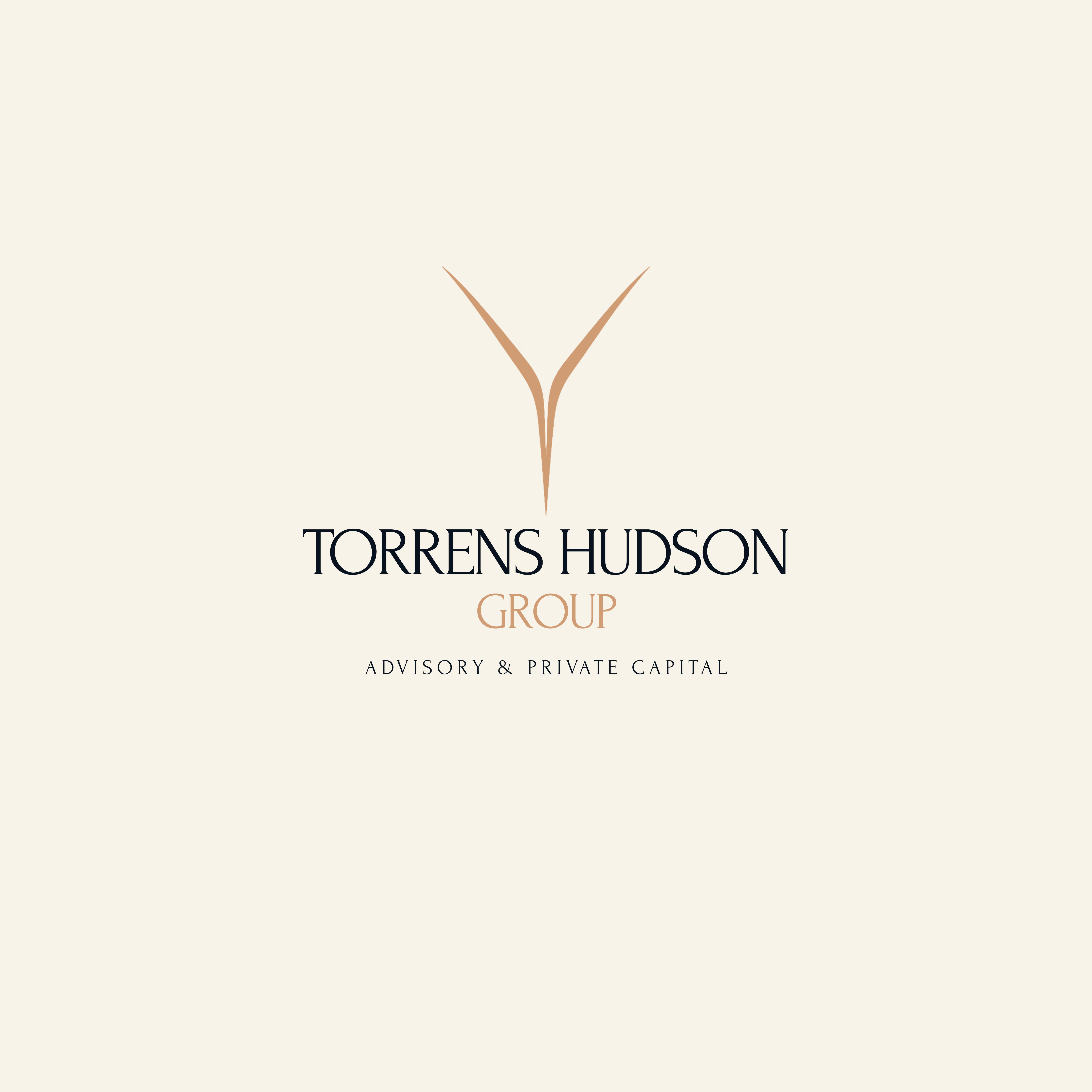
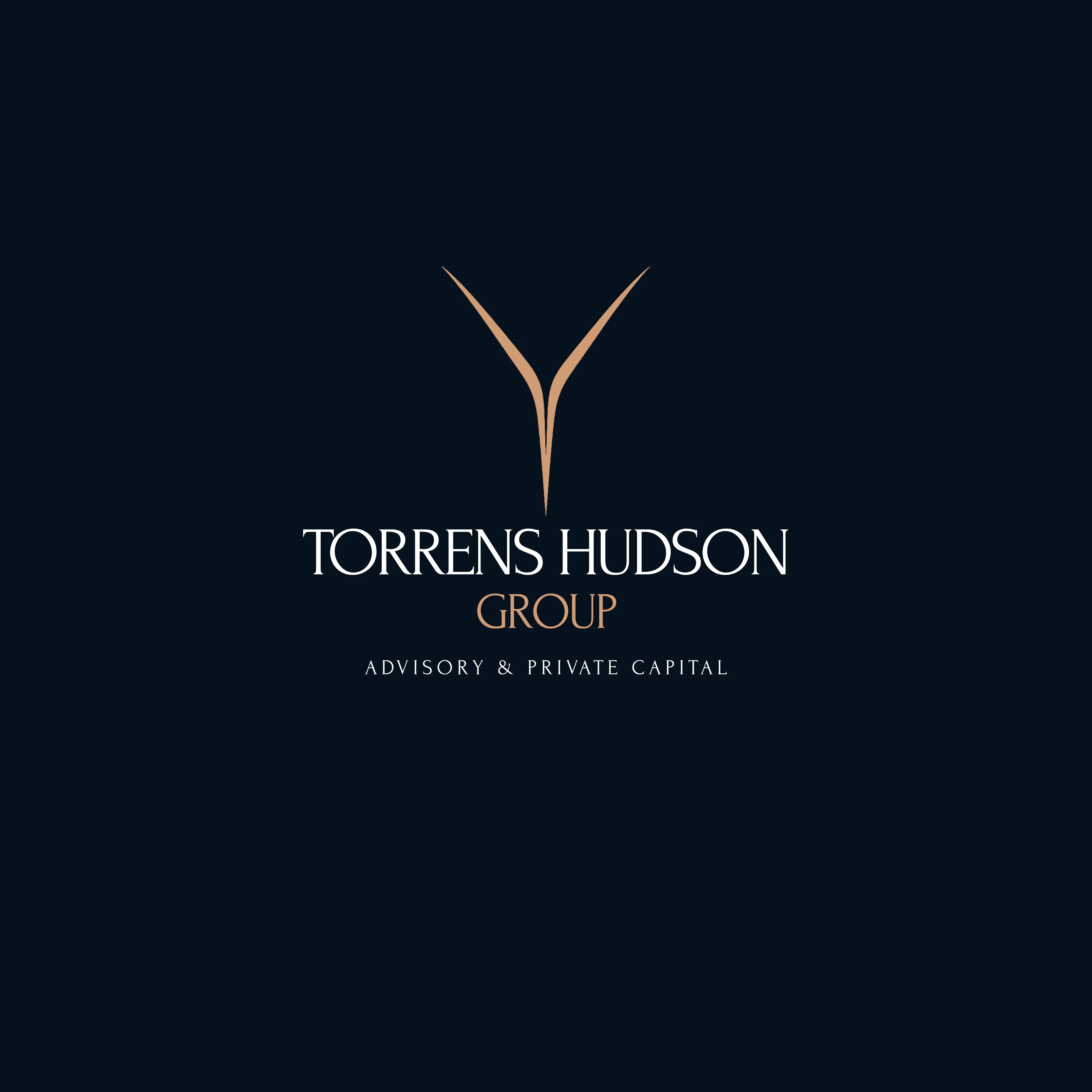
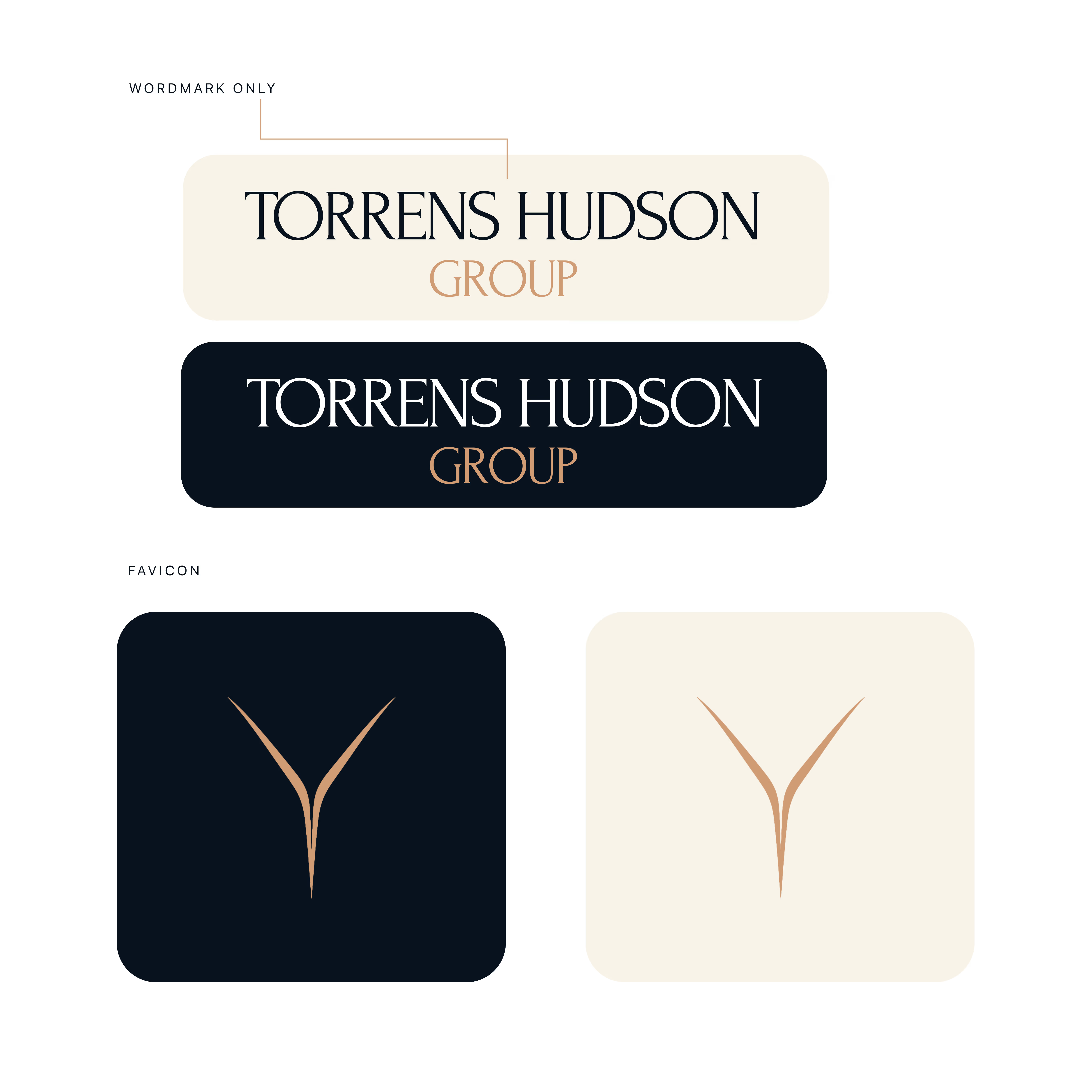
Torrens & Hudson - Brand Identity
Brand identity concept with an editorial serif wordmark, a minimal converging-rivers mark, and a navy, cream and bronze palette.



Nice work 🎉🎉

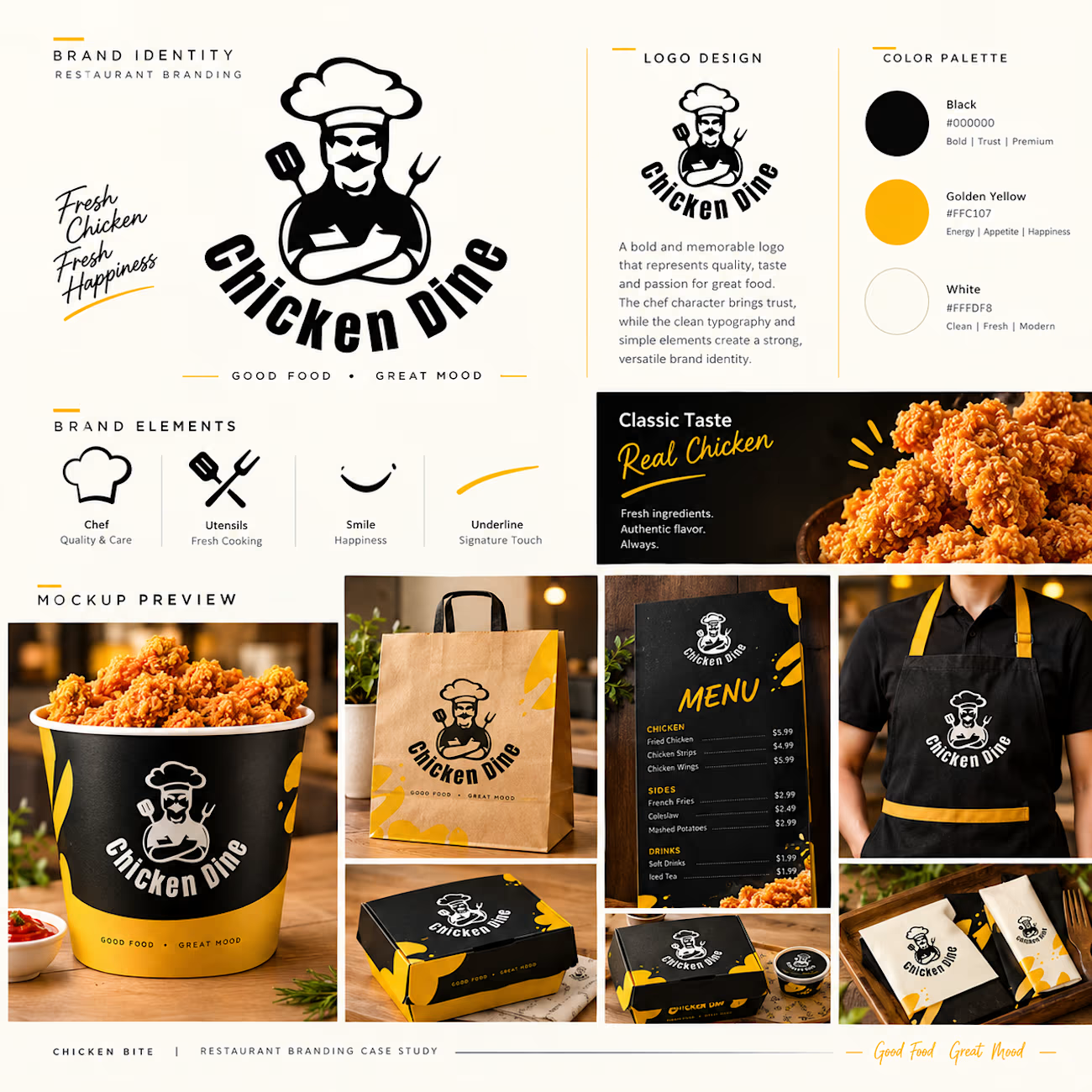
Chicken Dine | Premium Restaurant Branding.
Introducing the premium apparel branding mockup for Chicken Dine, a modern restaurant and café brand built around the concept of “Good Food, Great Mood.”
This creative T-shirt design features a bold black and golden-yellow color palette, a unique chef mascot logo, and eye-catching brand elements. Designed for both male and female staff, the uniform combines style, comfort, and a professional appearance.
The mockup showcases front and back T-shirt designs, premium logo printing, sleeve details, and fabric texture, demonstrating how a consistent visual identity can elevate a restaurant brand.
Brand Highlights:
Premium male and female T-shirt mockups
Custom restaurant uniform branding
Black, white, and golden-yellow color palette
Unique chef mascot logo
Professional front and back designs
Consistent restaurant brand identity
Brand Name: Chicken Dine
Industry: Restaurant & Café
Tagline: Good Food, Great Mood
A fresh and memorable visual identity designed to make Chicken Dine stand out.