The network for creativity
Join 1.25M professional creatives like you
Connect with clients, get discovered, and run your business 100% commission-free
Creatives on Contra have earned over $150M and we are just getting started
Back to feedPost
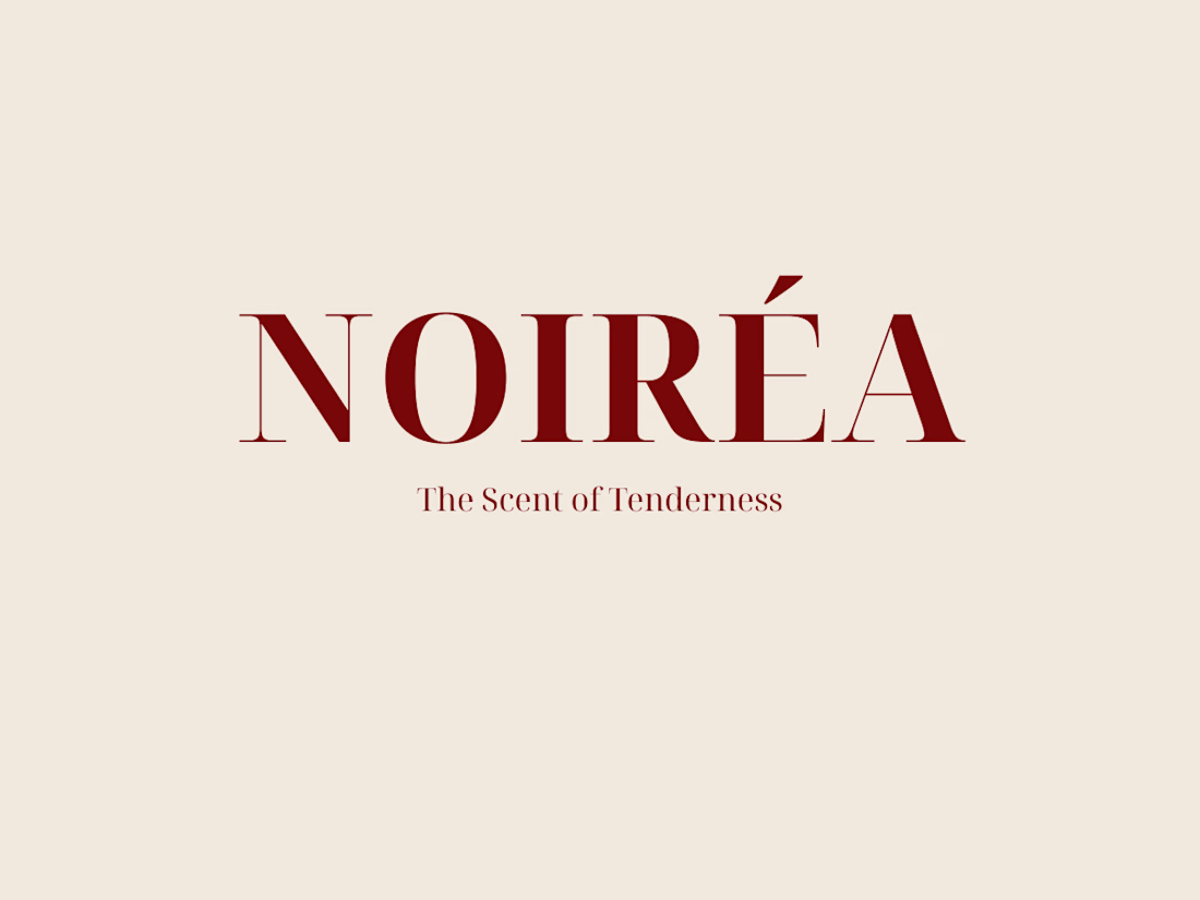
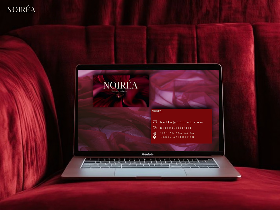
"Noiréa" — a full brand identity I created for a perfume brand: logo, monogram, business card, and mockup designs. Tried to bring a romantic, elegant feel through a deep bordeaux palette. Would love to hear your thoughts! 🤍

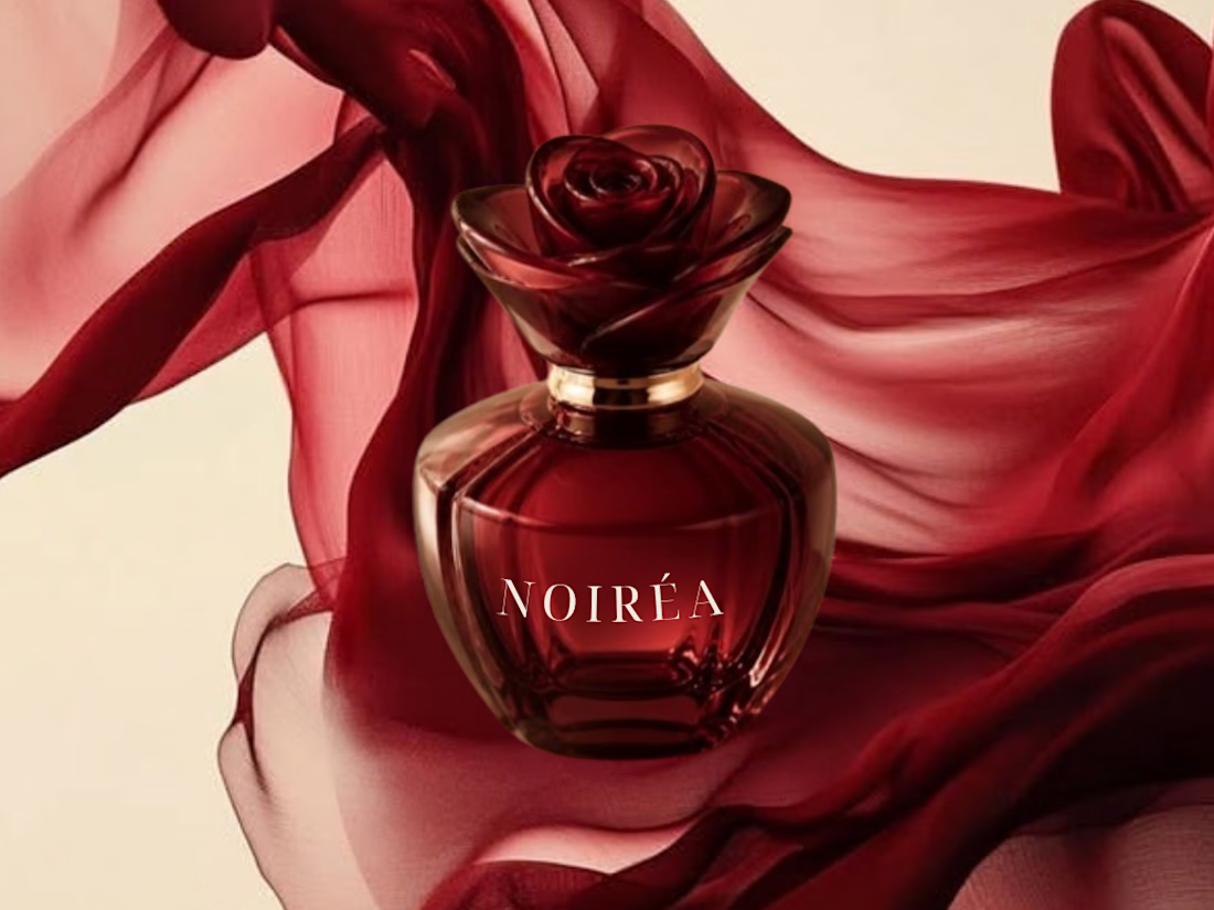
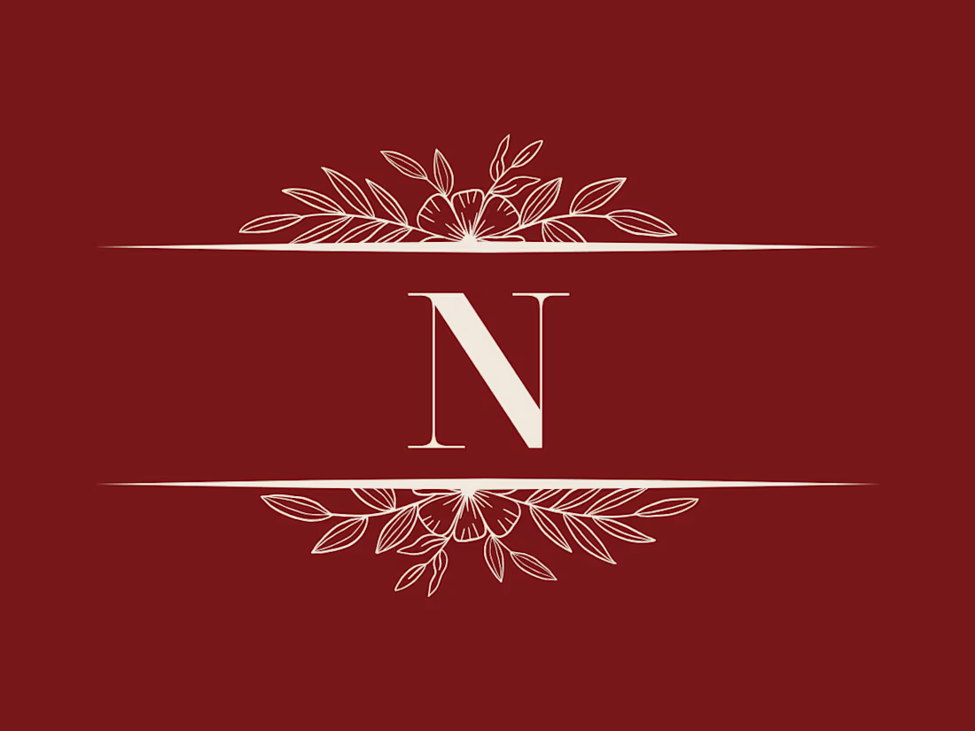

The deep bordeaux does a lot of the romantic work here, and a monogram suits perfume well since it can live on the cap and the box. Did you test the N at very small sizes?

Thank you! Yes, I actually tested it at smaller sizes, but I wasn't quite happy with how it turned out because it leaves too much empty space. So I kept it optimized for the sizes where it stands out best.
That makes sense, a mark with that much ornament tends to need a different cut at tiny sizes anyway. A stripped-down N for favicons or the cap could be a nice companion piece if the brand grows.
The network for creativity
Join 1.25M professional creatives like you
Connect with clients, get discovered, and run your business 100% commission-free
Creatives on Contra have earned over $150M and we are just getting started


Related posts


🎉 It’s live! I’ve finally updated my design portfolio:
👉
This space has been a long time coming, a reflection of the stories, systems, and identities I’ve been lucky to shape across wellness, healthcare, community & events!
It’s still evolving (aren’t we all?), and I’ll be adding more projects soon, but I’m excited to finally share a fresh look at my work and creative direction!

Congratulations on the new portfolio, Kajal! The grid of bold reds, magenta and cobalt mockups, with that confident serif G repeating throughout, makes the whole identity feel energetic yet cohesive. What guided the way you sequenced your wellness and healthcare projects?

Does a brand system need more rules or fewer?
Norr & Co. taught me fewer, but unbreakable ones. Two things never change. Everything else is allowed to get weird.
How fast can you tell a brand idea is weak?
Mine went flat the moment I tried it on a bakery and a late-night bar at the same time. Test your idea on your two most different cases first.

LOGO vs. BRANDING — What's your take? 🍵
I'm curious...
Which one makes a stronger first impression?
Do you prefer the simplicity of the logo or the personality of the complete branding?
I'd love to hear your thoughts! 💚
0 voted
0%
7 voted
100%
7 votes
Closed

makes me want a matcha haha, cool