The network for creativity
Join 1.25M professional creatives like you
Connect with clients, get discovered, and run your business 100% commission-free
Creatives on Contra have earned over $150M and we are just getting started
Back to feedPost

The Story Behind the O2Connects Logo🔗✨
When I started designing the O2Connects logo, I first thought about the meaning behind the name.😄 The brand is all about connecting people, ideas, and technology, so I wanted the logo to clearly communicate connection and collaboration.
I began exploring the letters “O” and “2” and transformed them into smooth, flowing shapes that connect with each other. I placed these shapes inside a circular form because a circle represents community, continuity, and strong relationships. The surrounding elements make the symbol feel like an active and growing network.🎯
For the colours, I selected deep green to represent trust, stability, and growth. I added warm gold to give the identity an elegant and premium touch, while soft ivory keeps the overall design clean, calm, and balanced.
After experimenting with different shapes, colours, and typography, the final logo became a modern and meaningful identity. It feels professional and premium, but still friendly and approachable—perfectly reflecting what O2Connects stands for.
Creative. Connected. Memorable. That’s O2Connects. 🚀


The network for creativity
Join 1.25M professional creatives like you
Connect with clients, get discovered, and run your business 100% commission-free
Creatives on Contra have earned over $150M and we are just getting started








Related posts

Logos & Marks — Volume 12
A curated selection of recent logo and identity work.
This collection brings together commissioned projects, unused concepts, and exploratory directions across technology, AI, finance, sports, retail, and other industries.
The work explores geometric symbols, custom typography, monograms, and abstract forms, with a focus on clarity, distinction, and strong visual character.
Selected marks are available for acquisition.
For licensing, customization, or brand identity inquiries, feel free to get in touch.
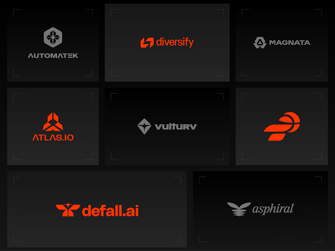
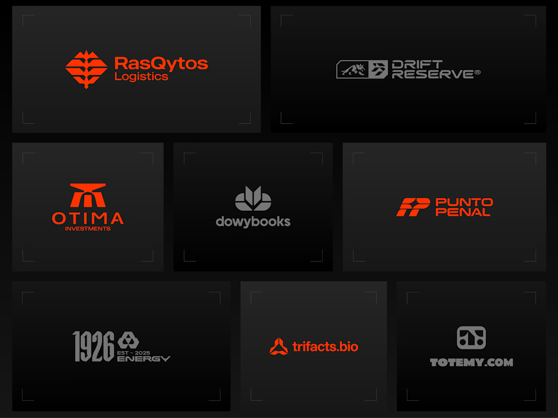
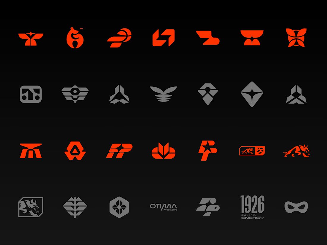


Holding the whole volume to one hot orange on charcoal makes the marks easy to compare, and the Otima symbol stacking a gate shape over the wordmark is my favorite of the set.

Recovery Brand Identity / Logo & Visual Direction
A new identity project for a recovery-focused brand that wanted to move away from the conventional clinical look of its category.
The direction combines clinical credibility with a more modern, movement- and performance-driven visual language.
First look at the logo. Full identity coming next.
Logo design and creative direction by Lepisov Branding
Social media Branding: collab with Mike Creative Mints


A product design project focused on creating a distinctive visual identity and a clear, professional presentation for the Agroxim brand.
Product and visual design
Layout and composition
Color palette and typography selection
Visual consistency and attention to detail
Preparing the final design for presentation
Tools & Software:
Adobe Illustrator · Adobe Photoshop · Adobe After Effect · Adobe Indesign
Focus:
Creating a visually appealing, professional design that communicates the brand's identity and helps the product stand out.
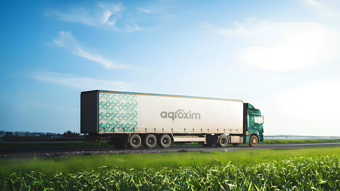
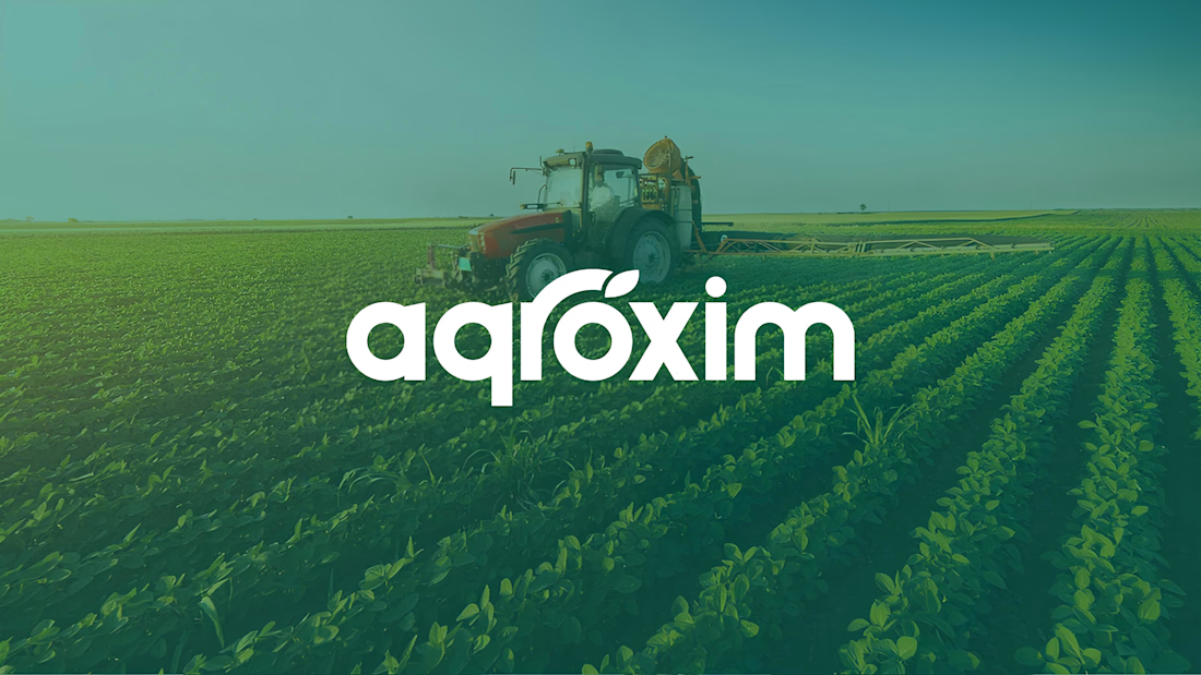

The agroxim wordmark sitting over that field photography is a lovely pairing, Sahib. Fresh greens really do the heavy lifting for an ag brand. Strong identity work.