The network for creativity
Join 1.25M professional creatives like you
Connect with clients, get discovered, and run your business 100% commission-free
Creatives on Contra have earned over $150M and we are just getting started
Back to feedPost

Meet my 6th @Framer template.
Orelia Event® - Event Planning & Production Studio.
Preview link : https://oreliaevent.framer.website/

The network for creativity
Join 1.25M professional creatives like you
Connect with clients, get discovered, and run your business 100% commission-free
Creatives on Contra have earned over $150M and we are just getting started





Related posts


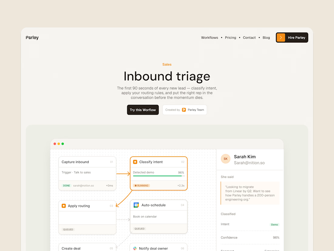
parley’s inbound triage page, with the workflow laid out below the introduction.
get it free now → https://framer.link/s1Llkdh

Nice work!


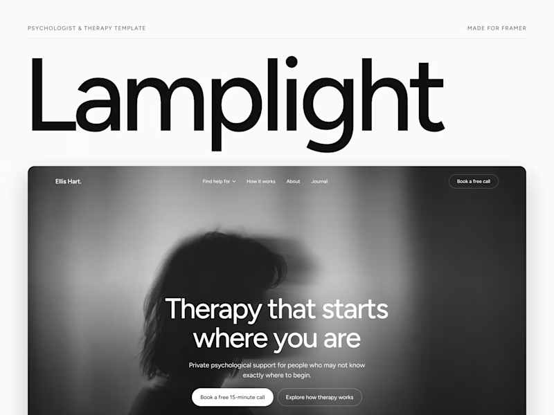
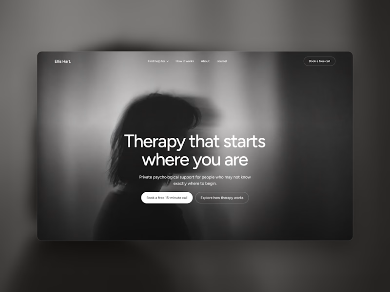
Which one grabs your attention and should be the main visual for a framer template thumbnail?
7 voted
50%
7 voted
50%
14 votes
Closed

Both works are great; it's hard to choose

Just launched Framer Portfolio template!
And...it´s totally FREE! Enjoy! 🙌
https://www.framer.com/marketplace/templates/riwa-mini/

Killer execution