The network for creativity
Join 1.25M professional creatives like you
Connect with clients, get discovered, and run your business 100% commission-free
Creatives on Contra have earned over $150M and we are just getting started
Back to feedPost


Every element in your identity either traces to a decision about your company or it traces to a mood board. The question stays open until you need a surface that was never scoped.
Then it gets built by copying the closest thing that already exists, and every step in that chain looks reasonable on its own. That is how a brand drifts without a decision behind it.

The "looks reasonable on its own" part is the trap, nobody signs off on brand drift, it just accumulates one unscoped surface at a time until someone finally audits the whole system.

This is such a sharp framing of brand drift. The unscripted surfaces are usually where the hidden strategy gaps become visible.
The network for creativity
Join 1.25M professional creatives like you
Connect with clients, get discovered, and run your business 100% commission-free
Creatives on Contra have earned over $150M and we are just getting started

Challenges
View all


Related posts

We built a tool for the client to use and create visuals, based on their brand identity

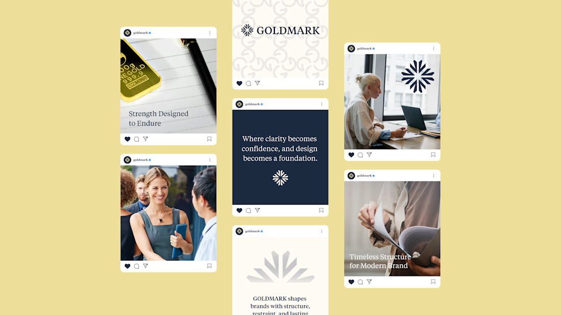
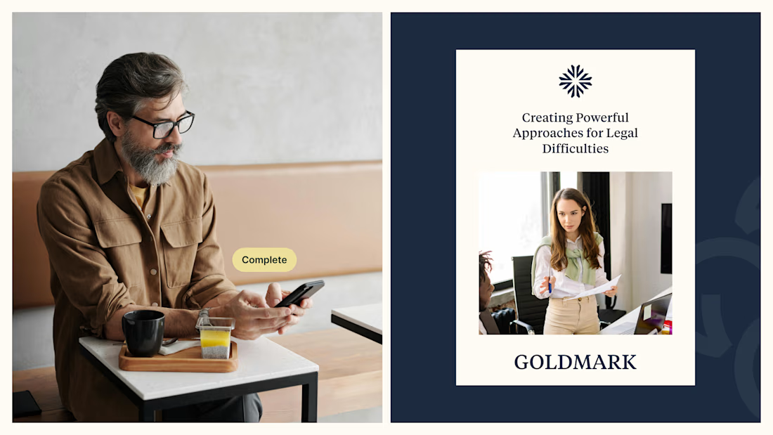
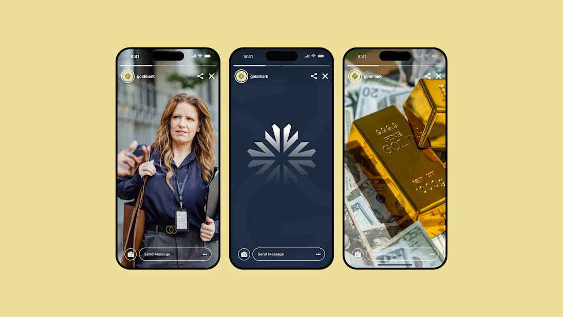
GOLDMARK - A refined identity for modern legal expertise. ✦
A complete branding exploration focused on building a visual language that feels premium, trustworthy, timeless, and confident.
The identity combines a distinctive symbol, elegant typography, and a deep navy + warm gold palette to create a sophisticated presence across digital and print applications.
Services: Brand Identity • Logo Design • Art Direction • Visual System
#BrandIdentity #BrandDesign #LogoDesign #VisualIdentity #Branding #GraphicDesign #ContraPortfolio


A brand can look beautiful and still feel forgettable.
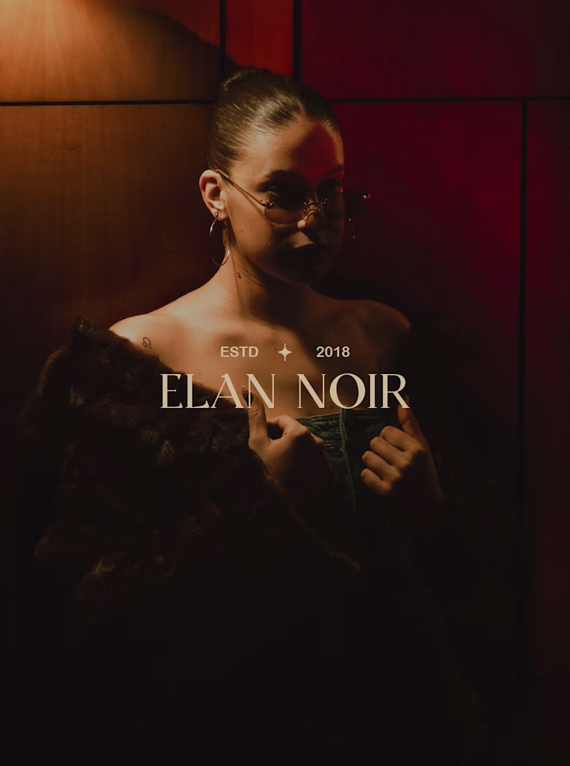
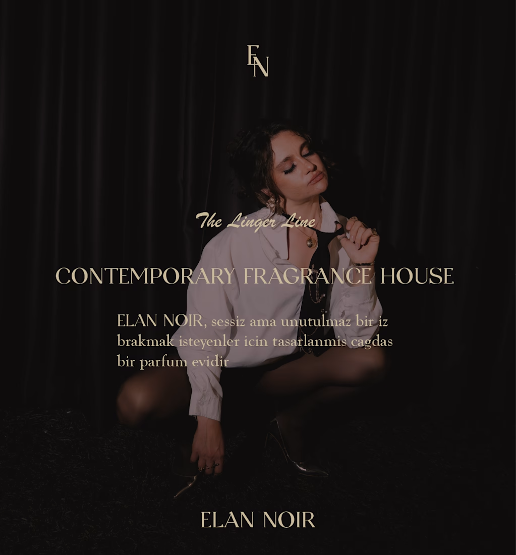
For ÉLAN NOIR, I wanted the identity to communicate something more specific: elegance, mystery, and quiet confidence.
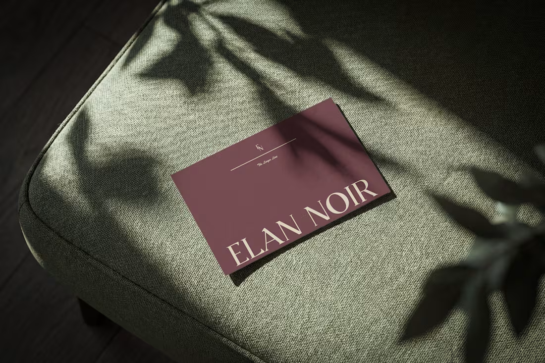
That meant looking beyond the logo and thinking about how the typography, color, layout, packaging and overall visual language could create one consistent feeling.
That’s how I approach brand identity and packaging design.
Not just making individual pieces look good, but building a visual system that gives a brand something recognizable to grow with. I’m currently open to working with founders and brands in:
→ CPG → Food & Beverage → Wellness → Lifestyle → DTC → Consumer products
Whether you're building a new brand, launching a product, expanding your SKUs, or refreshing an existing identity, I'd love to hear what you're working on.
What makes a brand instantly recognizable to you?
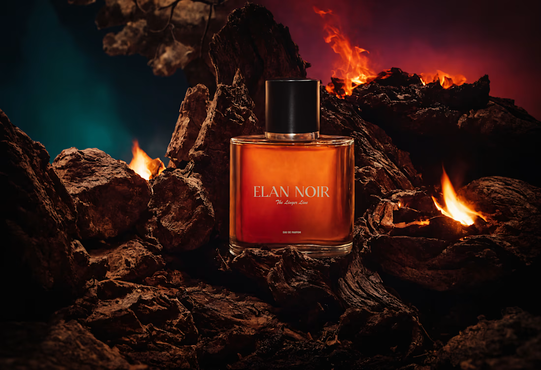

For me it's repetition of one non-logo asset — a crop, a paper stock, a specific shade — showing up often enough that people recognise it before they read anything. The low-key lighting is doing that job here; does it survive a retailer shooting the bottle on plain white?