The network for creativity
Join 1.25M professional creatives like you
Connect with clients, get discovered, and run your business 100% commission-free
Creatives on Contra have earned over $150M and we are just getting started
Back to feedPost

I used to keep two sets of text styles, one for desktop and one for mobile. Now one set of number variables does both.
• Each font size is a number variable.
• One collection holds Desktop and Mobile modes.
• Text styles are bound to those variables.
• Switching the frame's mode changes every bound size.
Do you design mobile type first or desktop first?
Follow for more videos: instagram.com/sellwrightstudio · youtube.com/@sellwrightstudio


Mobile first usually forces the hard choices early, since the small sizes are where line height breaks first. Do you bind line height to variables too, or only the font size?
Agreed, the small sizes are where line height breaks first. Line height can sit in the same collection as its own number variable with Desktop and Mobile values, so one mode switch updates both size and spacing together.
The network for creativity
Join 1.25M professional creatives like you
Connect with clients, get discovered, and run your business 100% commission-free
Creatives on Contra have earned over $150M and we are just getting started






Related posts


would you let people record a little voice intro before each track?


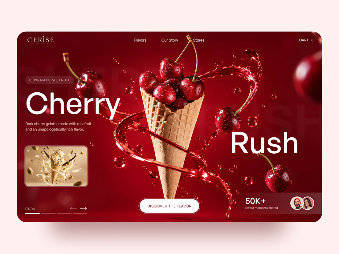
Very juicy. Didn't you feel like having some berries while working?

🚀 SPECIAL ANNOUNCEMENT: 20% OFF WEBSITE DESIGN SERVICES!
It's official! My 20% Discount Program is now LIVE! 🎉
I'm making it easier for businesses, startups, and entrepreneurs to build a stronger online presence with professional website design at a discounted rate.
Whether you're planning to launch a new website, redesign an existing one, or improve your online store, this is a great opportunity to get started.
Here's what you get:
20% OFF website design services
Professional, modern and user-focused designs
Websites built to support your business goals
A better digital experience for your customers
🎟️ Use promo code: ELIJDEV20
📅 Offer ends: January 1, 2027
Ready to give your business website the attention it deserves?
Send me a message here on Contra or reach out on WhatsApp: +1 (819) 486-7523
Let's build something great for your business!
#WebDesign #WebsiteRedesign #ShopifyDesign #Ecommerce #WebDevelopment #SmallBusiness #Contra #SpecialOffer



This is amazing