The network for creativity
Join 1.25M professional creatives like you
Connect with clients, get discovered, and run your business 100% commission-free
Creatives on Contra have earned over $150M and we are just getting started
Back to feedPost
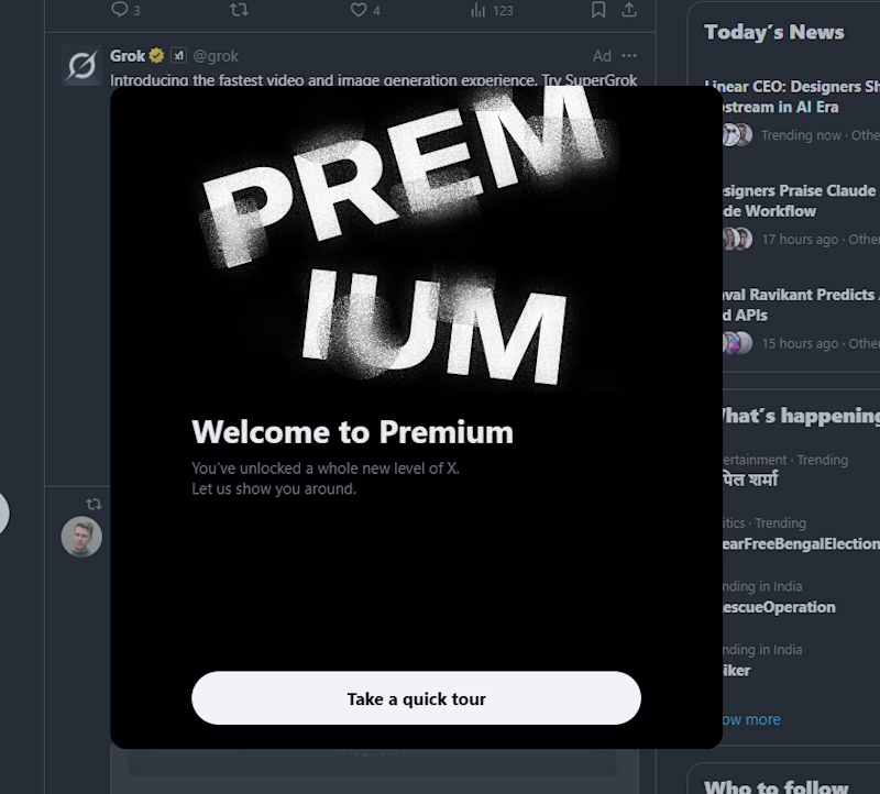
Taste Test
UX ICKS -- 01
Just purchased X/Twitter premium, and this was the welcome I got😓. The artwork is random as hell, and the text layout whitespace makes no sense.
Decided to fix it, here's my version.
2 voted
67%
1 voted
33%
3 votes
Closed
Nice work!
Your version is a huge improvement! The balance and whitespace in the original really do feel off, especially for a 'Premium' experience. As a web specialist, I believe small details like these define the entire user journey. Your version feels much more intentional and high-end. Great eye for UX!"
Thank you Arooj, honestly my version is just the standard in 2026. I don't get how X's welcome card for there premium users was that lacking 😂.
The network for creativity
Join 1.25M professional creatives like you
Connect with clients, get discovered, and run your business 100% commission-free
Creatives on Contra have earned over $150M and we are just getting started
Trending
Claude
Claude has entered the design space. How are you using Claude Design?
Contra University
Learn from expert creatives how to earn more using next-gen AI tools.
creativeaiflow
Creative AI workflows are evolving. What tools do you use, and what are their strengths and weaknesses?
freelancerlife
Freelancer life is wins, pivots, and everything in between. What’s yours right now?
Related posts
Most websites look good.
Few make people stop, trust, and take action.
This landing page was designed with one goal: clarity over complexity.
Every section has a purpose:
- Clear visual hierarchy
- Generous whitespace
- Clean, modern UI
- Scalable components
Good design isn't about adding more,it's about removing what doesn't help users.
I'd love to hear your thoughts:
What part of a landing page has the biggest impact on conversions?
If you'd like, I can also make it more viral, designer-focused, or client-attracting.
Weldone ☀️ 💖
The free AI rebuild prompt for Sunbeam’s homepage is now live on my website
Just hit “Get the prompt” and follow the instructions.
Sol 5.6 or Fable 5 will one shot it
AI create super cool websites
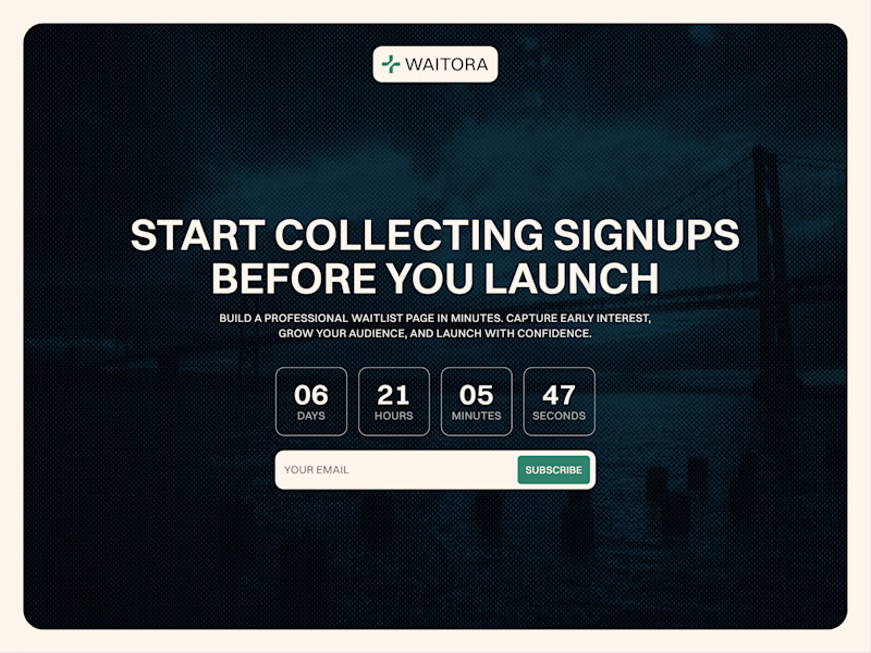
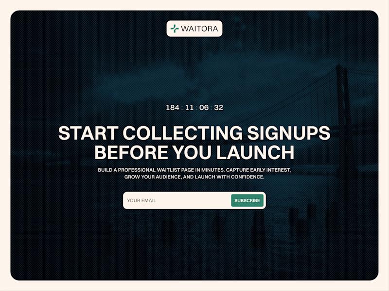
Which countdown looks better?
More complex on the left or simple one on the right?
12 voted
67%
6 voted
33%
18 votes
Closed
I like the more complex better