The network for creativity
Join 1.25M professional creatives like you
Connect with clients, get discovered, and run your business 100% commission-free
Creatives on Contra have earned over $150M and we are just getting started
Back to feedPost
Scoopi — Ice Cream Ordering App | UI/UX Design
Scoopi is a modern mobile app concept for an ice cream brand, combining playful visuals with a seamless shopping experience.
The design features a pastel-inspired color palette, realistic 3D ice cream imagery, intuitive flavor discovery, product detail screens, and a streamlined add-to-cart experience.


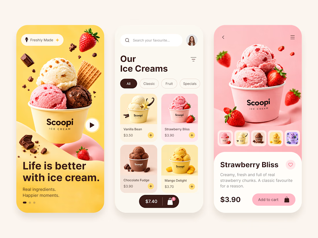

Selecting a flavour should update the photo, price and cart item from the same product ID. Are mixed-flavour cups part of the flow, or is each flavour a separate item?

Great point! 🙌 It’s the same ice cream product with different flavour options, rather than separate products. Selecting a flavour should update the image and price accordingly, and the cart should reflect the selected flavour. Mixed-flavour cups could also be an interesting feature to explore in the future!
Then a single product with a selected flavour variant is the clean model; carrying that variant into the cart keeps the image and price tied to the same choice.
Exactly! 🙌 Keeping the flavour as a product variant makes the experience more consistent and intuitive. It also keeps the product details and cart state in sync. Thanks for sharing your thoughts!

Super clean work!
Thank you so much, Kaushal! 🙌
The network for creativity
Join 1.25M professional creatives like you
Connect with clients, get discovered, and run your business 100% commission-free
Creatives on Contra have earned over $150M and we are just getting started







Related posts

Recent work on MAE - Visual identity

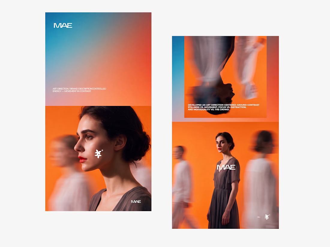

The motion blur on the figures gives the orange-to-blue gradient a reason to be there, and the small star mark stays readable on both the cheek and the shirt. Did the star come first as a standalone mark, or did it grow out of the photography direction?

Customer reviews can reveal what your website needs to explain better.
For BONK Golf, I turned recurring questions into a product-finder quiz.
It guides shoppers through gifting, fit and style to a relevant recommendation helping them choose with confidence and aiming to reduce unsuitable purchases and returns.
See it: https://bonkgolf.com/pages/quiz-page
Are your shoppers struggling to choose? I design & build Shopify shopping experiences. DM your store URL.


Social Media Concept Design for Seed