The network for creativity
Join 1.25M professional creatives like you
Connect with clients, get discovered, and run your business 100% commission-free
Creatives on Contra have earned over $150M and we are just getting started
Back to feedPost

Your website navigation should answer your visitor’s next question.
Someone arriving on a business website may know their problem without knowing which service to choose. A useful menu gives them a way forward.
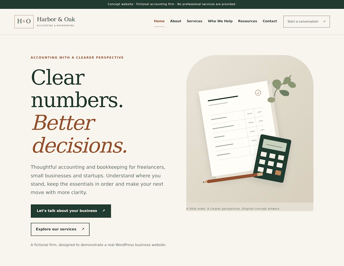
For Harbor & Oak, my self-initiated WordPress concept, I organised the experience around practical visitor questions:
• What support is available? → Services
• Is it relevant to my business? → Who We Help
• What should I understand first? → Resources
• How do I begin? → Contact
The homepage offers two clear routes: explore the services or start a conversation. Service and audience sections pair explanations with relevant next steps. Resource cards lead to complete on-page guides.
The custom theme keeps page content editable through Gutenberg, while responsive navigation preserves access to all six pages on smaller screens.
The takeaway: map your visitors’ questions before deciding your page list. Give each page a purpose and a clear next step—not just a place in the menu.
What is the first question your website needs to answer for a new visitor?
Self-initiated fictional concept. Harbor & Oak is not a real accounting practice and was not commissioned by a client. The website does not provide professional financial or tax advice. The enquiry flow is a local demonstration; no message is delivered to a business.

The network for creativity
Join 1.25M professional creatives like you
Connect with clients, get discovered, and run your business 100% commission-free
Creatives on Contra have earned over $150M and we are just getting started



Related posts

For Ranch University, I designed and built a custom Kajabi website and course platform + community around ranch ownership and life on the land.
Earthy colors, ranch photography, and spacious layouts carry through the site, membership pages, and course presentation. I also handled the course structure and offer setup behind the scenes.


We kept zooming in on a planet until it didn't fit on the phone.
A ringed gas giant grows until it fills the whole screen and lands on a deep boom. It's drawn in text characters, one per cell, against black space.
It's 11 seconds, and the sound is ours too.
What should we fly past next?
The whole code garden: https://contra.com/p/oRob3r7o
https://givemeprompts.com/lab/


Web screen stand out