The network for creativity
Join 1.25M professional creatives like you
Connect with clients, get discovered, and run your business 100% commission-free
Creatives on Contra have earned over $150M and we are just getting started
Back to feedPost
Building the best personal project I’ve ever made, from start to finish.
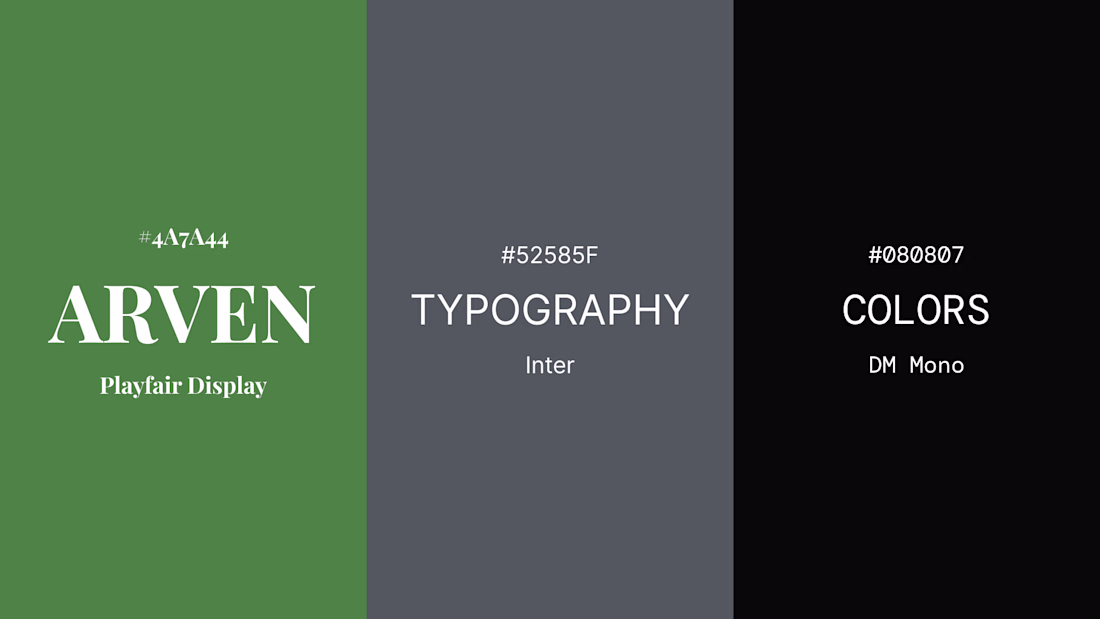
Step 7 - Color & Typography
The visual system starts here.
Forest Green.
Steel Graphite.
Warm off-black.
Three type families.
Three functions.
Playfair for impact.
Inter for clarity.
DM Mono for precision.
Everything has a job.
What’s your favorite font pairing right now?
Comment below with your answer.
Like this post and follow to keep up with the project.
Inter don’t<3
Just an initial idea.
Changes might happen...
What is your suggestion?
The network for creativity
Join 1.25M professional creatives like you
Connect with clients, get discovered, and run your business 100% commission-free
Creatives on Contra have earned over $150M and we are just getting started
Related posts
Redesigning and streamlining a brand system creates consistency across every touchpoint, reducing duplication, inefficiencies, and unnecessary production costs. A unified visual and operational framework enables teams to work faster, make better decisions, and scale more efficiently, ultimately saving significant resources over time. For large organizations, these improvements can translate into millions of dollars in savings through reduced design, production, implementation, and maintenance costs, while simultaneously strengthening brand recognition and customer trust.
This deserves more than just a like
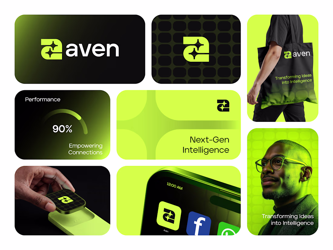
Aven is a next-gen AI intelligence brand built around transformation and speed. The identity centers on a bold geometric mark — a dynamic double-arrow motif that communicates forward motion and data exchange, rendered in high-contrast acid green on deep black.
The color system is unapologetically bold: electric green (#B6F000 range) paired with near-black creates instant visual authority in the AI/tech space. Every touchpoint — from the app icon to tote bags — holds the same visual weight, making the brand system feel cohesive and premium across digital and physical applications.
Deliverables included:
Logo mark + wordmark lockup, brand color system, icon/app version, pattern system, mockup presentation across merchandise, mobile, and digital media.
Built for AI, SaaS, and intelligence-driven brands that want to own their visual presence.
#BrandIdentity #LogoDesign #AIBranding #TechBranding #SaaSDesign #GeometricLogo #VisualIdentity #BrandSystem #LogoDesigner #CreativeDirection
Work in Progress!
Building "Buy template" component for my Framer templates.
Fantastic execution from both a UX and visual design perspective. The hierarchy, spacing, imagery, and overall flow create an immersive experience that perfectly suits a tourism website. Every detail feels thoughtful and purposeful. Excellent work! 🔥👏
Trending
Claude
Claude has entered the design space. How are you using Claude Design?
Contra University
Learn from expert creatives how to earn more using next-gen AI tools.
MagicPath
The canvas is infinite, and exploration is becoming the workflow. How are you using MagicPath?
creativeaiflow
Creative AI workflows are evolving. What tools do you use, and what are their strengths and weaknesses?
freelancerlife
Freelancer life is wins, pivots, and everything in between. What’s yours right now?