The network for creativity
Join 1.25M professional creatives like you
Connect with clients, get discovered, and run your business 100% commission-free
Creatives on Contra have earned over $150M and we are just getting started
Back to feedPost


The network for creativity
Join 1.25M professional creatives like you
Connect with clients, get discovered, and run your business 100% commission-free
Creatives on Contra have earned over $150M and we are just getting started







Related posts


Elias Vent’s services page puts large service names beside a preview of the work. The second image shows a project detail page.
Framer template: https://startfrom.co/templates/elias-vent
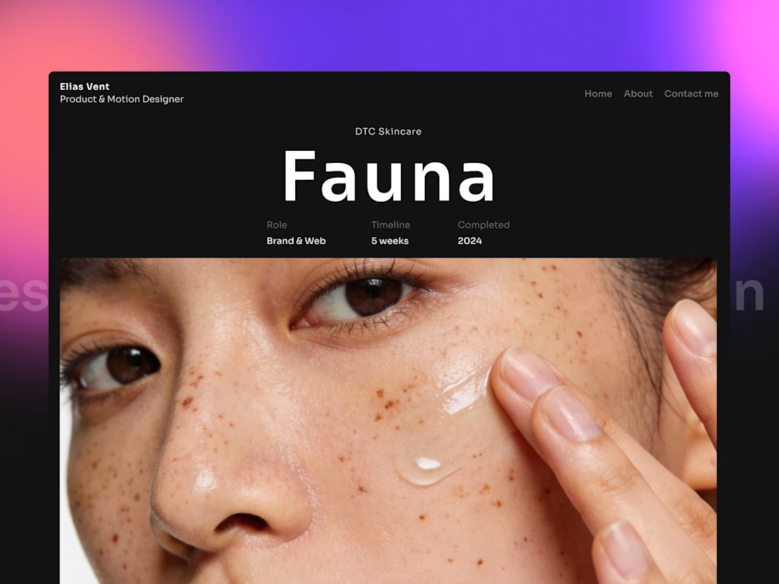
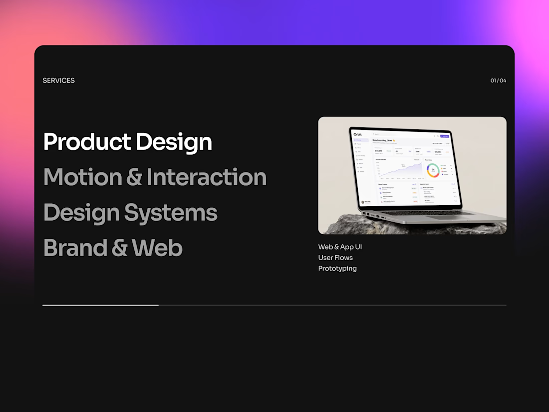

Pairing the service name directly with a preview image instead of making people click through is such an easy win that gets skipped constantly. Does the layout hold up once a client has more than two or three offerings, or does it start to feel cluttered past that?

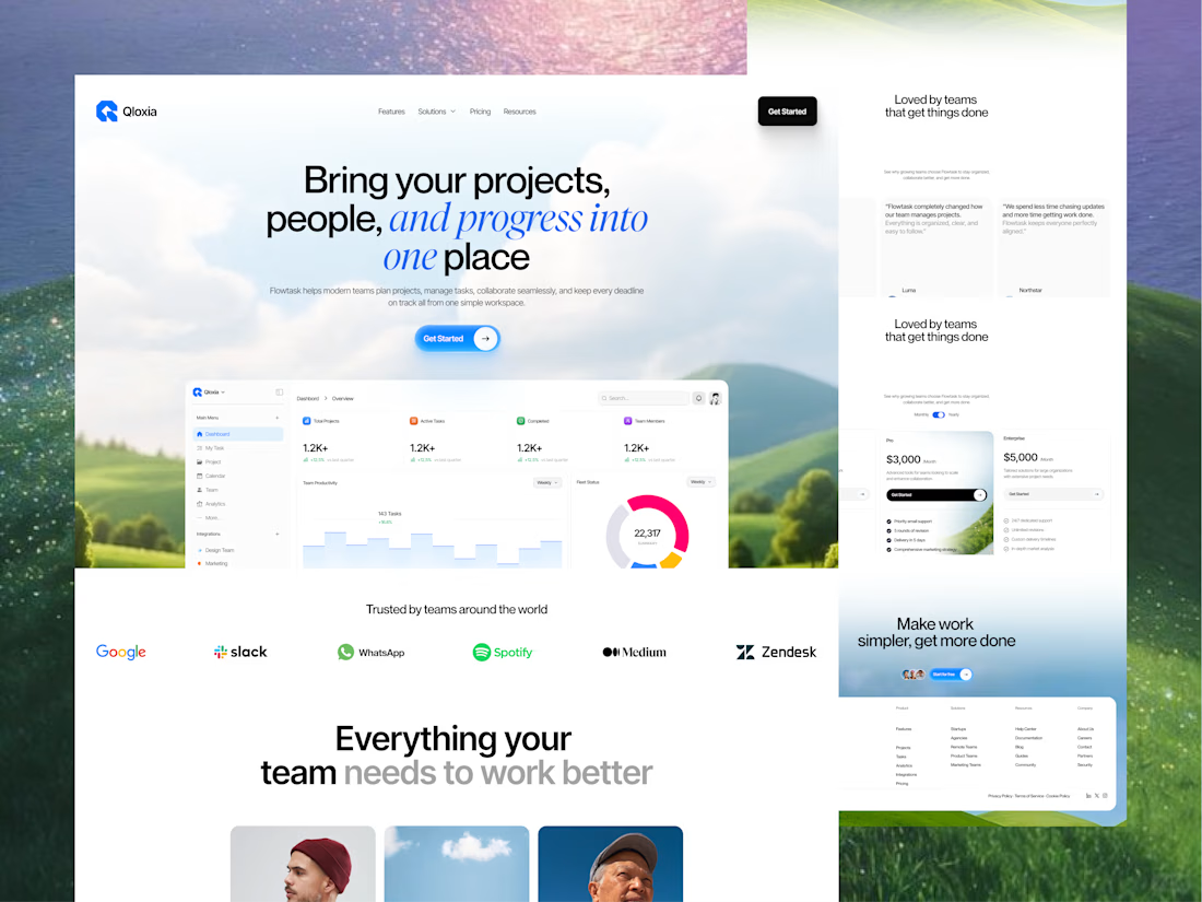
Qloxia - Project Management SaaS Web UI UX Design
Complex workflows deserve clearer interfaces.
Qloxia is a project management and team collaboration SaaS concept designed around a simple product promise:
Bring projects, people, and progress into one place.
The experience combines:
• Project management
• Task management
• Team collaboration
• Planning and analytics
• Progress visualization
• Social proof
• SaaS pricing
• Conversion-focused UX
The design direction uses soft visual environments, editorial typography, rounded components, product-led storytelling, and structured content hierarchy to make the platform feel both professional and approachable.
The goal wasn't to make another dashboard-heavy SaaS website.
It was to create an experience where users can quickly understand the product, explore its capabilities, build confidence, and take action.
Building a SaaS product, dashboard, or web application?
Taqwah can help you transform your product idea into a clear, scalable, conversion-focused UI/UX experience - from strategy and UX to polished interface design.
👉 Send us your product idea and let's discuss how we can design the experience around your business goals.
Project ManagementtaskmanagementsaaswebsiteProduct DesignUX DesignAdobe IllustratorAdobe PhotoshopFigma




Here we go! ⚡️
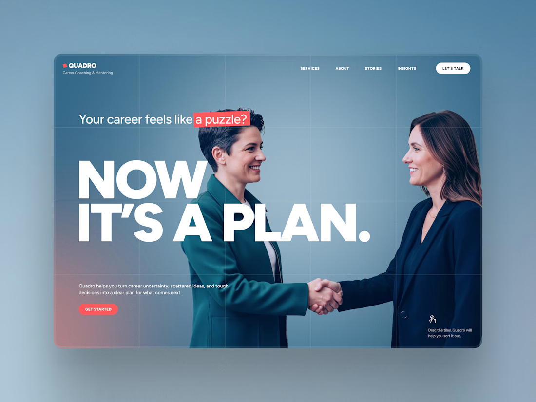
QUADRO — my new Framer template for career coaches and consultants is live!
https://framer.com/marketplace/templates/quadro/
The goal was to make the website look and work like a storytelling presentation, guiding you through the pages and sections.
Hope you’ll like it! 💙


nice designs