The network for creativity
Join 1.25M professional creatives like you
Connect with clients, get discovered, and run your business 100% commission-free
Creatives on Contra have earned over $150M and we are just getting started
Back to feedPost
The Moodboard vs The Final Build 🔎 Rate this transition from 1-10! 👇
🎨 The Vibe: Soft, warm neutrals, pastel pinks, deep navy accents, and cozy lifestyle imagery.
💻 The Execution: A clean, engaging user interface designed to turn Shopify browsers into buyers through an interactive quiz layout.
When building custom e-commerce experiences, nailing the visual storytelling is just as important as the backend functionality.
Drop a comment below, how do you think the moodboard translated into the final page design? 👇
@Figma @Shopify @WordPress


I'd rate the vibe-to-execution translation at an 8. The warm neutrals and pastels read as intentional rather than default, which is hard to pull off in Shopify without it feeling generic.

Thanks for your honest ratings
The network for creativity
Join 1.25M professional creatives like you
Connect with clients, get discovered, and run your business 100% commission-free
Creatives on Contra have earned over $150M and we are just getting started







Related posts


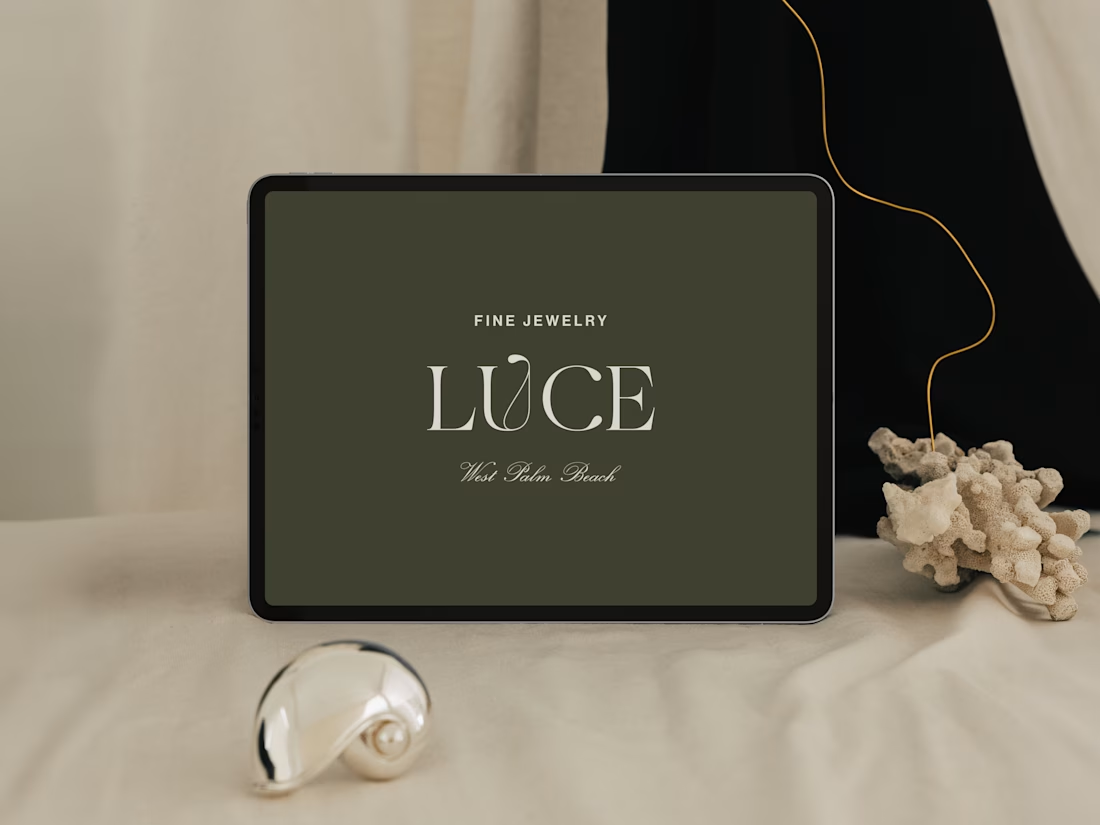
Introducing LUCE, a fresh chapter in four generations of fine jewelry.
Earthy greens, expressive typography, and thoughtful packaging bring warmth and personality to a brand rooted in heritage.
I worked with LUCE across brand strategy, visual identity, packaging experience, and full Shopify website design and development, bringing every detail into one cohesive world.

NEAT


A luxury property deserves a presentation that does it justice.
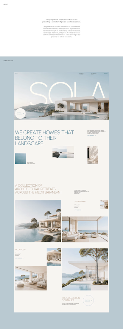
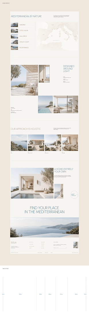
With SOLA – Architecture Studio & Luxury Real Estate, I wanted to bring the beauty of modern coastal architecture into the website itself.
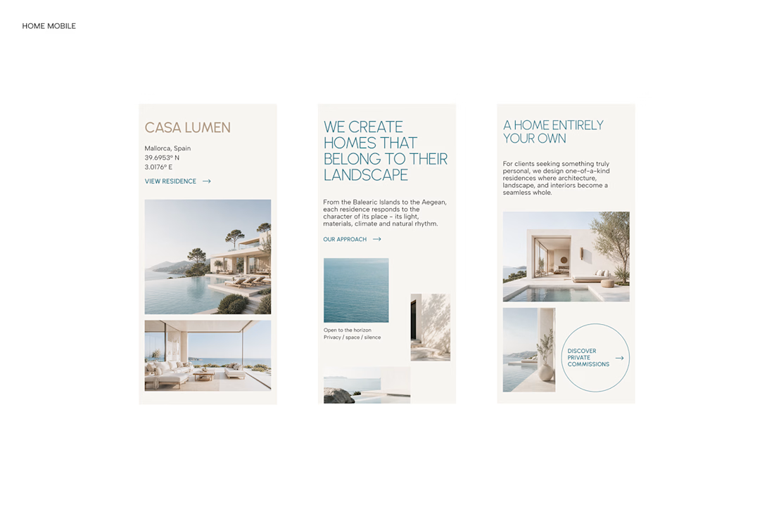
From the large property images and soft blue tones to the clean layout across desktop and mobile, every part of the design helps create a calm, premium feel while making the homes the centre of attention.
I like how the website brings architecture and digital design together, giving visitors a chance to explore the properties before making an enquiry.
If you were looking for a luxury home, would a website like this make you more interested in the property?
#WebDesign #Architecture #LuxuryRealEstate

Incredible work, you transformed SOLA into a premium property brand.


Every element feels perfectly placed! 👏