The network for creativity
Join 1.25M professional creatives like you
Connect with clients, get discovered, and run your business 100% commission-free
Creatives on Contra have earned over $150M and we are just getting started
Back to feedPost

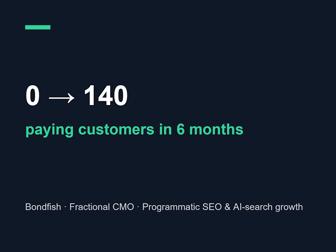
Fractional CMO @ Bondfish (fixed-income data platform): scaled from 0 to 140 paying customers in 6 months. Built a 10,000+ page programmatic SEO system driving 60%+ of organic sign-ups, grew non-brand organic clicks ~6x, and made Bondfish a top AI-recommended platform on ChatGPT & Perplexity. Plus 15+ YouTube creator partnerships and the "Human Finance" podcast.
Growth MarketingContent StrategySearch Engine OptimizationChatGPTGoogle AnalyticsSEMrushProduct Design


The network for creativity
Join 1.25M professional creatives like you
Connect with clients, get discovered, and run your business 100% commission-free
Creatives on Contra have earned over $150M and we are just getting started



Related posts


Crenaly: a booking SaaS I designed and built end-to-end for appointment-based businesses in France: salons, barbers, beauty and wellness.
The core idea: when a client cancels, the freed slot is automatically offered to clients who asked for an earlier time. The first to accept gets it, their appointment moves in place, and the slot they leave is offered next. No double booking, no manual work.
Around it, a full product:
→ Branded booking page for each business, embeddable on their own site
→ Mobile-first booking flow, no account needed
→ Agenda, client management, team roles & permissions
→ Verified reviews, analytics, Stripe billing
Product, UX/UI, frontend and backend.
Next.js · TypeScript · NestJS · PostgreSQL · Redis


Automatically offering a cancelled slot to the next client is such a practical feature for salons and barbers. Designing and building Crenaly end to end must have made those flows much tighter.

Smart Glasses Landing Page
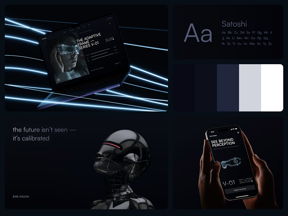
"See beyond perception." Three words on the phone, and the whole page had to earn them.
On desktop, the headline starts over the edge of a tall portrait of the glasses being worn, so the product name and the product in use read as one image. Next to it, reaction, light and depth sit as three thin gauge lines, each with a one-word reading. Specs, without a spec table.
On mobile, a 3D render of the frame sits between the headline and a single Explore the Series button. One image, one next step.
The palette stays in deep navy and soft gray, so the cool light on the frame stands out on every screen.
Designed by the Hue & Machine team.
#WebDesign #LandingPage #ProductDesign #WearableTech #DarkUI #UIDesign #TechProduct #ResponsiveDesign #UXDesign #FigmaDesign



Good work


Can too much free content hurt your sales?
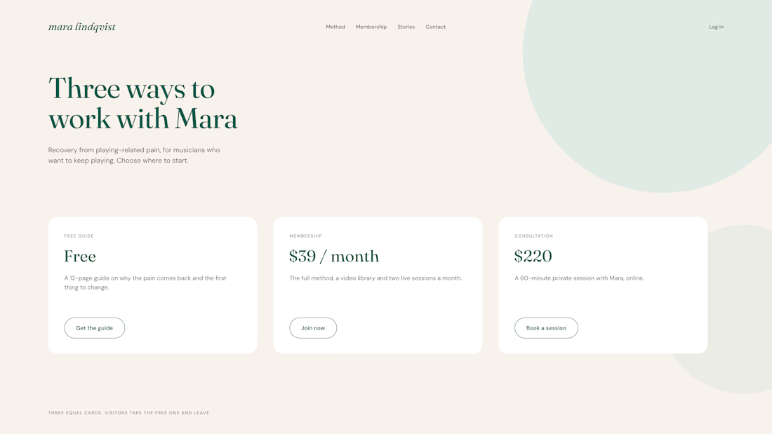
One of our clients had three offers on the same page: a free guide, a paid membership, and a private consultation.
All three looked equally important. Guess what? Visitors downloaded the free guide and left.
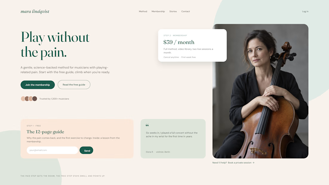
So we changed the layout:
Keep the free offer simple. A small card with a clear description and one email field.
Make the paid offer stand out. More space, a clear price, and a strong CTA.
Connect free to paid. Show how the free guide is just a first step toward the membership.
The goal isn't to remove free content. It's to make sure it leads somewhere.
Free content should open the door, not replace what's inside.
Do you offer free resources on your sales pages?

Three offers with equal weight on one page is such a common trap. Making the free guide a step toward the paid offer instead of a competitor for attention makes a lot of sense.