The network for creativity
Join 1.25M professional creatives like you
Connect with clients, get discovered, and run your business 100% commission-free
Creatives on Contra have earned over $150M and we are just getting started
Back to feedPost
Pretty PDPs get compliments. Clear PDPs get customers.
This Olipop redesign wasn’t about adding more design.
It was about making the buying decision easier.
I strengthened the hero section, made the value proposition clearer, surfaced key product benefits, added stronger social proof, improved the offer presentation and made the purchase options easier to scan.
Every section has a job:
Capture attention → build confidence → remove objections → create buying momentum.
That’s how I approach Shopify PDP design.
#Ecommerce #Shopify #DTC


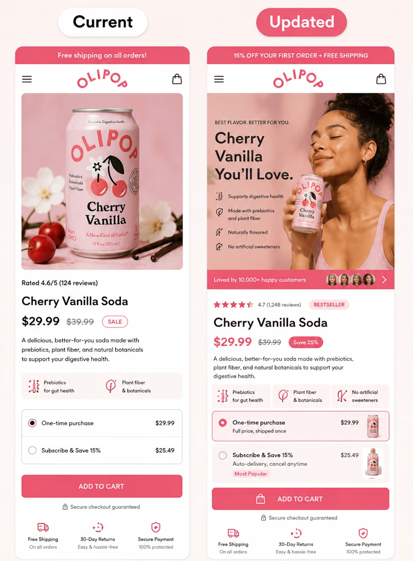

Defaulting to the subscribe option with a "Most Popular" badge instead of leaving both choices neutral is the real conversion move here — the hero and social proof get people to the fold, but that price-tier framing is what actually shifts the click.

That makes sense. I appreciate the feedback. I agree that making the subscribe option the default choice with a “Most Popular” badge will create a clearer decision path and make the pricing section more conversion-focused.
Thanks for engaging
The network for creativity
Join 1.25M professional creatives like you
Connect with clients, get discovered, and run your business 100% commission-free
Creatives on Contra have earned over $150M and we are just getting started



Related posts


🫡


I don’t get how web designers complain about spending hours on one hero section.
I’ll easily go through 10+ iterations before I even know which directions are worth showing the client
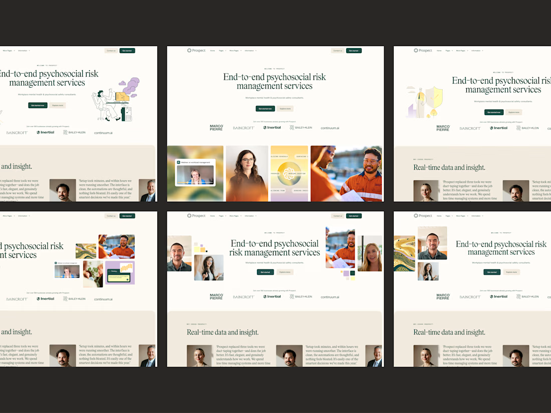

10+ iterations before the client sees anything is the unglamorous secret behind every calm site like this. A psychosocial risk brand has to feel trustworthy without going cold, and this nails that balance. The restraint is doing the heavy lifting.

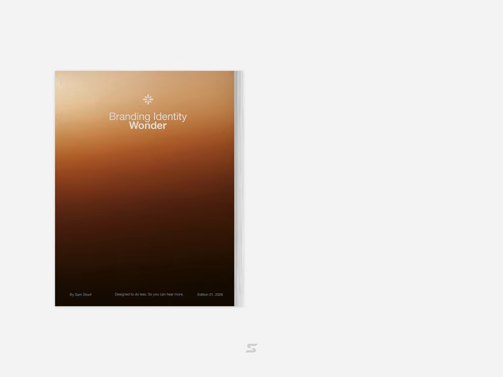
Brand Identity delivered by paper.



Love it🙌


