The network for creativity
Join 1.25M professional creatives like you
Connect with clients, get discovered, and run your business 100% commission-free
Creatives on Contra have earned over $150M and we are just getting started
Back to feedPost
Exploring the intersection of mental well-being and modern design. This interface focuses on "micro-moments" of calm, guiding users from stress to serenity through soft gradients, rounded typography, and gentle interactions.

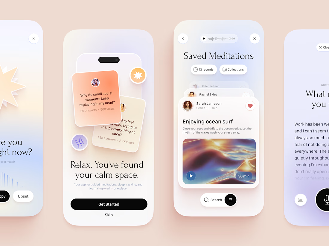


the soft peach cards look calm and nice


The gradient shift from warm peach to soft lavender across those screens does a lot of the emotional work without needing much copy. Did that color transition come out of user testing, or was it more of a design instinct that just stuck?

Thanks for the question! I decided on those colors intuitively.

It feels too good

The design looks awesome. Great project!

Eye catching Art 🙌


soft gradients suit this really well
Yeah, that's the point of a Wellness App such as this.

Love the gradientsss


Amazing😍

well done...🔥
The network for creativity
Join 1.25M professional creatives like you
Connect with clients, get discovered, and run your business 100% commission-free
Creatives on Contra have earned over $150M and we are just getting started





Related posts

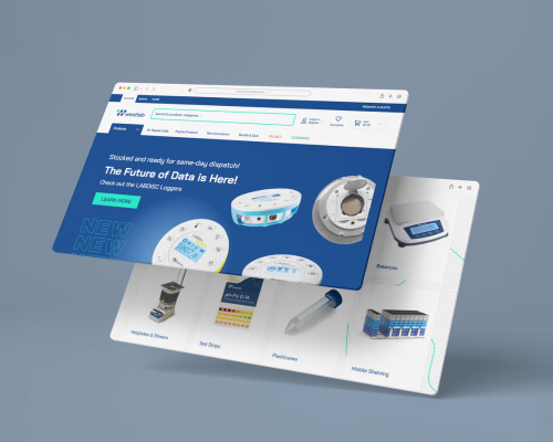
Medical E-commerce Website Design | UI/UX
A clean and modern e-commerce website concept for a medical technology brand, designed to make product discovery simple while presenting complex products in a clear and approachable way. The design combines a structured layout, strong product imagery, clear navigation, and responsive screens to create a professional shopping experience.


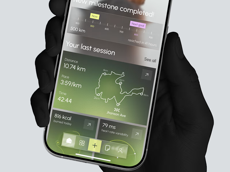
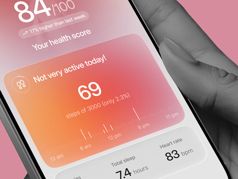
Designed two directions for a health tracking app
Same data, but two very different feelings
One is dark and focused, built for athletes. The other is warm and friendly, built for everyday people
What do you think?
Which one would you open every day, A or B?
21 voted
39%
33 voted
61%
54 votes
Closed

Option 1 gave me a very fin-tech feel and option 2 feels like my health is in danger, sorry 😂

Paws & Pour: 3D Interactive Booking for Experiential Cafés 🐾
Business Name: Paws & Pour Cat Café
Location: Kemang, South Jakarta
Archetype: Appointment-based Experiential Café
Realistic Problems:
The solo owner is drowning in WhatsApp DMs and playing "table tetris" every single day. Customers don't just want any table; they want to sit near specific resident cats (like Mochi or Pepper). Additionally, due to high demand, the café strictly caps visits at 30, 60, or 90-minute sessions. This causes endless back-and-forth messaging, manual double-booking errors, and frustrated walk-ins.
I transformed a chaotic, manual DM-based reservation process into a self-serve, mobile-optimized 3D map, allowing guests to independently secure their exact table, time slot, and preferred cat companion instantly.
Fixing the Front Door :
To turn an inbound inquiry into a confirmed booking with zero effort from the owner, I completely redesigned the customer-facing booking flow. Instead of a boring, standard form, I built an immersive 3D seating map where customers can:
- Pick Their Vibe: Visually explore the café layout and select a specific cozy corner. See where their favorite resident cats are currently hanging out on the map.
- Lock in the Rules: Select precise session lengths (30, 60, or 90 minutes) during the booking process, automatically setting expectations.
- Book Anywhere: Experience a flawless, fully mobile-optimized booking journey directly from their phone.
The Impact:
The owner’s manual work goes from hours of coordinating schedules, answering DMs, and managing table assignments to zero. The real-time admin portal automatically handles availability, updates the seating chart, and tracks guest sessions. The owner can finally focus on running the café and taking care of the cats instead of staring at a screen.
Lovable Public Link: https://paws-and-pour-cafe.lovable.app/
Social Post: Check on twitter!
#lovable #catcafe #cat #webdesign


3D interaction while booking looks great!