The network for creativity
Join 1.25M professional creatives like you
Connect with clients, get discovered, and run your business 100% commission-free
Creatives on Contra have earned over $150M and we are just getting started
Back to feedPost

🎨 NOCTURNE — Design Taste Test | Cyberpunk vs. Minimalist
Two visual directions. One creative concept. Which style makes the stronger impact?
⚡ Version A: Cyberpunk — Futuristic visuals, bold contrasts, and an energetic digital atmosphere.
◼️ Version B: Minimalist — Clean composition, refined typography, and a focused visual identity.
This taste test explores how different design styles influence perception, mood, and visual appeal. Your feedback will help determine which direction communicates the concept most effectively.
Which version wins your vote — A or B? Drop your choice in the comments and share what made it stand out!
The network for creativity
Join 1.25M professional creatives like you
Connect with clients, get discovered, and run your business 100% commission-free
Creatives on Contra have earned over $150M and we are just getting started



Related posts

AI isn't the designer. It's the tool.
You're the designer. The art director.
It can't design without your direction.

yes, we are like a boss to AI. its all upto us how we get done our work from subordinate.

I explored two directions for a thumbnail designer’s portfolio and can’t decide.
A: loud, editorial, poster-like
B: quieter, cinematic, built around a photographer’s contact sheet
Which one is more memorable, and which has the better first screen? Honest feedback welcome. Concept project, placeholder content.


5 voted
63%
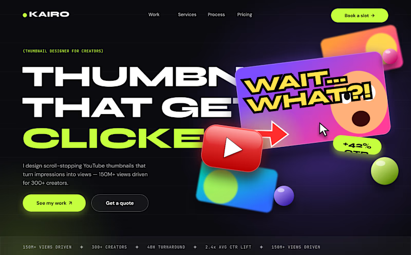
3 voted
37%
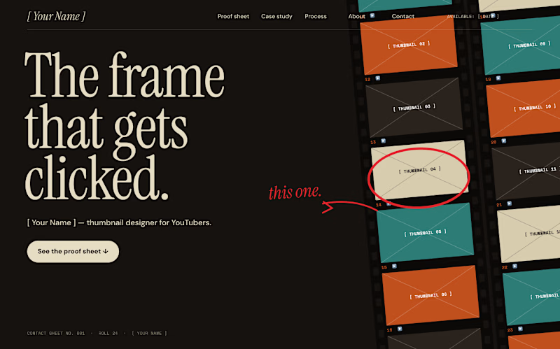
8 votes
Closed

Voted v2. The contact sheet idea feels specific to a thumbnail designer, while v1 is louder but more generic.

A perfume visual built around golden-hour light.
ÉCLAT is a self-initiated key visual for the NeuroDNA portfolio, created with ChatGPT. A glass bottle, sunset reflections and flowing fabric set the mood in a coastal setting.
Shown here as a static advertising concept.
For a fragrance launch, would you keep this scenic setting or choose a simple studio background — and why?

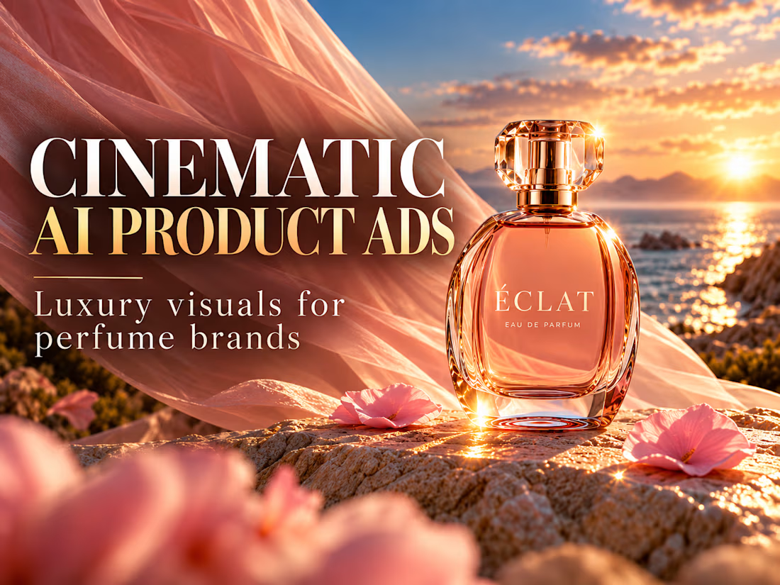
I’d keep the scenic setting! The golden-hour light and coastal atmosphere give the fragrance a warm, luxurious feel.