The network for creativity
Join 1.25M professional creatives like you
Connect with clients, get discovered, and run your business 100% commission-free
Creatives on Contra have earned over $150M and we are just getting started
Back to feedPost

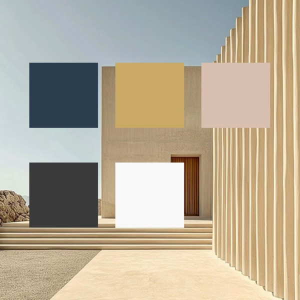
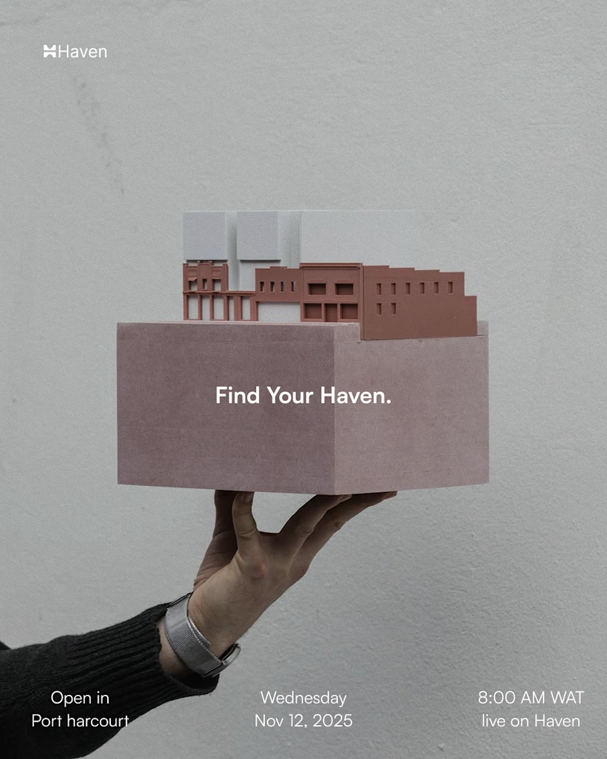
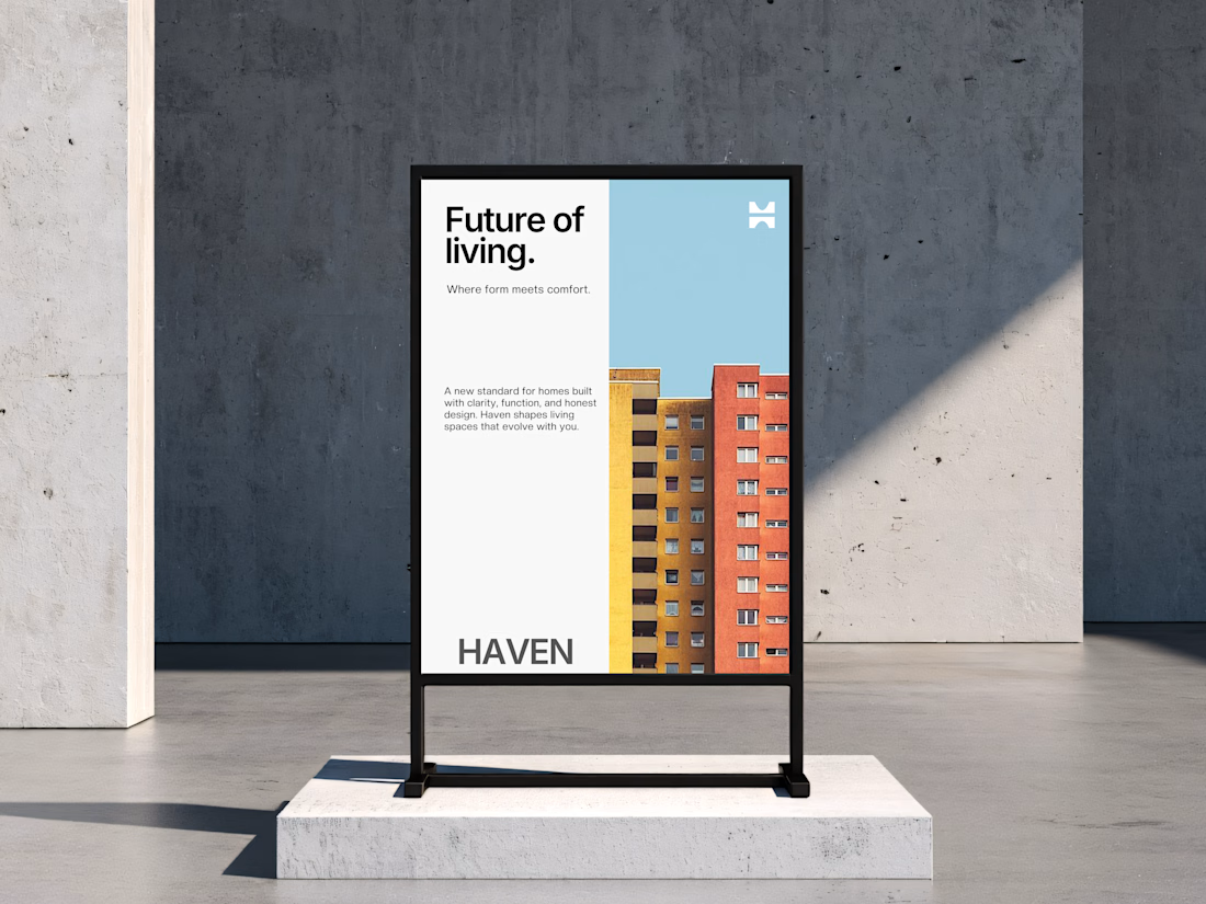
HavenRise—Real Estate Brand. Link to full project here https://www.behance.net/gallery/238809495/HavenRise-Properties-Creative-Design-Exploration


The network for creativity
Join 1.25M professional creatives like you
Connect with clients, get discovered, and run your business 100% commission-free
Creatives on Contra have earned over $150M and we are just getting started



Related posts

People don’t just want a banking app. They want to feel in control of their money.
Great fintech design doesn’t just look premium. It makes money feel simpler, safer, and easier to control.
Meet Ziko, a mobile banking concept where every interaction is designed to reduce friction and build trust.
What wins your trust first: 🔒 Security, ✨ Simplicity, or ⚡ Speed?

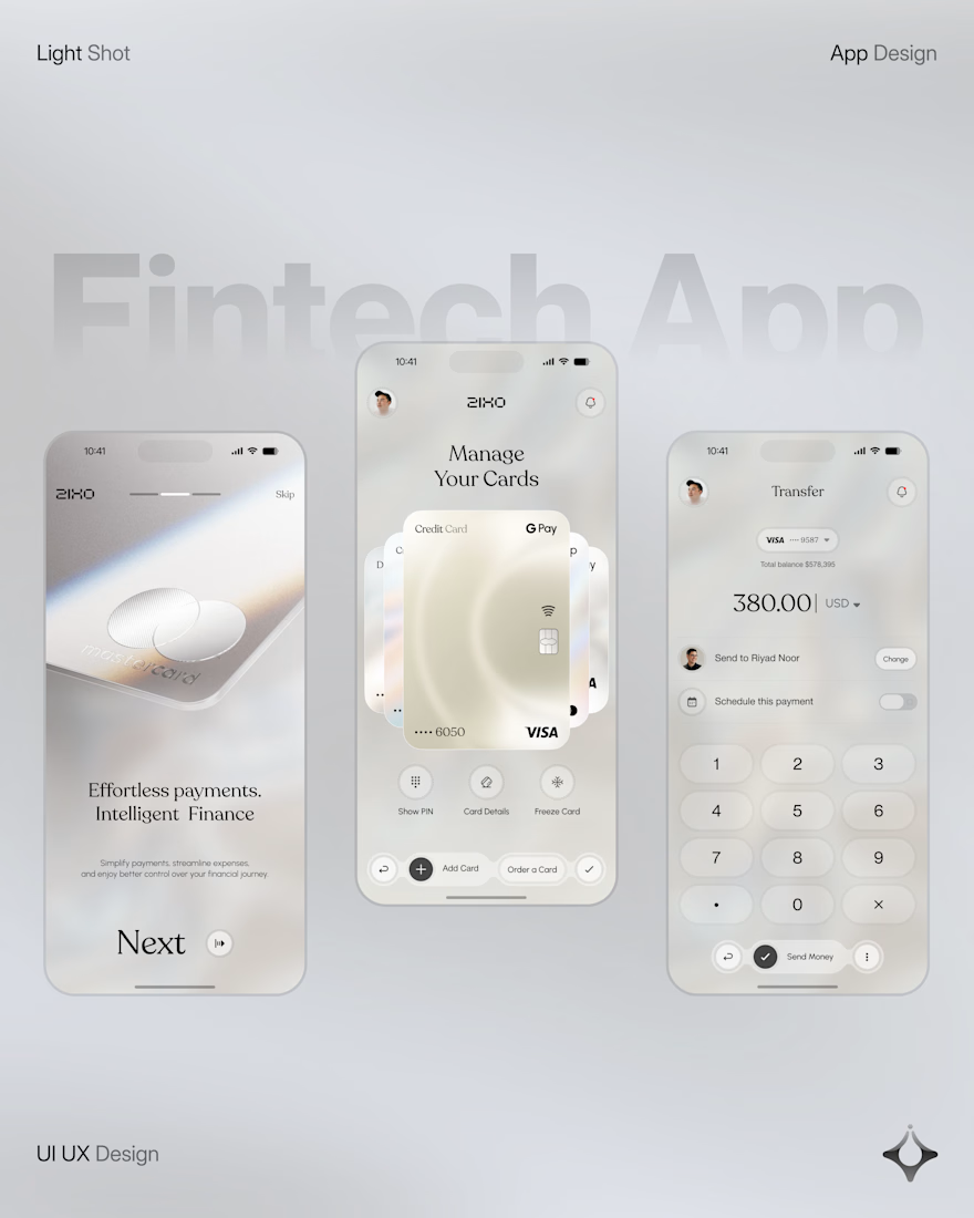
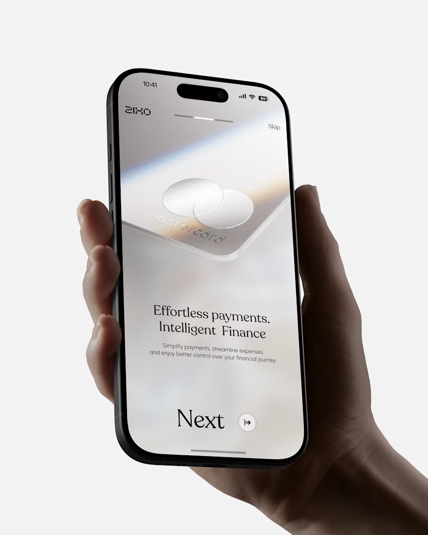
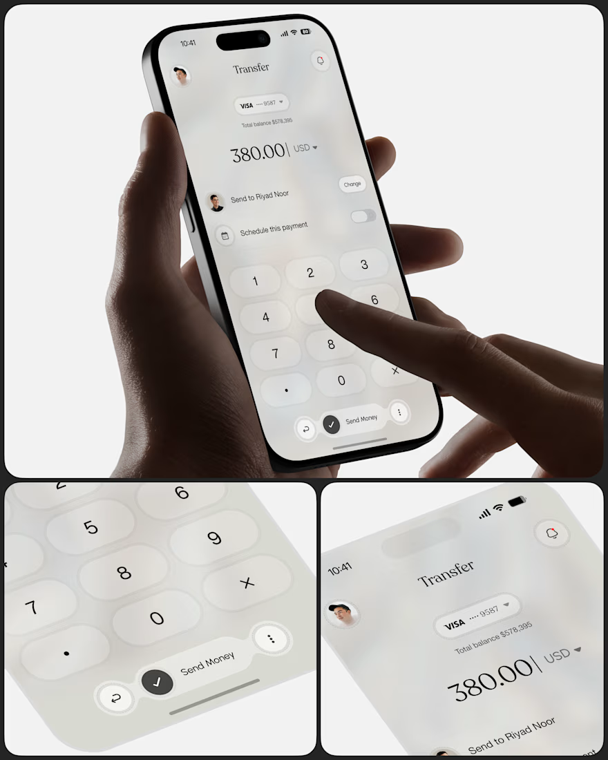
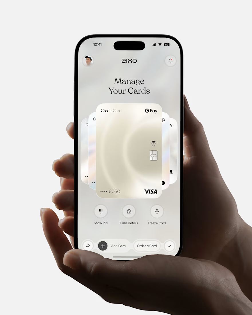

Absolutely love this Fintech App design! The minimal soft 3D elements with the clean UI is such a premium combo — feels very Apple-like and trustworthy. The interaction "designed to reduce" cognitive load really shows in the execution. Super polished work, that "Effortless payments. Intelligent Finance." screen is my fav!

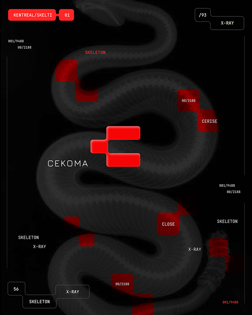
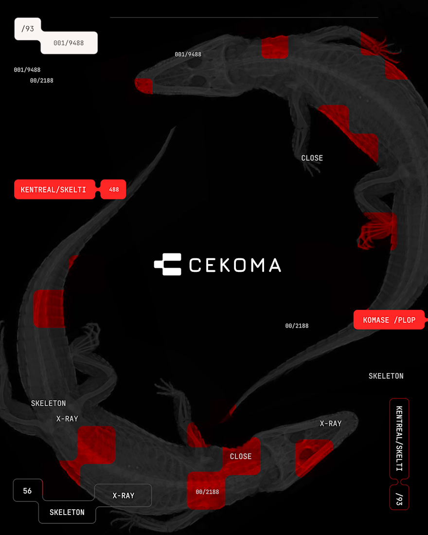
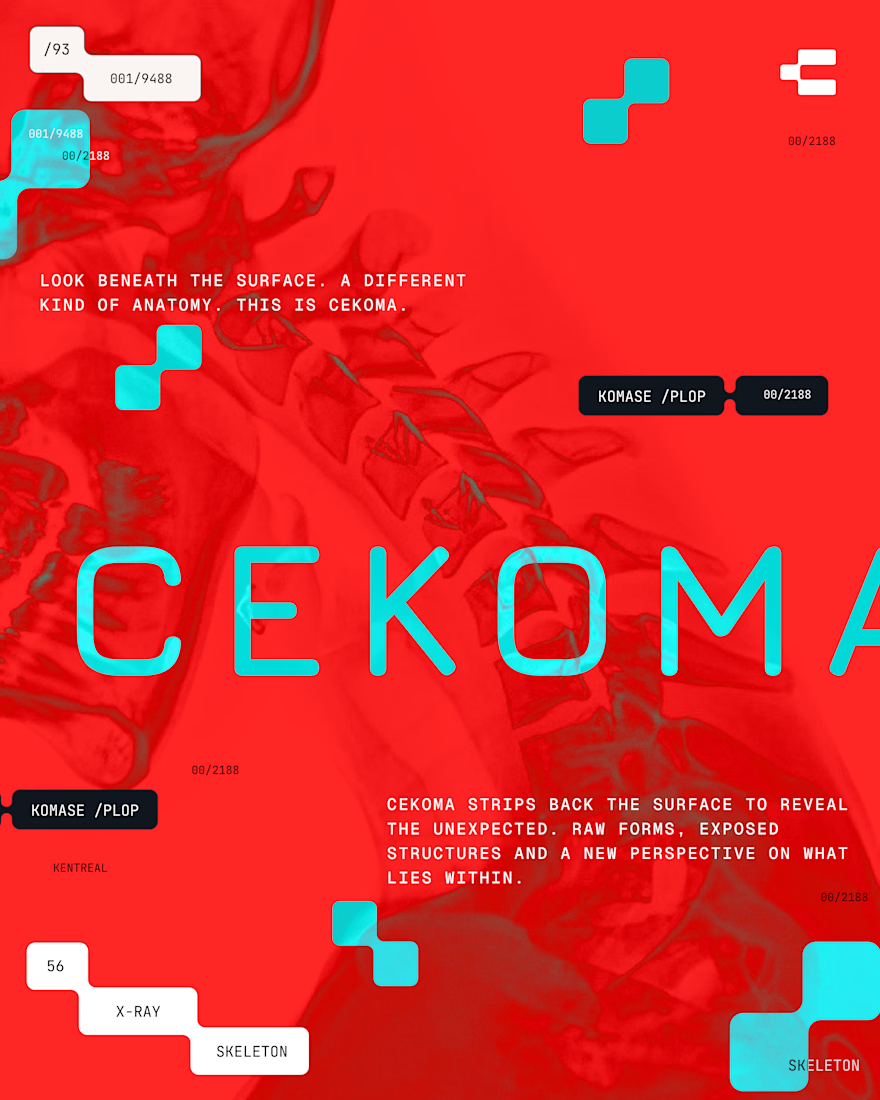
CEKOMA — Brand Identity & Visual Exploration
A bold visual identity built around abstract forms, striking red accents, and experimental typography. The system balances raw textures with a minimal, high-contrast aesthetic to create a distinctive and cohesive brand experience across application


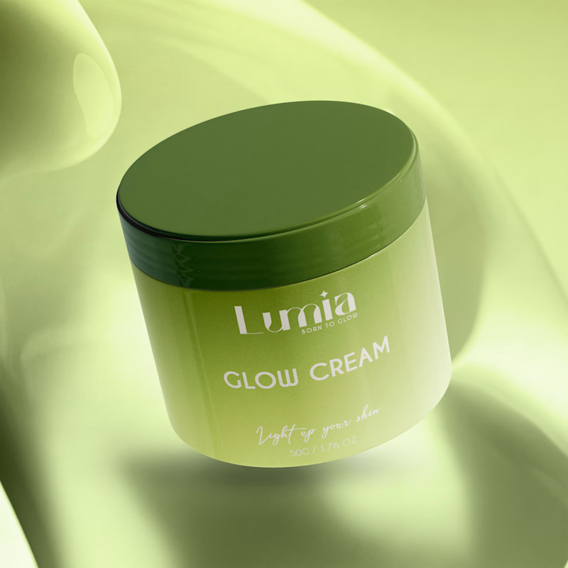
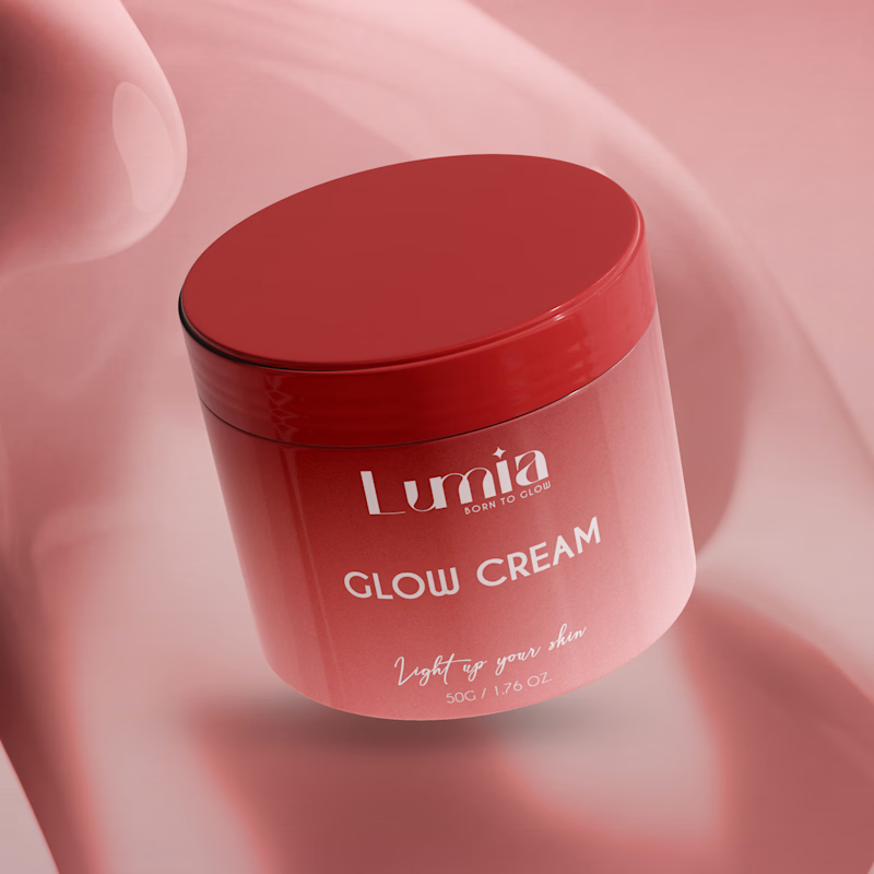
Which packaging color catches your eye first?
6 voted
46%
7 voted
54%
13 votes
Closed

The green version catches my eye first: the dark olive lid gives the lighter jar a clear focal point. I would also test the small white label text at thumbnail size, since the soft lighting reduces its contrast in both versions.