The network for creativity
Join 1.25M professional creatives like you
Connect with clients, get discovered, and run your business 100% commission-free
Creatives on Contra have earned over $150M and we are just getting started
Back to feedPost

Check out this project and let me know what you think; I created it in less than a day, and I'm already working on new projects in Lovable!
The network for creativity
Join 1.25M professional creatives like you
Connect with clients, get discovered, and run your business 100% commission-free
Creatives on Contra have earned over $150M and we are just getting started



Related posts

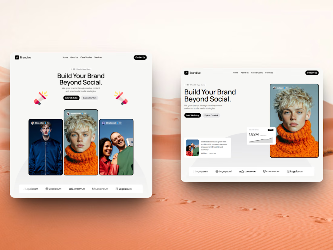

I'd pick the right one. The headline and image split is cleaner and the stats card gives proof right away, the left feels busier with three portraits. Is this template for Webflow?

Had a little idea for presenting content differently. Something about the contrast between crumpled paper textures and polished metallic elements felt worth exploring. Ended up really liking how this came together.
What do you think of this direction?