The network for creativity
Join 1.25M professional creatives like you
Connect with clients, get discovered, and run your business 100% commission-free
Creatives on Contra have earned over $150M and we are just getting started
Back to feedPost

The Last Samurai
When a medieval samurai finds himself in modern-day Japan, he's immediately confronted by unknown adversaries who may know of his origins.
This was made in CapCut Video Studio using Seedance 2.5. To achieve character consistency and style for this, I used a character design sheet with additional details on the samurai (Ronin), his outfit, and the city, and, using those parameters, Seedance brought the idea to life!
The network for creativity
Join 1.25M professional creatives like you
Connect with clients, get discovered, and run your business 100% commission-free
Creatives on Contra have earned over $150M and we are just getting started





Related posts

🇯🇵 日本のスタートアップの皆さんへ
AI機能をスピーディーに形にします。
・RAG/社内ナレッジ検索
・既存プロダクトへのLLM組み込み(OpenAI / Claude / Gemini)
・AIエージェント・業務自動化(Slack / Jira / メール連携)
・MVP開発(Next.js / Node.js / Python)
タスクごとに時間でお見積もりし、初回デモは約3営業日。
「このAI機能、どれくらいで作れる?」という段階でも、タスク分解と見積もりを無料でお送りします。
日本語でお気軽にメッセージください。
🌏 For startups in Japan (and beyond)
We build AI features fast: RAG, LLM integrations, AI agents and MVPs.
Every task is estimated in hours up front, and you get a working demo in about 3 business days.
Send me your idea and I'll reply with a free task-and-hours breakdown. Japanese or English is fine.

The three day demo promise stands out; packing a RAG setup and LLM hooks into that window must involve tight task slicing.

The Last Banner: Complete page
Japanese Cinematic gaming site concept


Nice design🥰

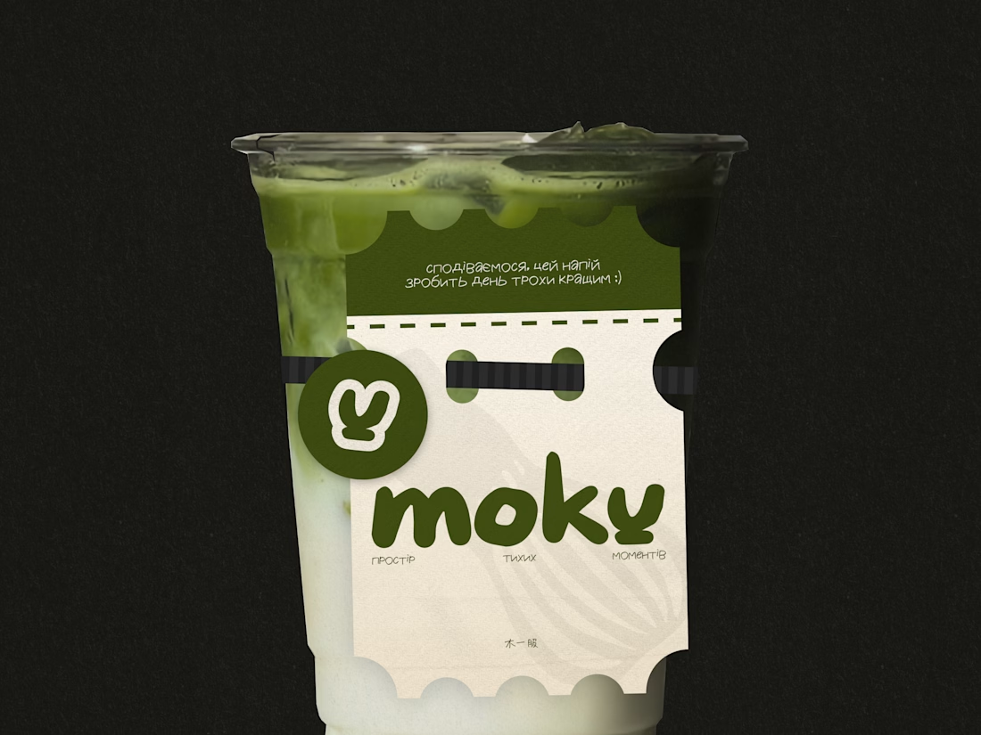
MOKU — Matcha Café Brand Identity
MOKU is a conceptual matcha café in Kyiv, created around a dark, atmospheric interpretation of Japanese-inspired aesthetics.
The identity was designed to move away from the light, pastel, and overly playful visual language often associated with matcha cafés. Instead, MOKU combines deep, muted tones with Japanese-inspired visual references to create a more sophisticated, atmospheric, and distinctive character.
The branding explores a balance between traditional Japanese aesthetics and a contemporary café experience. The visual system includes the logo, typography, color palette, graphic elements, and supporting applications, creating a cohesive identity across the café environment and brand materials.
The result is a dark and refined visual identity that feels calm, modern, and rooted in Japanese-inspired culture while still being approachable for a contemporary Kyiv audience.