The network for creativity
Join 1.25M professional creatives like you
Connect with clients, get discovered, and run your business 100% commission-free
Creatives on Contra have earned over $150M and we are just getting started
Back to feedPost

Lanwell Behavioral Health just left this review and it made my whole week 🩷
Something I changed about my process that made a real difference: moodboards before design.
I used to go straight into design and figure things out as I built. It usually worked out, but there was always some rework at the end because what I made didn't quite match what the client pictured.
Now I start with a mood board instead. Colors, type, references. Enough for the client to react to before we're deep into actual pages and layouts. By the time I start designing, we already agree on the direction.
Small change, big difference. Worth trying if you've never done it 🙇🏽♀️🤍
RECOMMENDED
“Florencia was amazing! She brought my vision to life and made the process seamless. She was patient, attentive, and always delivered ahead of deadlines. I especially loved starting with mood boards to capture my brand’s aesthetic.”


Shanique Lankford
Lanwell Behavioral HealthThe network for creativity
Join 1.25M professional creatives like you
Connect with clients, get discovered, and run your business 100% commission-free
Creatives on Contra have earned over $150M and we are just getting started

Related posts


100+ people already use my free skill file to stop their AI from making the same 25 design mistakes.
Drop it into your project and your agent gets better at typography, spacing, color, and dark mode. Link in the comments.



Created this masterpiece ❤️
The goal was to create a design that communicates and solve the clients problem.


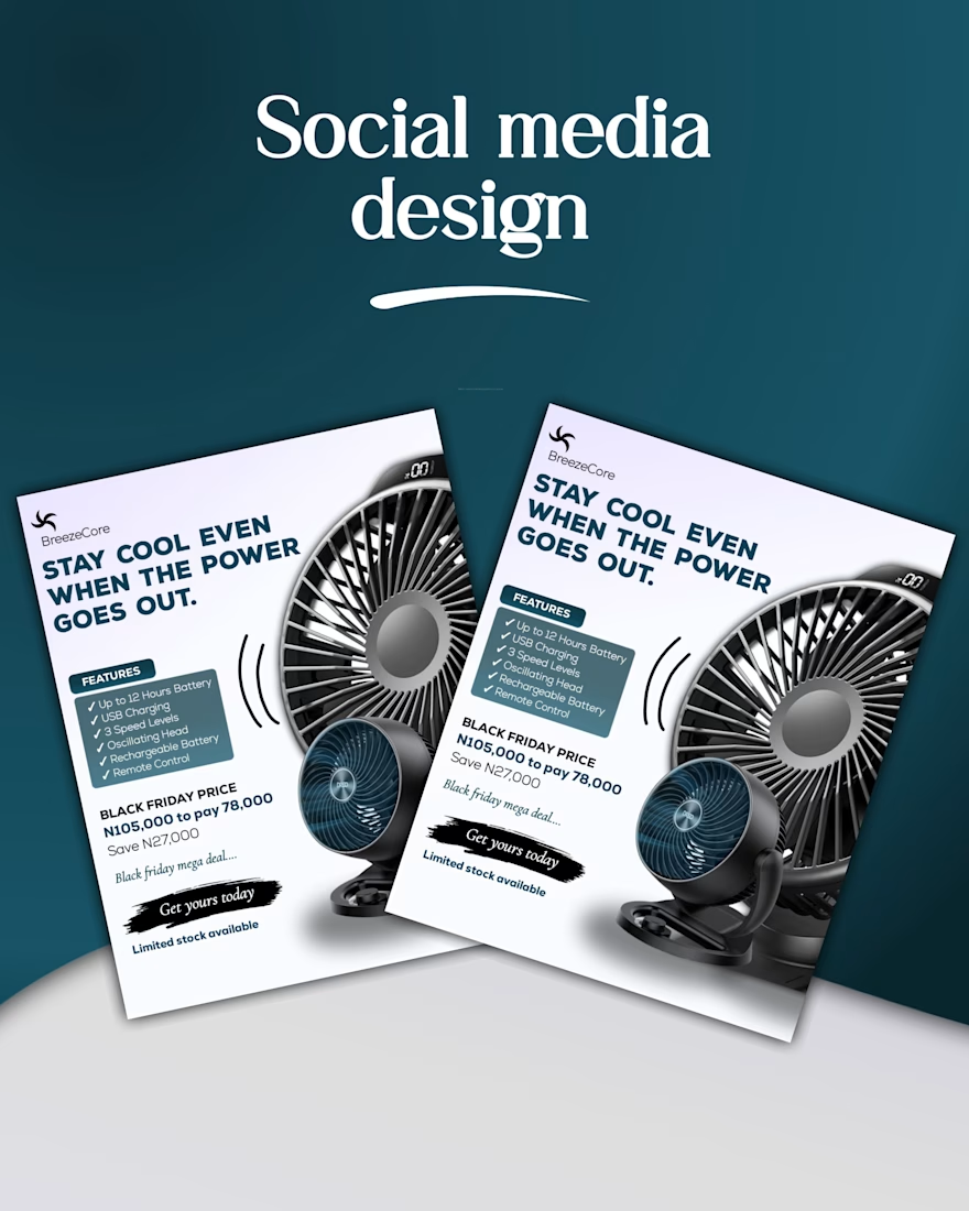
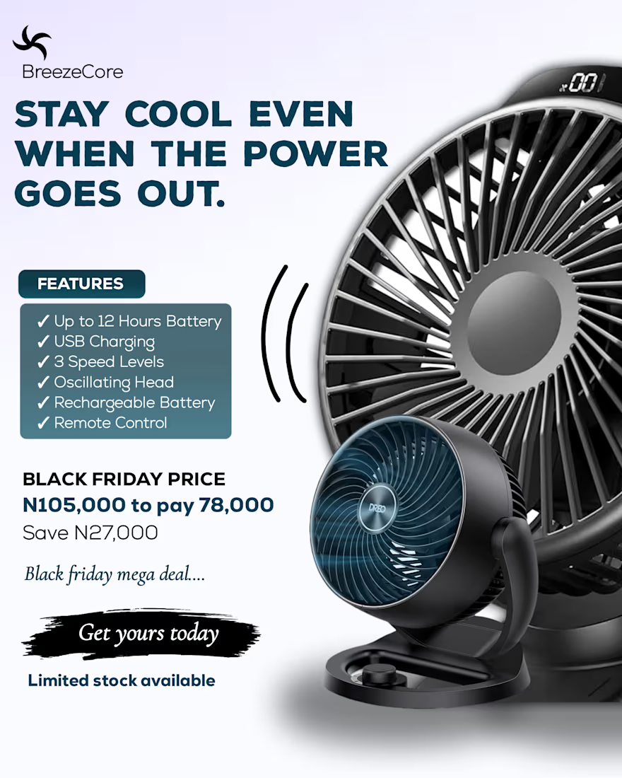
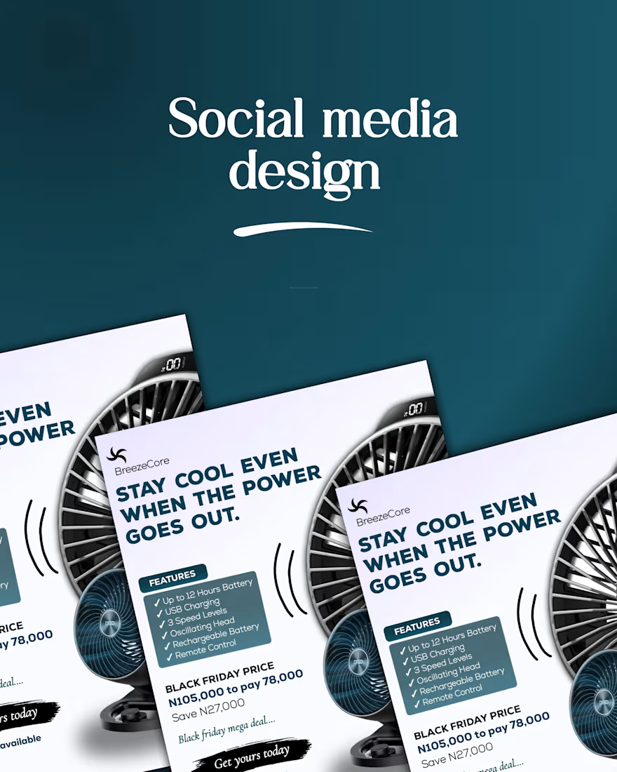

Not every design needs to sit still.
A little depth. A little movement. A whole new experience.
Exploring 3D motion and interactive UI concepts through Say It in Daylight, a mental wellness concept built around connection, reflection, and self-expression.
Your next idea could look this good in motion.
Available for creative projects and collaborations.
#3DMotion #MotionGraphics #DigitalDesign #Contra





