The network for creativity
Join 1.25M professional creatives like you
Connect with clients, get discovered, and run your business 100% commission-free
Creatives on Contra have earned over $150M and we are just getting started
Back to feedPost

The biggest conversion killer on a product page usually isn’t the price.
It’s the 10 seconds before a shopper decides whether they trust you enough to keep reading.
Every scroll should answer a question before it creates a new one. If visitors have to hunt for proof, benefits, pricing, or reassurance, your paid traffic starts leaking before they even reach the CTA.
That thinking shaped this skincare PDP I built in Replo for Shopify. The goal wasn’t to make it look premium it was to reduce hesitation with stronger information hierarchy, visible proof, objection handling, and a buying path that feels effortless.
Founders spend thousands improving ads. Sometimes the bigger win is making each click worth more.
What’s the first thing you look for when auditing a product page: trust, clarity, or friction?


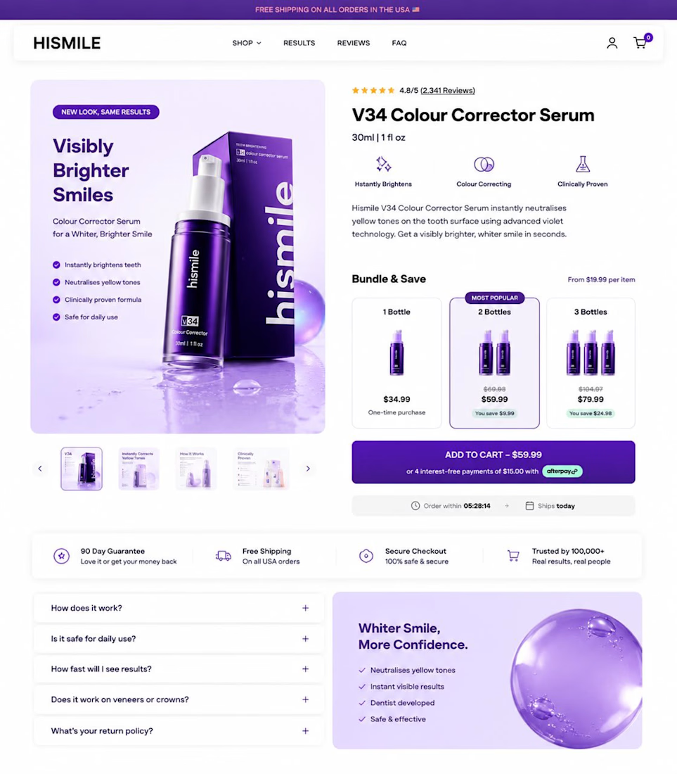

Trust and clarity usually come before price. If visitors can't quickly understand the product's value or find the information they're looking for, they're unlikely to stay long enough to consider buying.
The network for creativity
Join 1.25M professional creatives like you
Connect with clients, get discovered, and run your business 100% commission-free
Creatives on Contra have earned over $150M and we are just getting started
Related posts

As a Squarespace designer I am SO excited for the Finish Layer tools they just dropped. I already loved Squarespace for the easy drag and drop interface, but this adds a whole new level to my work.
Which of the tools are you the most excited to try?


Those tools makes the work more fun and clean

🔥Designed two editorial story concepts where typography becomes the visual, not just sits on top of it.
Same design system. Same vertical letter logic. Same decorative text grid. Two moods, fire and warmth.🍂
Which one stops your thumb? 👇
13 voted
50%
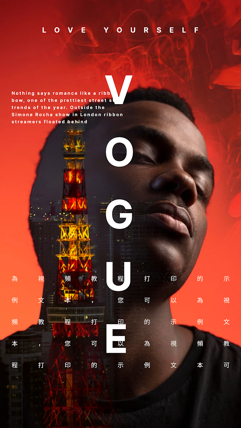
13 voted
50%
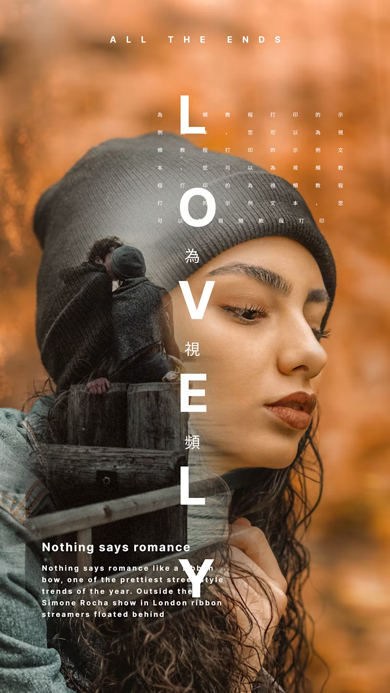
26 votes
Closed

Vogue / Love Yourself stops my thumb. 🍂. That's the one I'd stop scrolling for.

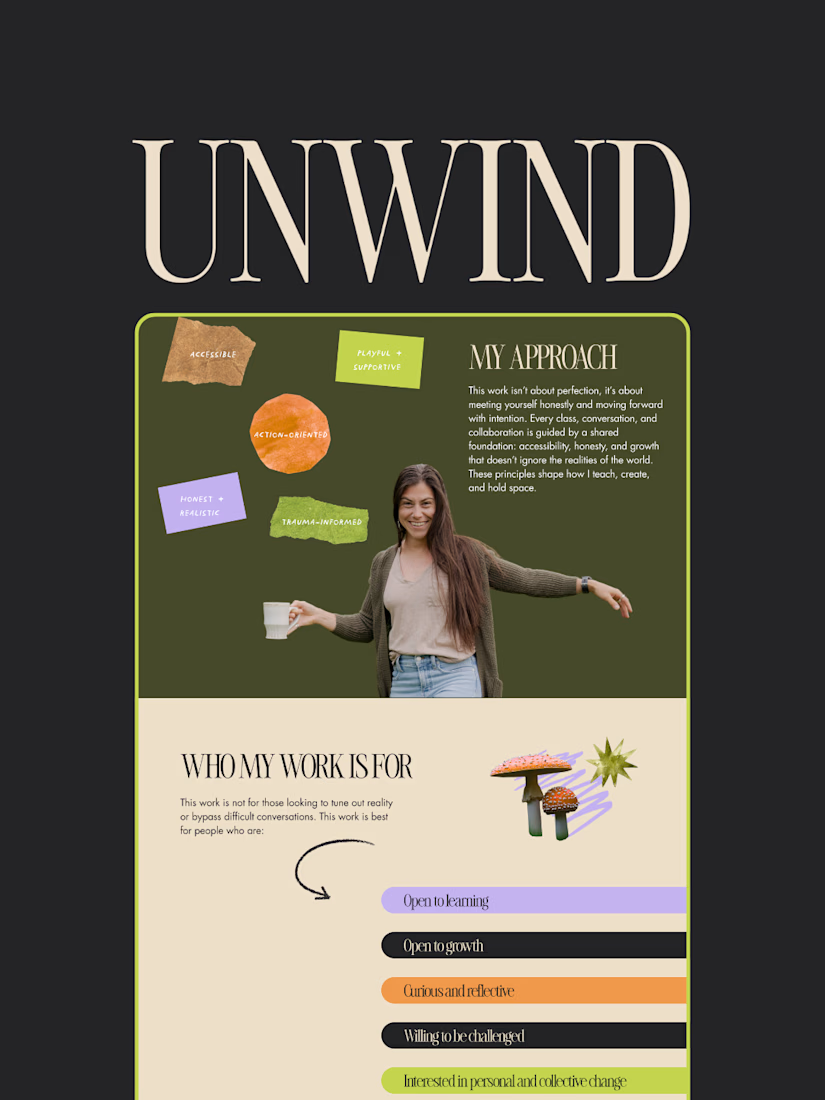
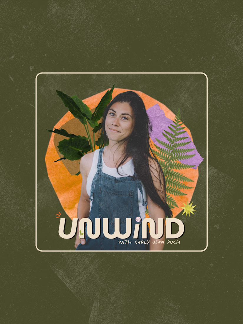
My creative studio, DoGoodBiz, recently completed this rebrand + website design project for Carly Puch, UNWIND Movement & Media 🚀
Project: Brand identity + website design
Site: unwindmovementmedia.com
Carly Puch teaches accessible yoga, hosts a podcast and zine club, and writes about climate, culture, and collective liberation from Northern Minnesota. Her work sits at the intersection of movement and media, where rest and resistance are held together.
"Working with Natalie is like working with your bestie that's a super talented graphic designer. She was approachable and professional."
The finished site carries UNWIND's full range: yoga and mindfulness classes in Northern Minnesota, a podcast and zine club, and writing that moves between rest and resistance without flattening either one. Carly is most excited about the overall feel of the site, and specifically the Work With Me page.
Since launch, the shift has shown up in more than the site itself:
"Greater confidence in sharing not only my website but also what I do. Easier to explain and share my offerings. The business branding is now caught up to where I am. Before this project, I felt embarrassed by my website. After this project, I feel like sharing it with everyone."



Good job












Trending

Claude
Claude has entered the design space. How are you using Claude Design?

Contra University
Learn from expert creatives how to earn more using next-gen AI tools.
creativeaiflow
Creative AI workflows are evolving. What tools do you use, and what are their strengths and weaknesses?
freelancerlife
Freelancer life is wins, pivots, and everything in between. What’s yours right now?