The network for creativity
Join 1.25M professional creatives like you
Connect with clients, get discovered, and run your business 100% commission-free
Creatives on Contra have earned over $150M and we are just getting started
Back to feedPost
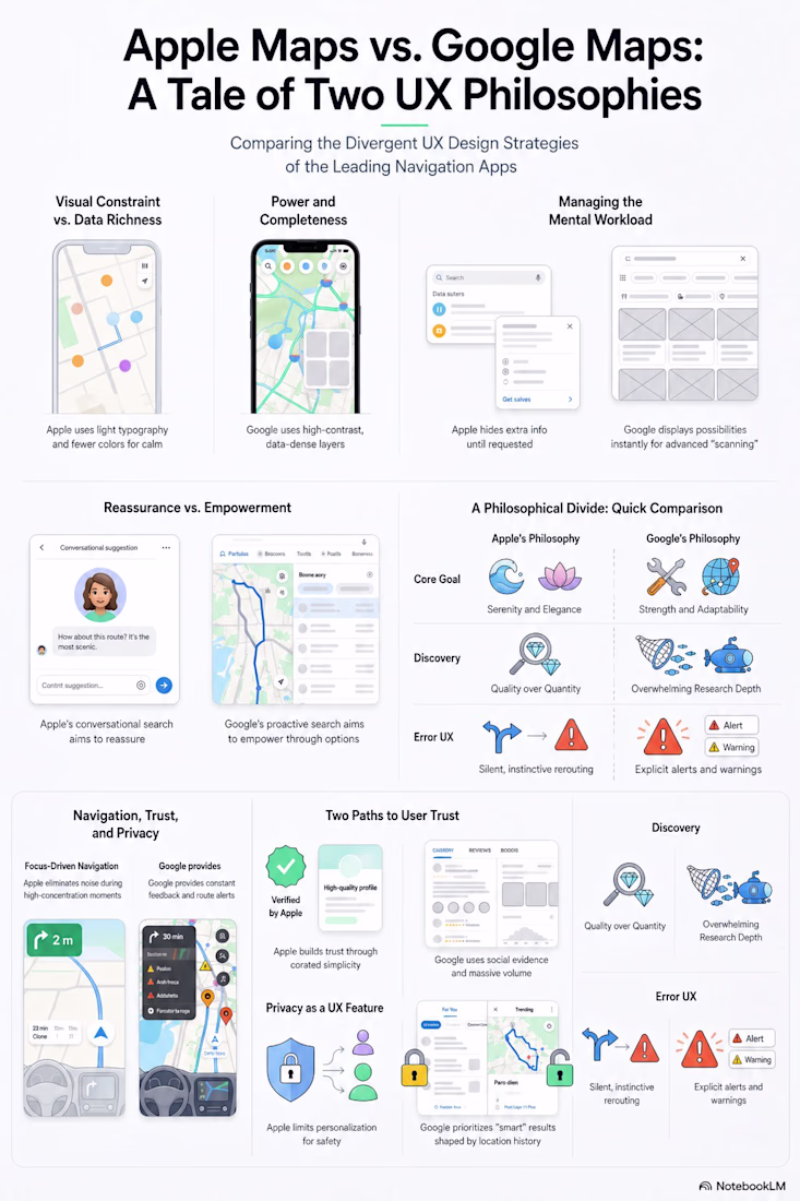
Apple Maps vs Google Maps
Two apps. Same goal.
Completely different UX philosophies.
I broke down Apple Maps vs Google Maps to understand something deeper
This isn’t about features.
It’s about how each product thinks.
Apple Maps:
Reduces noise
Hides complexity
Focuses on calm, guided navigation
UX goal: Reassurance
Google Maps:
Shows more data
Surfaces options instantly
Gives users control
UX goal: Empowerment
The interesting part?
Neither is better.
They’re solving different user mindsets.
When you're driving in a new city:
You want clarity → Apple wins
When you're exploring options:
You want control → Google wins
Big UX takeaway:
Good design isn’t about adding features.
It’s about choosing:
What to show
What to hide
And when
Design is not just interface.
It’s philosophy.
Which one do you prefer Apple or Google?
#UXDesign #UIUX #ProductDesign #UXStrategy #DesignThinking #UserExperience
The network for creativity
Join 1.25M professional creatives like you
Connect with clients, get discovered, and run your business 100% commission-free
Creatives on Contra have earned over $150M and we are just getting started
Related posts
I always give a client at least two options, whatever the task.
Each one packs in as many small tweaks as possible: color, size, count, or position of elements. So the client can either pick a finished version, or mix and match by telling me which element they like from each.
Example on an app icon below.
Which one do you prefer?
14 voted
70%
6 voted
30%
20 votes
Closed
02
Day 3 — Premium Improvements ✨
Spent today polishing the UI to make the experience feel cleaner, more premium, and more refined.
Would you rather use:
☀️ Light Mode
🌙 Dark Mode
Vote below 👇
12 voted
60%
8 voted
40%
20 votes
Closed
make it double in your web , the website will give choice people about it
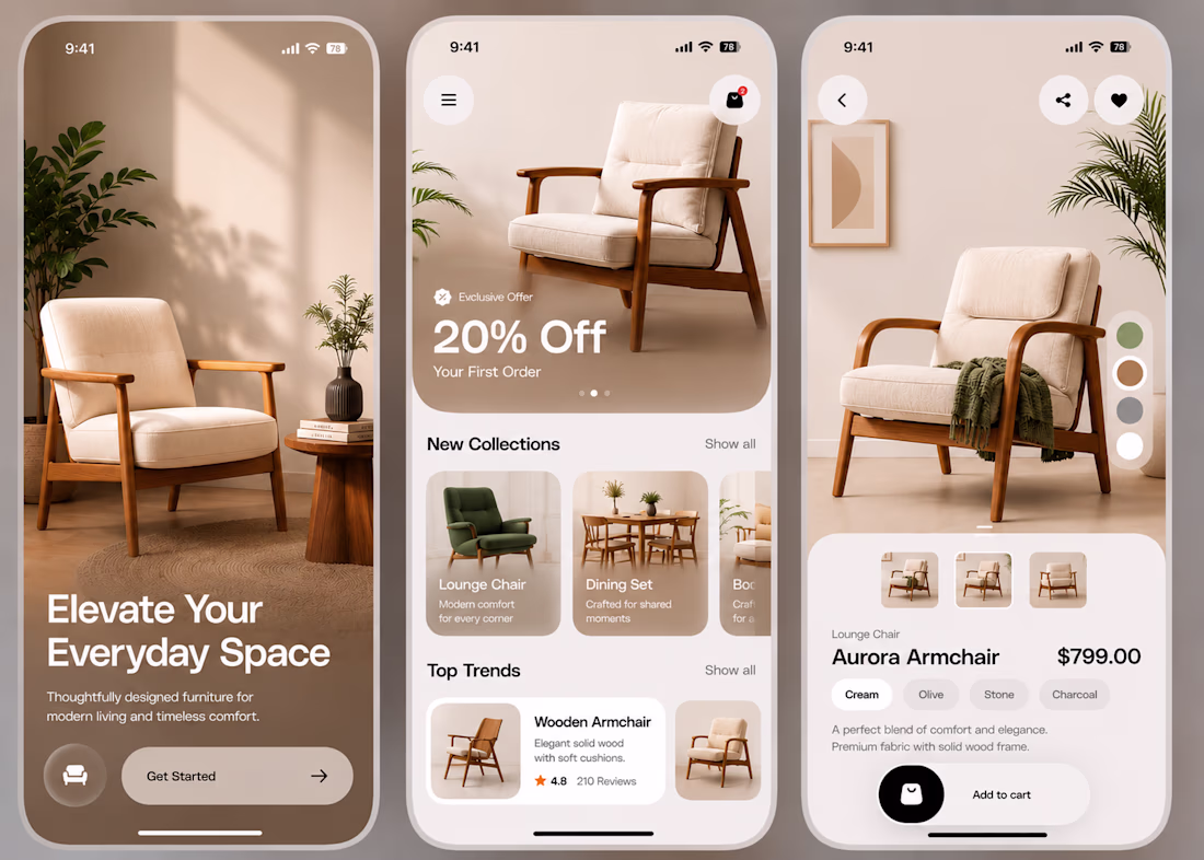
Working on a minimal furniture shopping app today.
A few things I focused on:
- Creating a clean and premium visual experience.
- Letting the product be the hero instead of the UI.
- Using soft, neutral colours to create a warm feel.
- Keeping the layouts simple and easy to scan.
- Designing a smooth flow from onboarding to product details.
- Paying attention to spacing, typography, and small details.
I believe good design isn't about adding more.
It's about making every element feel intentional.
I'd love to hear your thoughts.
Feedback is always appreciated.
Great hierarchal structure 👌✨️
Challenges
View allTrending
Claude
Claude has entered the design space. How are you using Claude Design?
Contra University
Learn from expert creatives how to earn more using next-gen AI tools.
fifaworldcup2026
The World Cup is here and the whole world's watching. How are you designing for the world stage?
creativeaiflow
Creative AI workflows are evolving. What tools do you use, and what are their strengths and weaknesses?
freelancerlife
Freelancer life is wins, pivots, and everything in between. What’s yours right now?