The network for creativity
Join 1.25M professional creatives like you
Connect with clients, get discovered, and run your business 100% commission-free
Creatives on Contra have earned over $150M and we are just getting started
Back to feedPost

Mukashi OS: I built the retro desktop OS I always wished existed
"Bring your dream product to life as a prototype in Flowstep. Chase the idea that excites you, or solve a problem you actually have. We want to see something only you would have made."
That line hit differently for me. Because what I built doesn't solve a problem for the general public. It doesn't have a market. There's no pitch deck behind it. It's just something I genuinely wanted to exist, and now it does.
The idea
Look around at any design showcase right now. Everything is clean. Minimal. Frosted glass. Soft gradients. Dark mode with a single accent color. The entire design world has converged on the same aesthetic and honestly? I'm a little tired of it.
I grew up with the Nokia 3310. That chunky, indestructible phone with the green LCD screen and the pixel font that looked like it was built from graph paper. There was something deeply satisfying about that UI. It didn't try to be beautiful. It just worked, and it had a personality that no amount of glassmorphism has ever matched.
So I asked myself: what if Nokia had made a desktop operating system? What would that look like?
That became Mukashi OS.
Mukashi is a Japanese word. It roughly translates to "once upon a time", the feeling of something from a long time ago, looked back on fondly. It felt like exactly the right name for an OS inspired by an era of computing that most people have forgotten.
The design
Everything in Mukashi speaks the same visual language. Nokia green (
#94B532) on near-black (
#0A0F00). Pixel bitmap monospace font, all caps, no exceptions. The home screen mimics the Nokia 3310 layout exactly OS name center stage like a network name, date below it, time in a dark angled strip at the bottom right, three soft keys at the bottom. GO TO. MENU. SETTINGS.
I built three themes into the OS: the default Nokia green, an amber phosphor variant (think old calculator LCDs and ATM machines from the 90s), and a Classic mode based on the Game Boy's grey-green palette. Switching themes changes every screen, every component colour.
The entire OS is keyboard-only. Arrow keys and WASD to navigate. Enter to select. Escape to go back. No mouse. No clicks. Just keys. It makes the whole thing feel like you're actually operating a device from 2003, not browsing a website.
How I built it
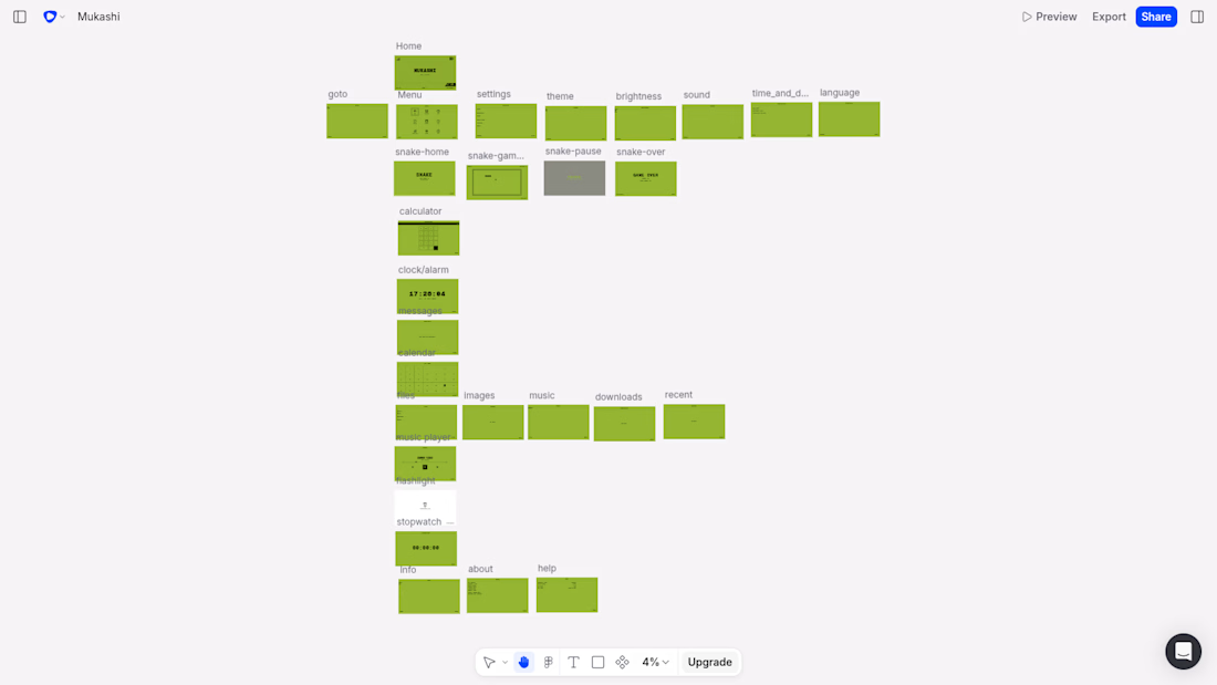
I used Flowstep AI to design the bulk of the screens and there are a lot of them. The home screen, the main menu with its 9-app icon grid, the GO TO shortcuts list, the full Settings hierarchy (theme, brightness, sound, time & date, language), the Info section, and individual app screens for: Calculator, Clock, Messages, Calendar, Files (with subfolders), Music Player, Flashlight, Stopwatch.
The Flowstep prompting process was genuinely iterative. Getting the right aesthetic took precision, I had to be explicit about colors, layout hierarchy, what NOT to include (no rounded corners, no shadows, no modern iconography), and crucially, what the Nokia home screen actually looks like versus what an AI assumes it looks like. The reference image approach, attaching a real Nokia screenshot alongside the prompt was the turning point that got the design system locked in properly.
For the Snake game screens specifically, I wired Flowstep's MCP server into Cursor and generated all four Snake screens (start, gameplay, pause overlay, game over) through the agent directly. That workflow describing the screens in natural language through an IDE and watching them appear on the Flowstep canvas was genuinely exciting to use. It's also what I captured for the video walkthrough.
Final iterations, font decisions, and the code export process were handled through Claude AI via its MCP connection, helping me get the component code clean and consistent across all screens before bringing everything into the actual build.
The final app is built in React + Vite + TypeScript + Tailwind and deployed on Vercel. The Snake game is fully playable with a working high score system. The Calculator actually computes. The Clock reads real system time. The Stopwatch runs. The Calendar shows the real date with today highlighted. The Music Player plays two actual songs — Summer Vibes by Sigmamusic Art and Back in 95 by Open Mind Audio, both from Pixabay.
Why it excites me
I said this doesn't solve a problem for the general public and that's true. But it solved something for me. I've spent years building things that are useful, practical, and forgettable. Mukashi is none of those things. It's a piece of design fiction, a product from an alternate timeline where Nokia pivoted to desktop software instead of getting swallowed by the smartphone era.
And now I can actually open it in a browser, navigate it with my keyboard, play Snake on it, and feel something that most modern software doesn't make me feel.
That feeling? That's what I built this for. Thanks to Flowstep for giving me the window to actually ship it.
Flowstep file: https://app.flowstep.ai/file?activeFileId=35ed57d3-37ae-477f-9c2b-5194734f6d56
prototype hosted link: https://mukashi-os.vercel.app/
best viewed in full-screen mode :)


The network for creativity
Join 1.25M professional creatives like you
Connect with clients, get discovered, and run your business 100% commission-free
Creatives on Contra have earned over $150M and we are just getting started






Related posts



Super clean work!

Two ways to redesign the same living room. Which editor would you use?
A · Material Studio
B · Spatial Workshop
Rotate the room, swap the sofa, try a finish and save your design. I built both in Flutter, and I’m sharing both versions and the 3D assets for free:
Roomform

7 voted
64%
4 voted
36%
11 votes
Closed

Material Studio. The light interface lets the room be the hero, while the dark one makes the controls compete with it. Really generous of you to share the 3D assets too. Thank you.

Ask a coding agent to "make the UI look premium", and you get whatever it felt like building that day.
I give mine constraints instead.
I keep a list of sites that generate design markdown files for AI builds. Typography, colours, spacing, radius, shadows, components, states, responsive behaviour. A full design system in a single file.
The workflow, before any screen gets built:
Pick a visual direction. Generate the .md against what the product actually does and the outcome it needs to hit. Drop it into Claude Code or Codex or Kimi or Cursor. Use /design to fix what stays consistent across every screen.
Now the agent follows a spec, not a mood.
That file, plus a folder of five or six visual references, is the first thing I prepare before a client build.
The sites:
https://www.typeui.sh/
https://design-md.hyperbrowser.ai/
https://neuform.ai/
https://www.aura.build/
https://www.designmd.supply/
https://open-design.ai/
https://designmd.me/
Enjoy. Build. Ship.
Cheers.

This is so true! 🔥 "Make it premium" is the most subjective prompt ever - every agent has its own version of premium haha! Giving constraints like typography, colors, spacing, radius, shadows, components, states is the real pro move. That's how you get consistent design...