The network for creativity
Join 1.25M professional creatives like you
Connect with clients, get discovered, and run your business 100% commission-free
Creatives on Contra have earned over $150M and we are just getting started
Back to feedPost
This Image Mosaic in the testimonial section of ClipsAI hits different ✨
It literally turns your social proof into a scroll-stopping trust engine.
Leading to more credibility, greater perceived value & higher conversions 💰


Thanks Ciro, I appreciate this !

Great Design
Thank you Rasel !!
The network for creativity
Join 1.25M professional creatives like you
Connect with clients, get discovered, and run your business 100% commission-free
Creatives on Contra have earned over $150M and we are just getting started











Related posts

A landing page should continue the conversation started by the ad.
For Corpus, a Pilates and physiotherapy studio, I designed campaign-specific entry points. Pilates, physiotherapy and RPG each needed a relevant starting point, while sharing one visual system.
The page keeps the brand’s warm, editorial character through typography, photography and movement. Clear service information and WhatsApp calls to action give that visual experience a practical next step.
My role covered art direction, responsive web design, interaction and AI-assisted front-end development.
This clip shows the general version. The responsive layouts follow the same visual language across desktop and mobile.
When designing campaign landing pages, do you start with one master page or with the individual ad journeys?

Separate entry points per campaign under one visual system is exactly the right instinct. The warm editorial character comes through even in the clip. I tend to start with the individual ad journeys, then build the system around what they have in common. Did the WhatsApp CTA drive noticeably more bookings than a standard form?

Two free builds, for freelancers or designers.
My Contra profile has no reviews yet, and I'd rather earn the first ones with real work. So I'll build your Figma design as a live site, or make you a portfolio site. One page, works on phone and desktop, live within 3 days of the day we start. The code is yours, and I'll hand it over so you can host it anywhere.
The first two that fit get one: one page, with the design or the content ready.
No strings attached. When it's live, I'll ask you both for an honest review on my profile, good or bad. Just say in the review that the build was free. You keep the site either way.
Comment with a link to your Figma file or your current site, or message me if it's private. It all happens in writing, here on Contra. No calls.
Got a Figma page that never made it online?

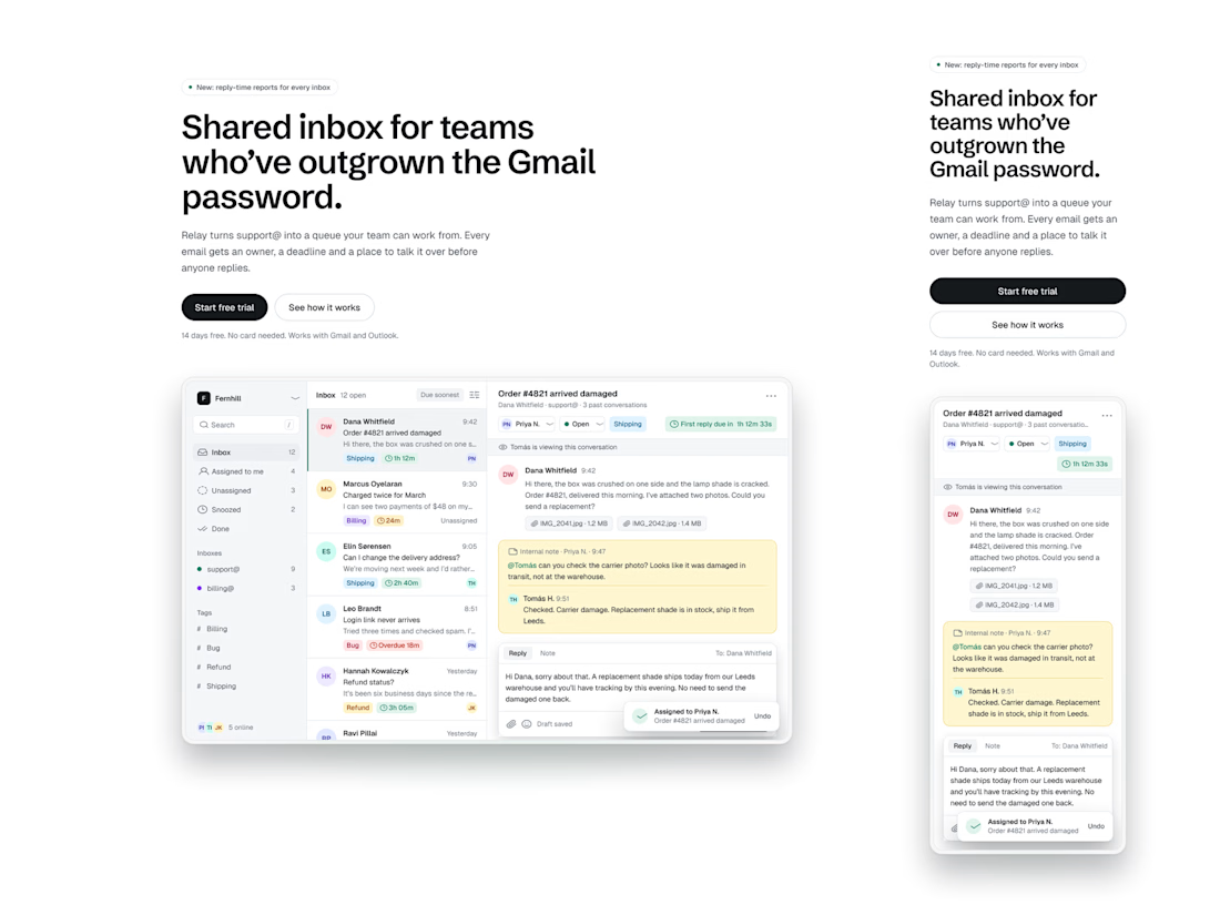
Respect for earning the first reviews with real work instead of buying them or begging friends. Asking for an honest review, good or bad, is the kind of confidence that tells people the build will be good. The SaaS marketing page and matching design system file are solid proof...

Watch the full scroll of Pathwright ↓
Framer Site Where Content Becomes Paths. Pathwright helps teachers and teams turn content, activities and events into guided learning paths. I built their site in Framer with a dark, playful look and animated product moments.
Inside the build:
• Product story: "No more chaos. Make paths."
• Features, pricing and resources pages
• Animated product showcases built natively in Framer
• Built the site in Framer from the design with smooth, native animations
• Reusable components and CMS where the team needs to publish
Stack: Framer, Framer CMS, Figma
Live: pathwright.com
Are you building marketing sites in Framer yet?
Want a site like this for your brand? Let's talk.

No more chaos. Make paths is a killer product story, it does the explaining before the visitor even scrolls. The dark playful look with the animated product moments feels like the right energy for a learning platform too, not the usual corporate blue. Did the Pathwright team...