The network for creativity
Join 1.25M professional creatives like you
Connect with clients, get discovered, and run your business 100% commission-free
Creatives on Contra have earned over $150M and we are just getting started
Back to feedPost
Hey Contra community, here’s my entry for this awesome challenge!
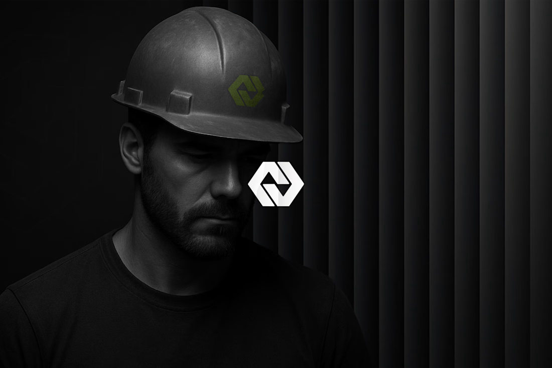
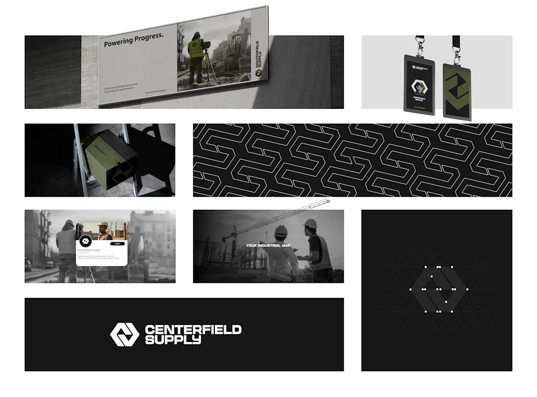
Centerfield Supply™ is a Canadian industrial supply company serving sectors like construction, mining, oil and gas, and forestry.
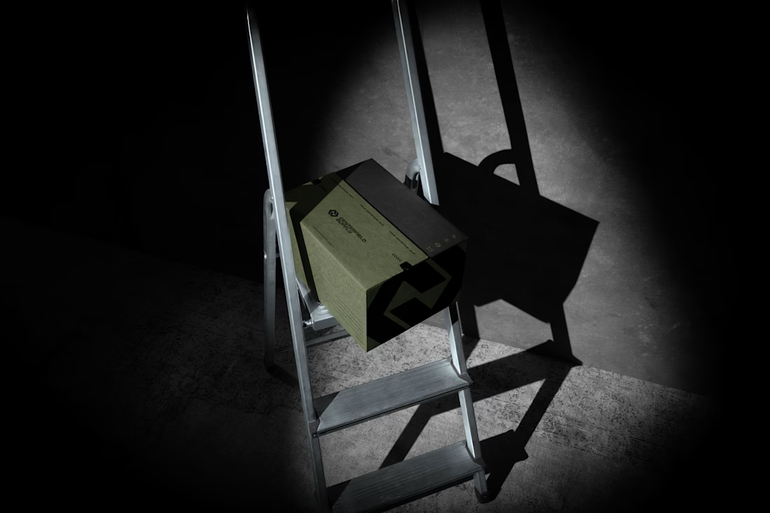
The goal was to craft a bold, masculine, and professional brand identity reflecting reliability, teamwork, and expertise.
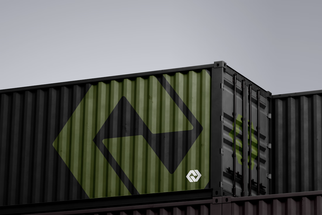
The logo combines the CS initials in a strong, geometric form inspired by baseball aesthetics, symbolizing unity and precision. Its chain-link structure and negative space arrows pointing up and down represent togetherness and above-and below-ground operations, while the olive green palette conveys strength and sustainability.
Typography pairs a commanding headline font with a clean, modern typeface to balance power and clarity, positioning Centerfield Supply as a trusted team built on performance and shared purpose.


@Drazen Vukajlovic love when an industrial company can look so sleek and clean. great work on this one!

@Allison Nulty Thanks a lot! Yeah, it’s really something... looks way better than most players in the industrial sector, and by a huge margin! I was lucky to work with such open-minded people who were cool with exploring this kind of approach.
Tools used: Adobe Photoshop, Adobe Illustrator, Jitter, Midjourney.
The network for creativity
Join 1.25M professional creatives like you
Connect with clients, get discovered, and run your business 100% commission-free
Creatives on Contra have earned over $150M and we are just getting started


Challenges
View all



Trending

Claude
Claude has entered the design space. How are you using Claude Design?

Contra University
Learn from expert creatives how to earn more using next-gen AI tools.
fifaworldcup2026
The World Cup is here and the whole world's watching. How are you designing for the world stage?
creativeaiflow
Creative AI workflows are evolving. What tools do you use, and what are their strengths and weaknesses?
freelancerlife
Freelancer life is wins, pivots, and everything in between. What’s yours right now?