The network for creativity
Join 1.25M professional creatives like you
Connect with clients, get discovered, and run your business 100% commission-free
Creatives on Contra have earned over $150M and we are just getting started
Back to feedPost

Creating clarity out of complex information ✨
When designing multi-page educational guides and workbooks, visual hierarchy is everything. A clean layout with deliberate typography and structured spacing doesn't just look aesthetic—it drastically reduces cognitive load for the reader.
Currently focusing on:
• Clean editorial layouts in Canva & Google Docs
• Structured typography hierarchies
• Bite-sized cheat sheets and reference guides
Always love turning dense curriculum notes into calm, readable digital resources. What’s your favorite step in designing long-form documents?
The network for creativity
Join 1.25M professional creatives like you
Connect with clients, get discovered, and run your business 100% commission-free
Creatives on Contra have earned over $150M and we are just getting started
Related posts

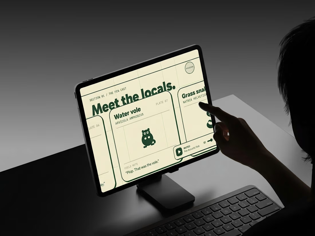
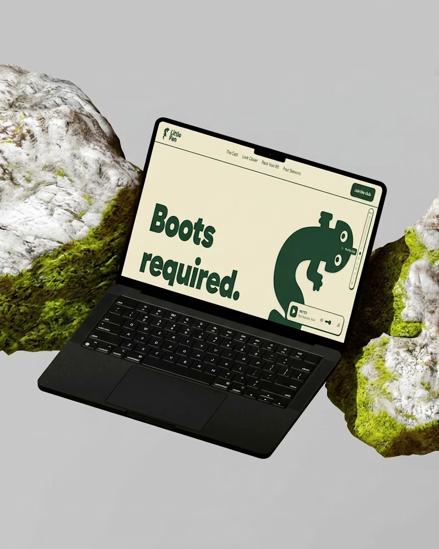
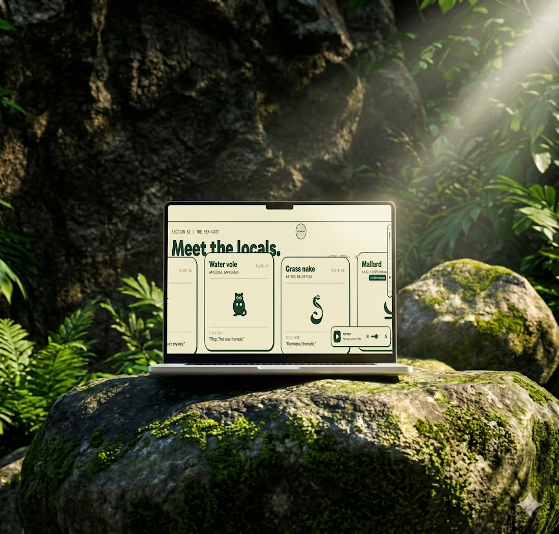
Most websites open with “Welcome.”
This one opens with “Boots required.”
Little Fen’s site is a field guide: locals with Latin names and a heron soundtrack.
Go meet the vole.

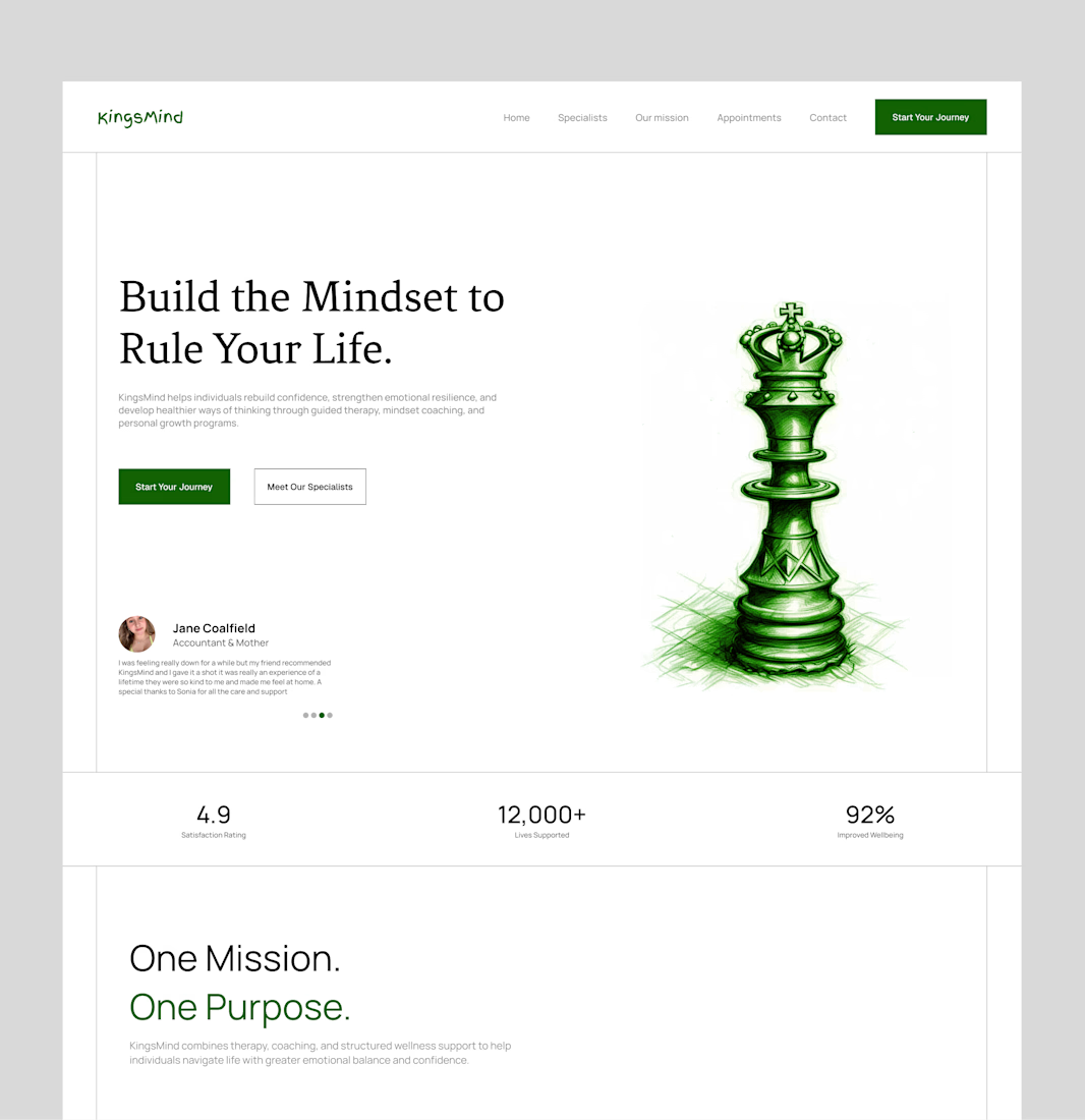
Bringing an old hero section design back to the spotlight. ✨
A hero section is often the first thing people see when they visit a website, so it needs to do more than just look good. It should capture attention, communicate the brand's message, and guide visitors toward the next step.
For this concept, I focused on creating a clean layout, strong visual hierarchy, and a balanced composition that makes the content feel clear and engaging without overwhelming the viewer.
Looking back at older projects is always a good reminder of how much thought goes into the little details that make a design work.
What do you think of this one? 👀
#WebDesign #UIUXDesign #HeroSection #LandingPageDesign #Framer #WebDesigner #UIDesign #DesignInspiration #Contra #PortfolioWork



this is amazing design

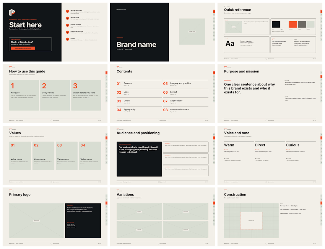
brand guidelines template for Adobe Illustrator
Version 1.0
WHAT THIS IS
A 42-page brand guidelines book plus one designer-only "Start here" artboard,
built on a 12-column grid at 1920 x 1080 px. Live text, vector shapes, five
global swatches, seven paragraph styles, five layers.
#Adobe Illustrator #guidelines #brand


Super useful template Mohammed! 42 pages with live text, vector shapes, global swatches and paragraph styles on a 12-column grid is exactly what designers need - saves so much setup time. Love that you included the designer-only "Start here" artboard and structured it from...