The network for creativity
Join 1.25M professional creatives like you
Connect with clients, get discovered, and run your business 100% commission-free
Creatives on Contra have earned over $150M and we are just getting started
Back to feedPost

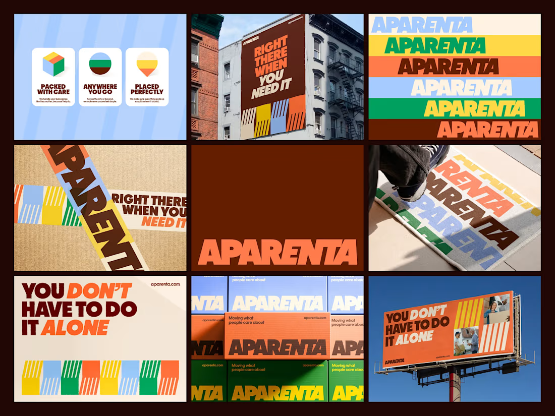
Branding direction for Aparenta, a relocation company built around the idea that moving isn’t just about boxes, it’s about people going through change.
The identity focuses on being present and supportive in those moments. It’s bold, direct, and easy to understand, just like the service itself. Strong typography carries most of the communication, keeping things clear and confident without feeling cold or corporate.
At the center of the system is a pattern inspired by helping hands. Translated into simple geometric forms, it creates a sense of movement, coordination, and support — a visual way of showing that you’re not doing this alone.
The color palette is vibrant and optimistic, bringing energy into an experience that’s usually stressful. Instead of feeling technical or logistical, the brand feels human, active, and reassuring.
Overall, the direction positions Aparenta as more than a relocation service. It’s a reliable presence that helps people move forward, both physically and emotionally.


The network for creativity
Join 1.25M professional creatives like you
Connect with clients, get discovered, and run your business 100% commission-free
Creatives on Contra have earned over $150M and we are just getting started











Related posts

Brand Expressions -- Olivir



Thats so crazy!!!!!! Seeing this I feel we humans are still far better than AI

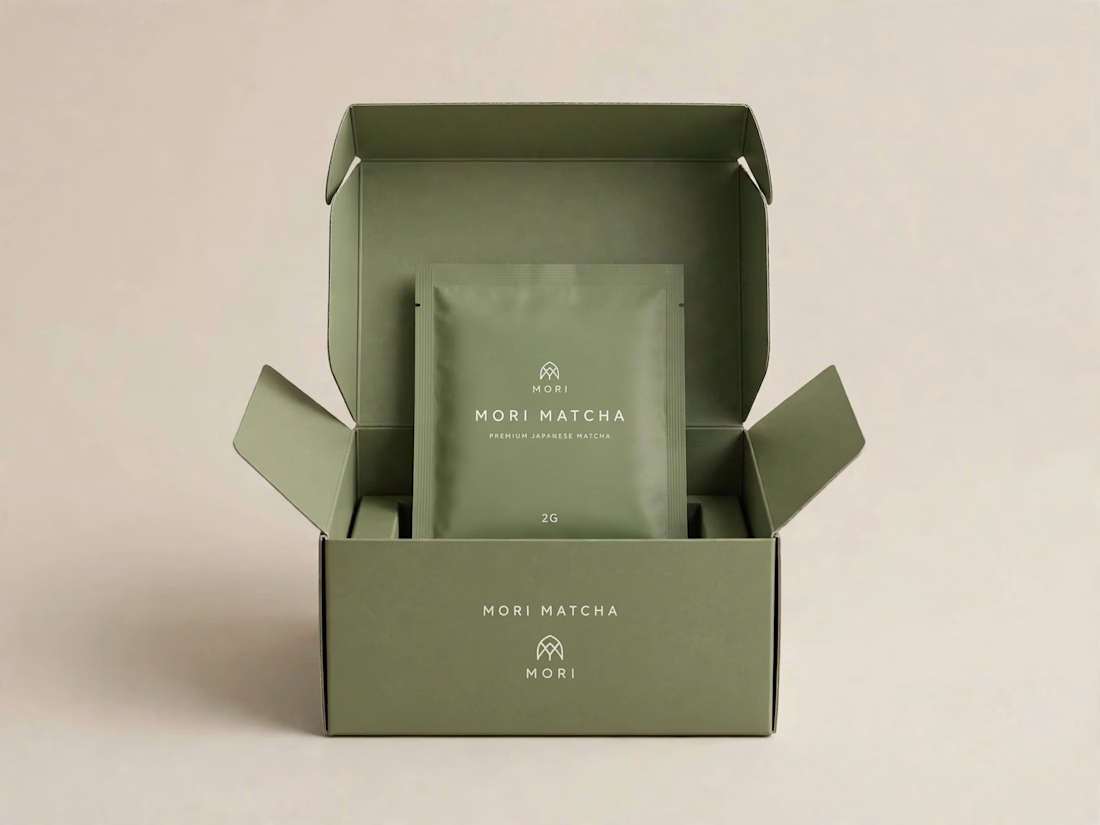
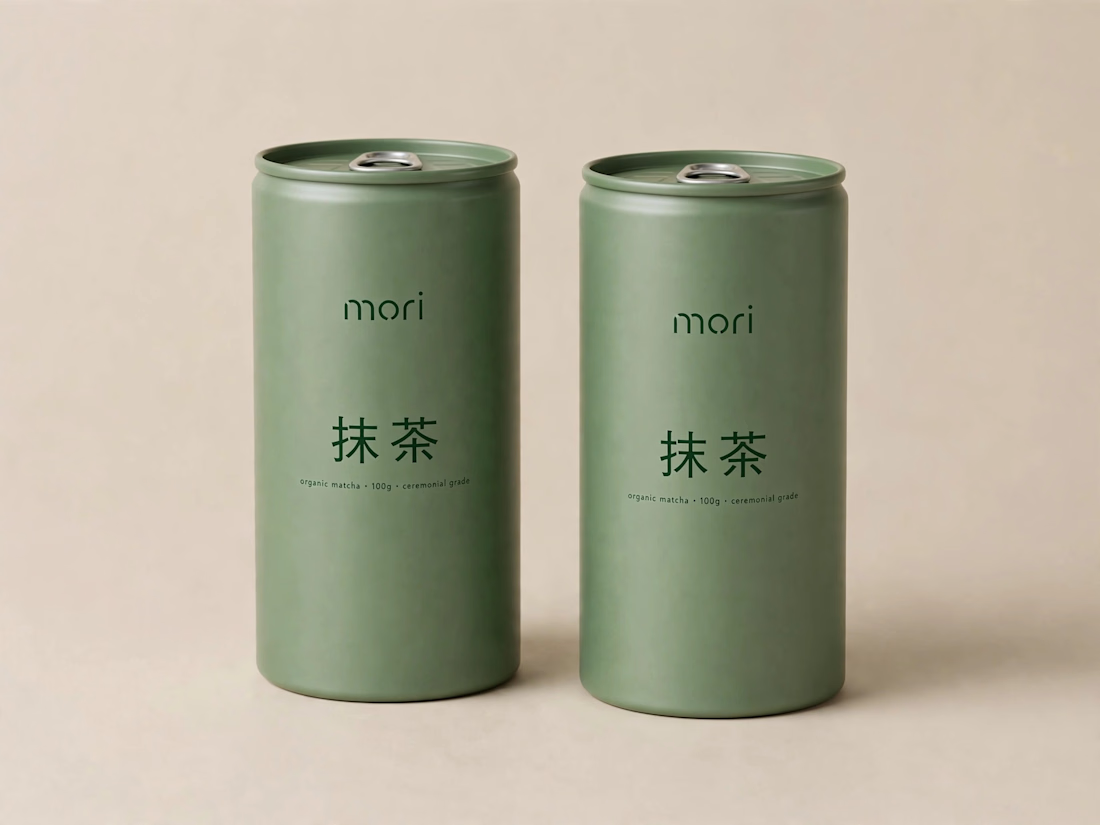
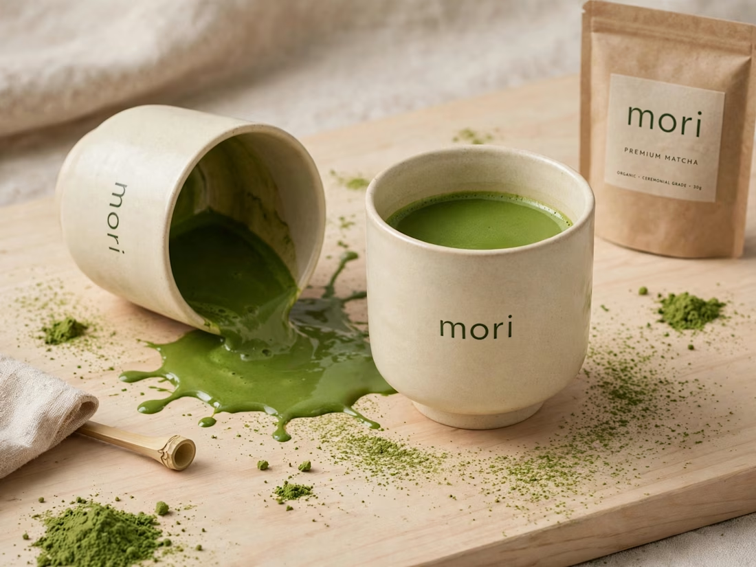
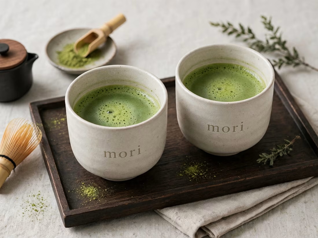
more visuals from my latest project — mori matcha 🍵
explored minimal Japanese packaging with earthy greens and calm typography.
focusing on premium ceramic cups and clean can design.
#branddesign #packagingdesign #visualidentity #brandstrategy #matcha #minimaldesign #japanesedesign #figma #mockup #branding


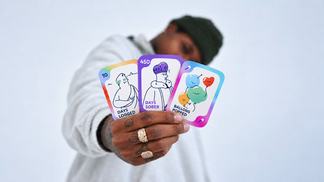
Most early-stage brands play it safe and disappear after a while. For Drylendar, I did the opposite.
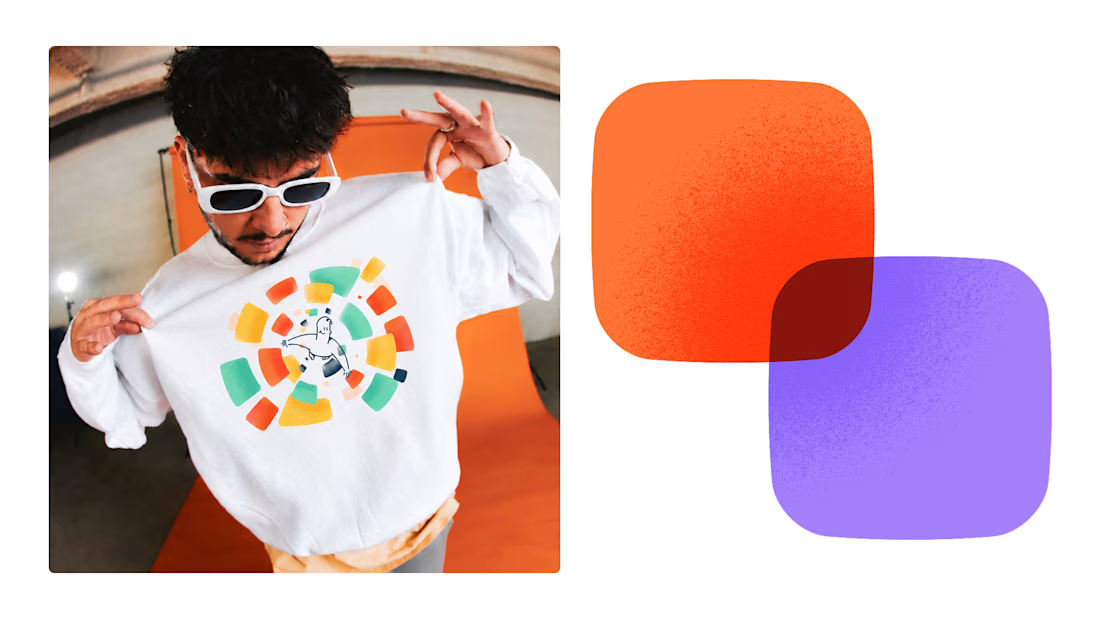
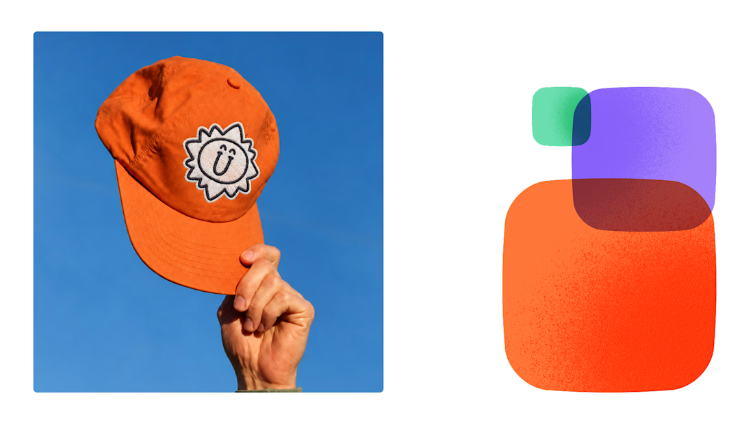
3 weeks from brief to full identity: logo, illustration system, app visuals, collectible cards and even merch.
AI makes things cheaper. Personality makes brands memorable.
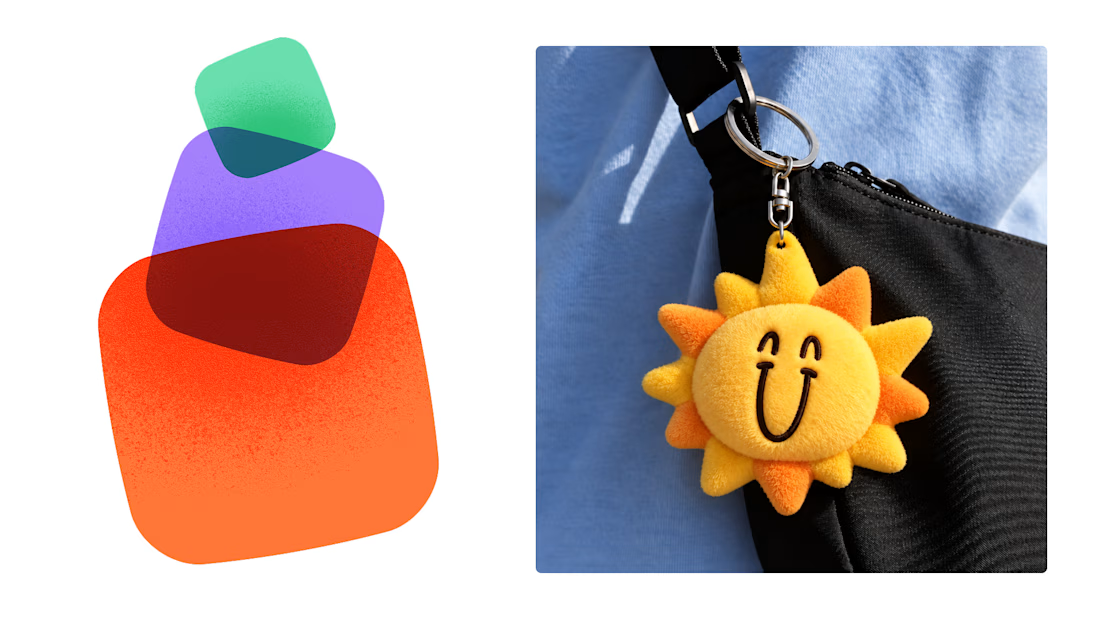

This is exactly what branding should be! 🔥 3 weeks for full identity, merch, cards - you really built personality, not just a logo. Love the Drylendar vibe. AI makes it cheap, but this makes it memorable - so true!