The network for creativity
Join 1.25M professional creatives like you
Connect with clients, get discovered, and run your business 100% commission-free
Creatives on Contra have earned over $150M and we are just getting started
Back to feedPost

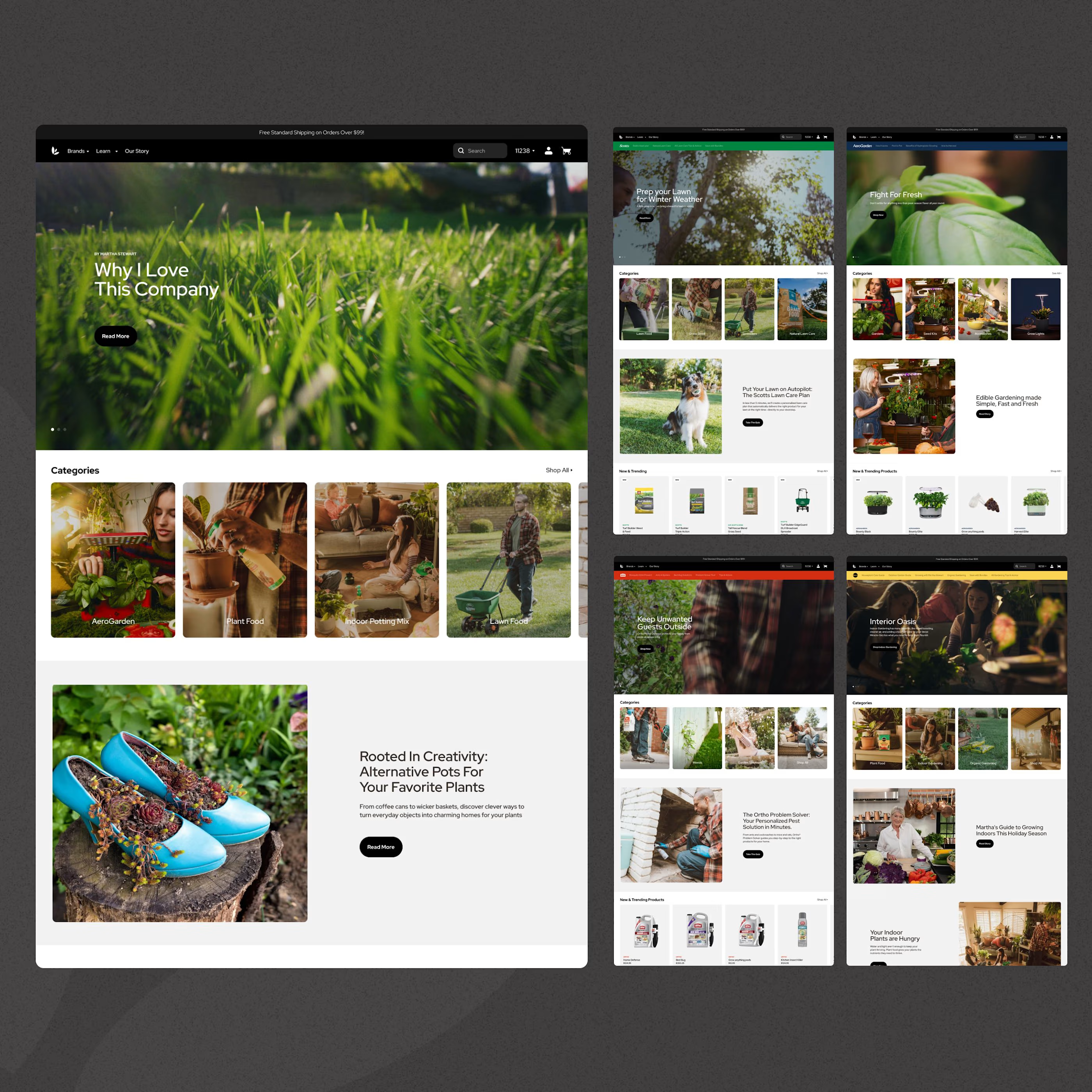
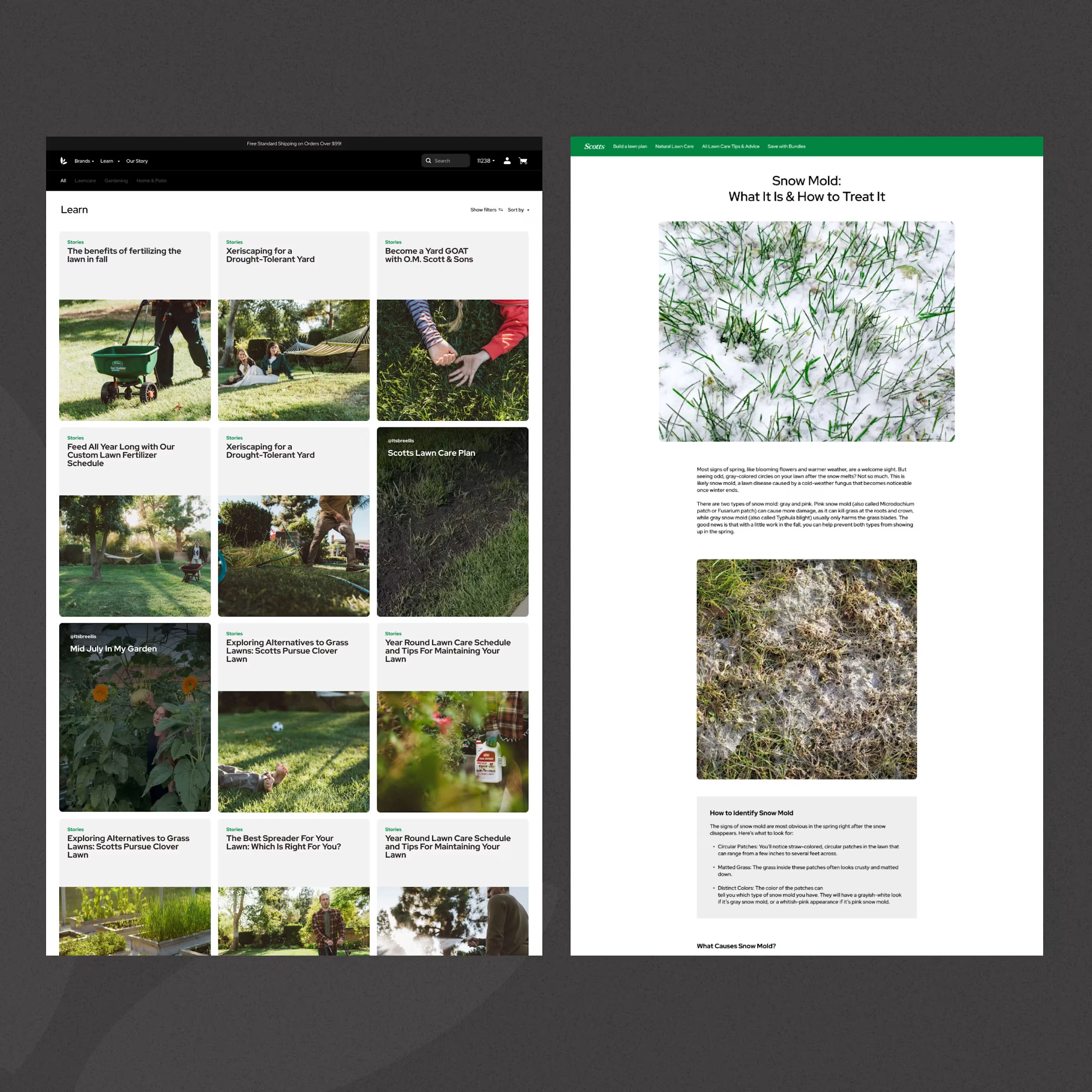
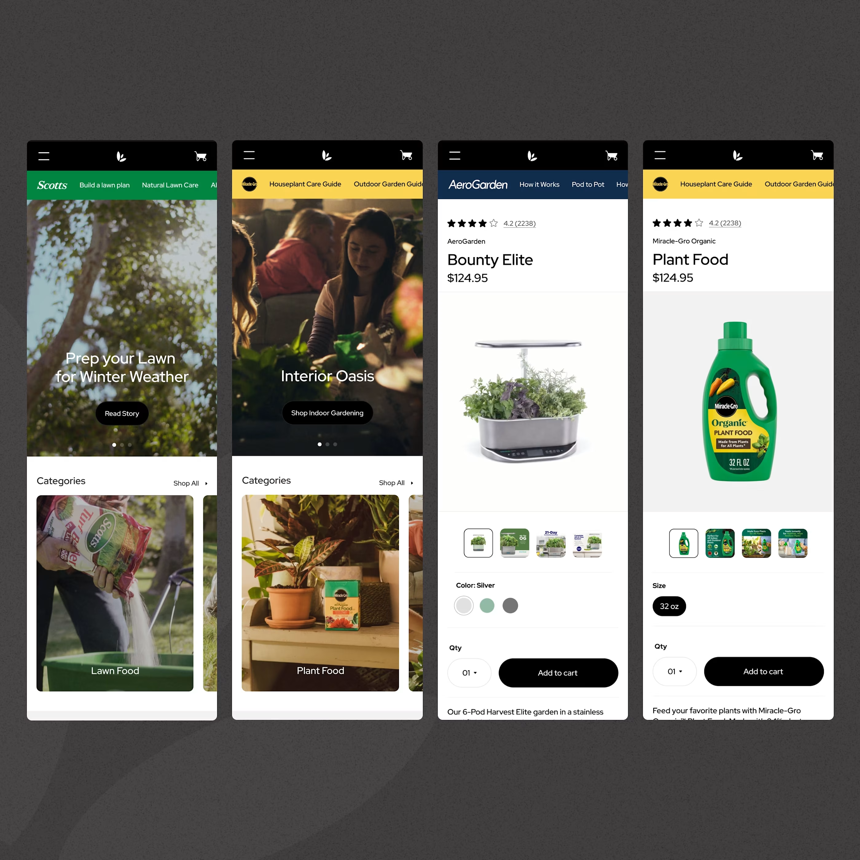
Excited to share a redesign I worked on for Scott's Miracle-Gro! Put together a design system to have cohesive sites for each of their brands (Scotts, Aerogarden, Miracle-Gro, Ortho, and Tomcat), redesigned the the PLPs / PDPs, & so much more.
So unbelievably happy with how this one turned out.

The network for creativity
Join 1.25M professional creatives like you
Connect with clients, get discovered, and run your business 100% commission-free
Creatives on Contra have earned over $150M and we are just getting started









Related posts

Another section completed for TealSites, a web design and development agency.
This time, I designed the What We Do section, highlighting three core services:
- Landing Pages
- Marketing Websites
- Web Apps and MVPs
The goal was to make each service easy to understand while keeping the layout clean and consistent with the overall visual identity.
I used custom illustrations, subtle grid lines, and teal accents to give each card its own character without making the section feel cluttered.
Designed in Figma.
What do you think of this section?
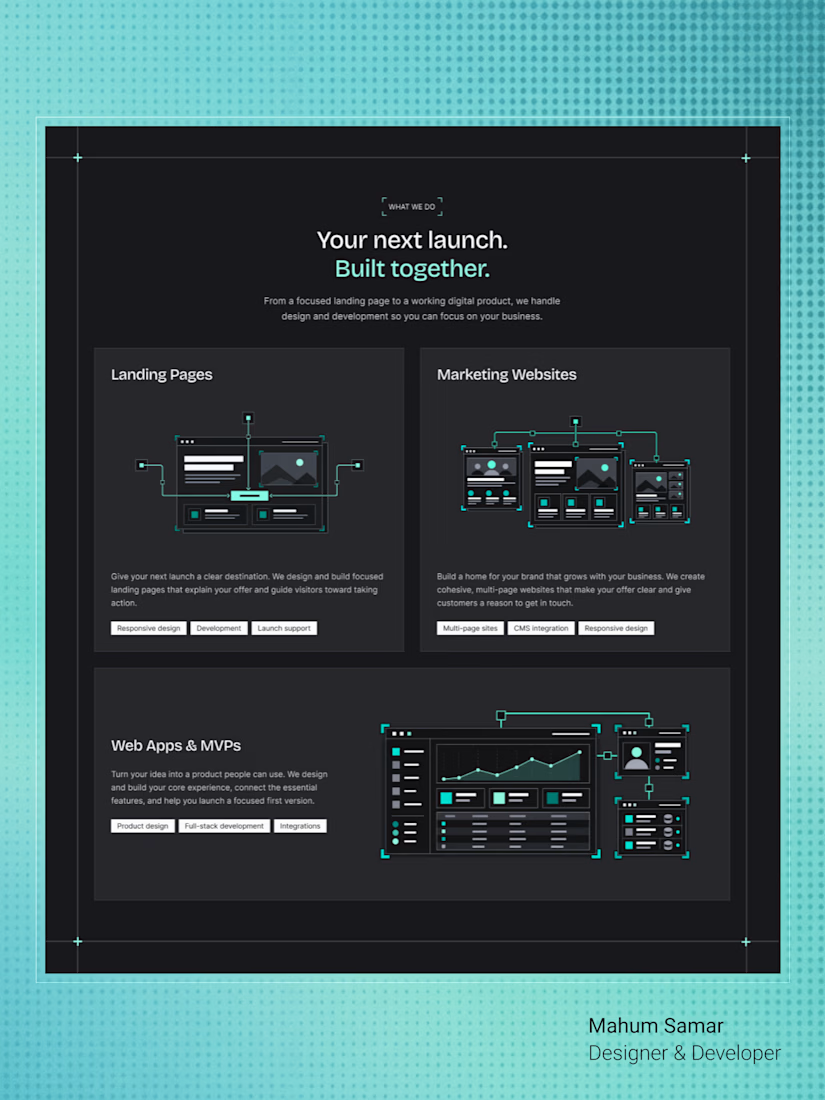

Clean structure! Love how you separated Landing Pages vs Marketing Websites vs MVPs — a lot of agencies mix them up. The isometric illustrations with the teal accent keep it technical but friendly. How did you handle the responsive behavior for those 3 cards?
A clean and modern food delivery app concept designed with a focus on simple navigation, clear layouts, and a smooth user experience.
Designed in Figma.
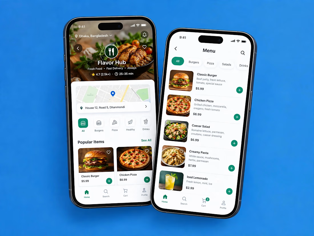

Love how clean and intuitive this feels, the navigation looks super smooth and the layout is really well balanced

First time exploring branding. Had fun bringing this one to life.
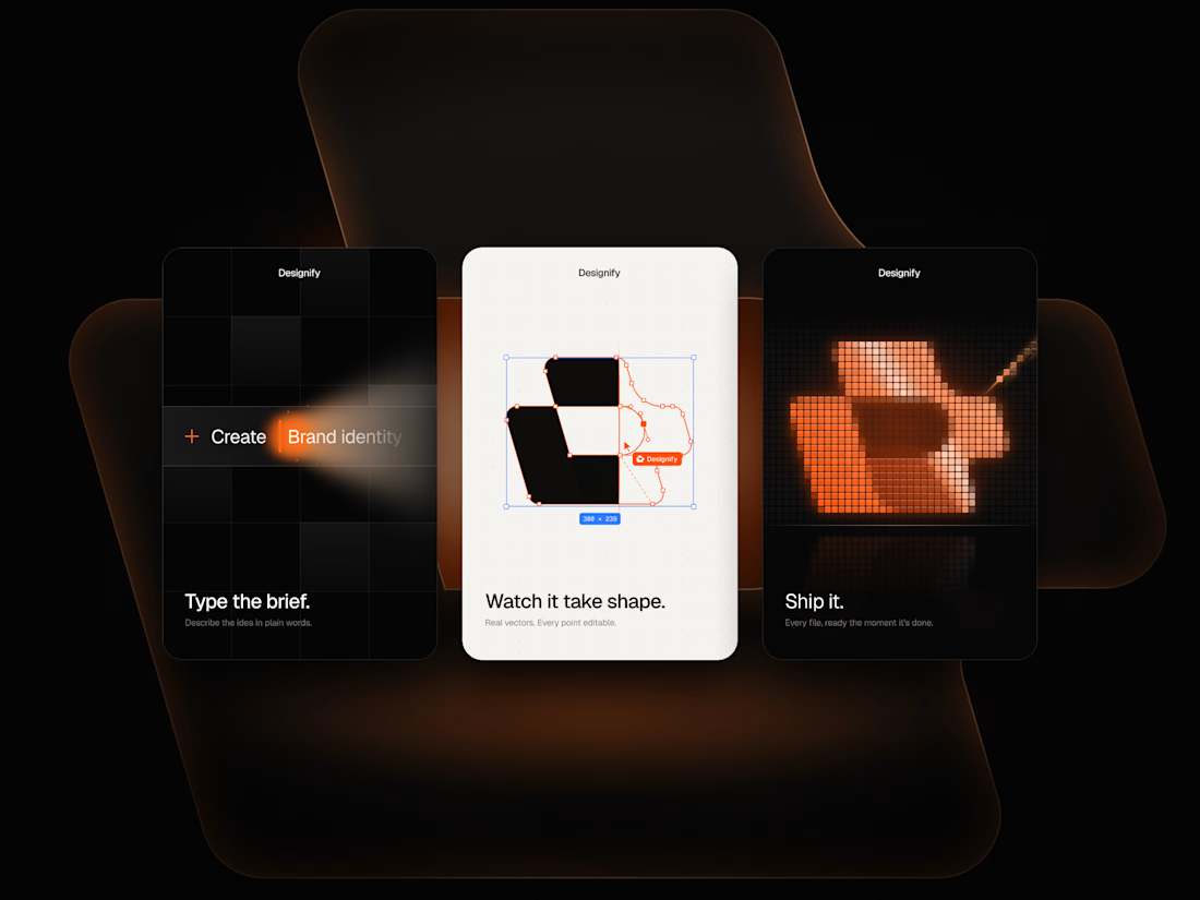

Love that orange pixel effect, Waleed! How did you make it?