The network for creativity
Join 1.25M professional creatives like you
Connect with clients, get discovered, and run your business 100% commission-free
Creatives on Contra have earned over $150M and we are just getting started
Back to feedPost

Zeroframe × Sonori
Structure. Motion. Presence.
Built for studios shaping branding, film, and digital culture.

The network for creativity
Join 1.25M professional creatives like you
Connect with clients, get discovered, and run your business 100% commission-free
Creatives on Contra have earned over $150M and we are just getting started





Related posts


Building a pet SaaS hero
Soft visuals, bold typography, and a clear conversion path, designed to make the product feel as friendly as the pets it helps
Built in Framer
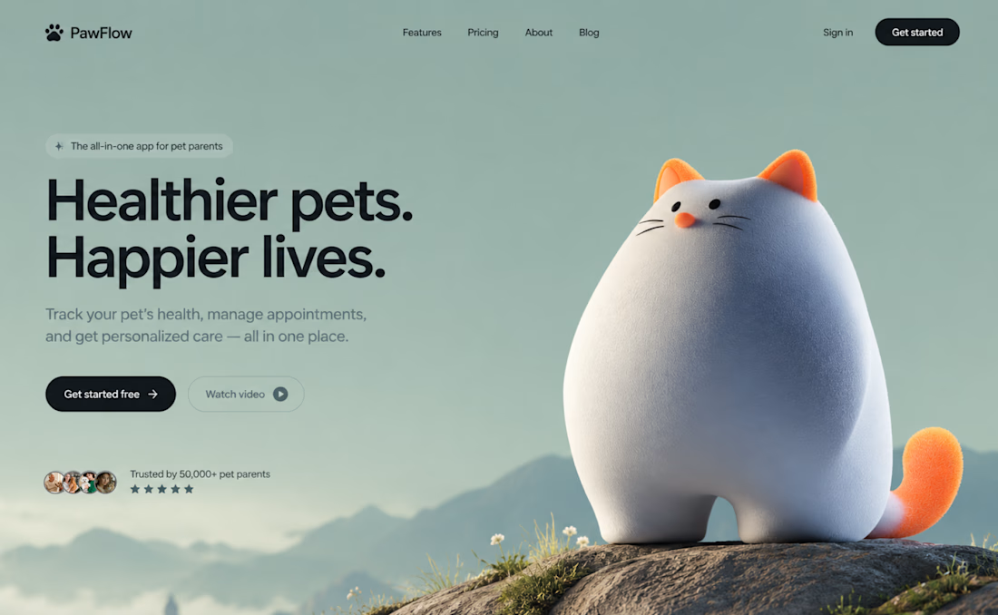

The dark CTA stands out against the soft sage background, even with the cat taking center stage. How are you handling the cat and headline on mobile: stacked or a tighter crop?

Client testimonial cards from a recent Framer project.
The slight card rotations give this an editorial feel, and the orange card creates a clear focal point. Do they straighten on hover for easier reading?

Navigation, but a little different.
Built this floating side nav from scratch and designed a hero to match it.
Offset.


I love the smoothness