The network for creativity
Join 1.25M professional creatives like you
Connect with clients, get discovered, and run your business 100% commission-free
Creatives on Contra have earned over $150M and we are just getting started
Back to feedPost

A logo is not a brand system.
Many businesses invest in a logo and assume the brand is complete.
But brands live in systems:
Typography / Spacing / Photography,
Messaging /
Digital experience
Without structure, consistency disappears quickly.
A strong identity is designed to scale across every touchpoint.

The network for creativity
Join 1.25M professional creatives like you
Connect with clients, get discovered, and run your business 100% commission-free
Creatives on Contra have earned over $150M and we are just getting started











Related posts

Title: Proper Form — Brand Identity & Visual Language
A brand identity for Proper Form built around a more modern, movement-driven take on recovery and healthcare.
The visual system extends the logo into a complete language through color, typography, imagery and layout, creating a consistent identity across different brand touchpoints.
Created by Lepisov Branding in collaboration with @Creative Mints
Logo design: Ilya Gorchanyuk
Creative direction: Dmitry Lepisov
Brand identity: Lepisov Branding × Creative Mints


Using the logo mark as the big graphic across the layouts is smart. The purple to pink gradient gives recovery a more energetic feel.

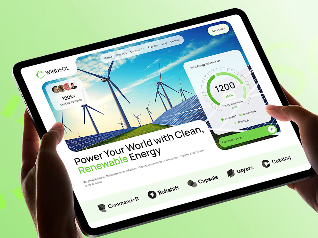
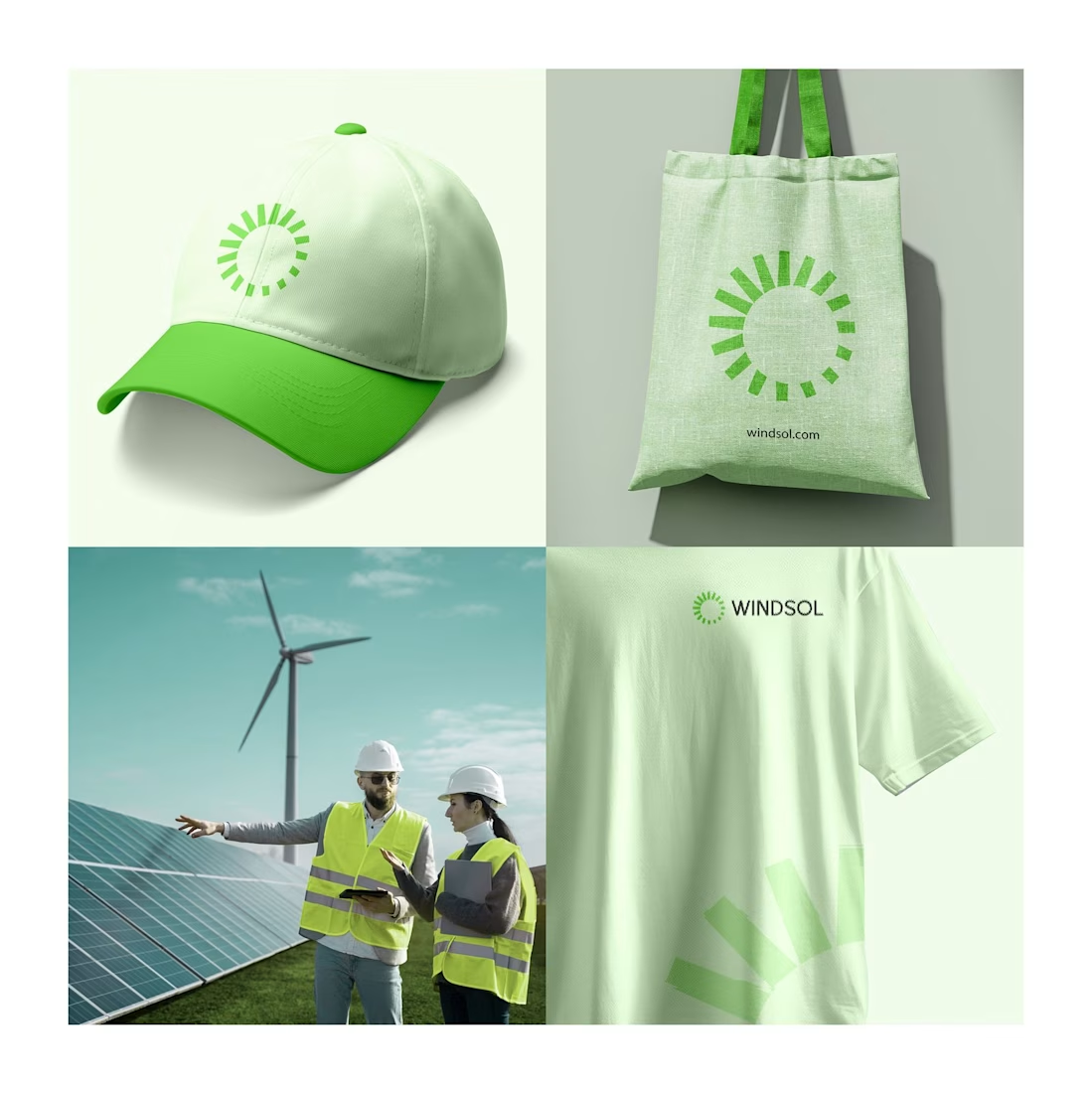
Windsol: a brand and website built to power the clean energy shift
Windsol is a renewable energy company covering solar and wind. We built the full identity and the website around one idea: clean energy should feel simple, bright and trustworthy.
The sun-ray symbol works across a cap, tote and tee, and the site turns live energy data into something people can read at a glance.
Which touchpoint do you think sells a brand best, merch or the website?


Saltline - A Coastal Brand Experience
Saltline is a digital concept built around the spirit of the ocean, combining a distinctive visual identity with a clean, immersive web experience.
The goal was to create a brand that feels modern, adventurous, and effortlessly premium, with a strong visual direction and an interface designed to make the experience feel as memorable as the brand itself.
Built with Base44


Woow , warmth and premium