The network for creativity
Join 1.25M professional creatives like you
Connect with clients, get discovered, and run your business 100% commission-free
Creatives on Contra have earned over $150M and we are just getting started
Back to feedPost
A fintech brand shouldn’t just look modern. It should make people feel confident moving money.
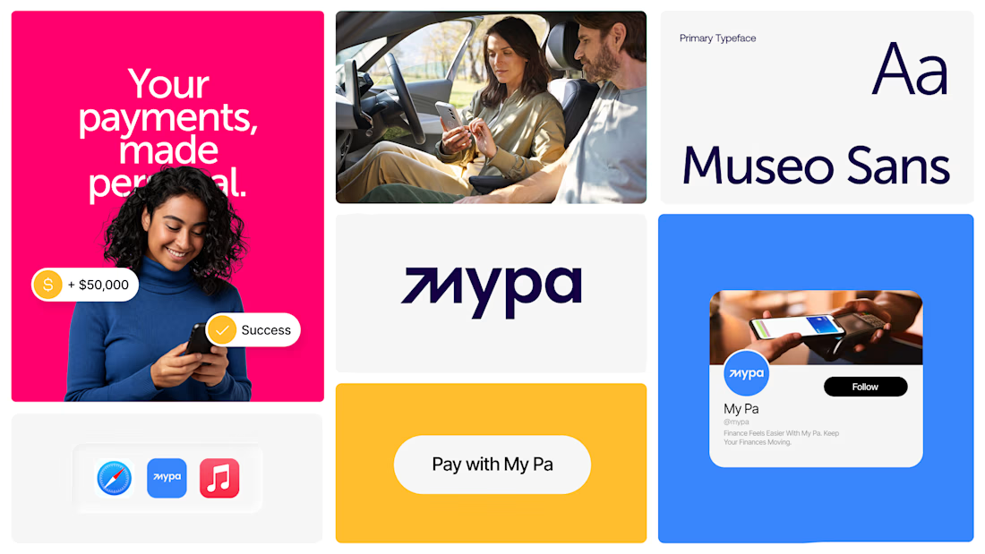
For My Pa, we built a bold, human-centered brand identity designed to make finance feel simpler, more approachable, and memorable.
From the distinctive wordmark and vibrant color system to typography and digital/social applications, every detail was created to build recognition, trust, and a stronger digital presence.
A brand system designed not just to look good, but to position the business, connect with people, and scale across digital touchpoints.
Brand Identity • Fintech Branding • Visual Identity • Digital Branding
#BrandIdentity #FintechBranding #BrandStrategy #VisualIdentity #Fintech #BrandDesign #DigitalBranding #UXUI #SocialMediaDesign #Branding






Great Concept


Good work🔥👏👏

Thanks

Perfect Color and Visuals 😊
Thanks

Great 🔥
Thanks

Nice work
Thanks

Awesome :)
Thanks

Thanks

Amazing!
Thanks


The bold wordmark and colors make it feel a lot more human. I like how it avoids the usual fintech look.
Thanks

I like the idea of making finance feel more simple and friendly. The bold style fits that really well.
Thanks

Just wow
Thanks

So nice bro! Love the logomark and the colours! 🧡

wow nice bro

Amazing work.

The presentation makes the logo even more powerful. ✨
The network for creativity
Join 1.25M professional creatives like you
Connect with clients, get discovered, and run your business 100% commission-free
Creatives on Contra have earned over $150M and we are just getting started





Related posts

Brand identity work for WesoftAI




The thing I keep relearning: a design is never finished because someone ran out of ideas. It's finished because someone decided to stop. Knowing when to stop is the hardest part.


Damn.... Crazy colors 👏😍

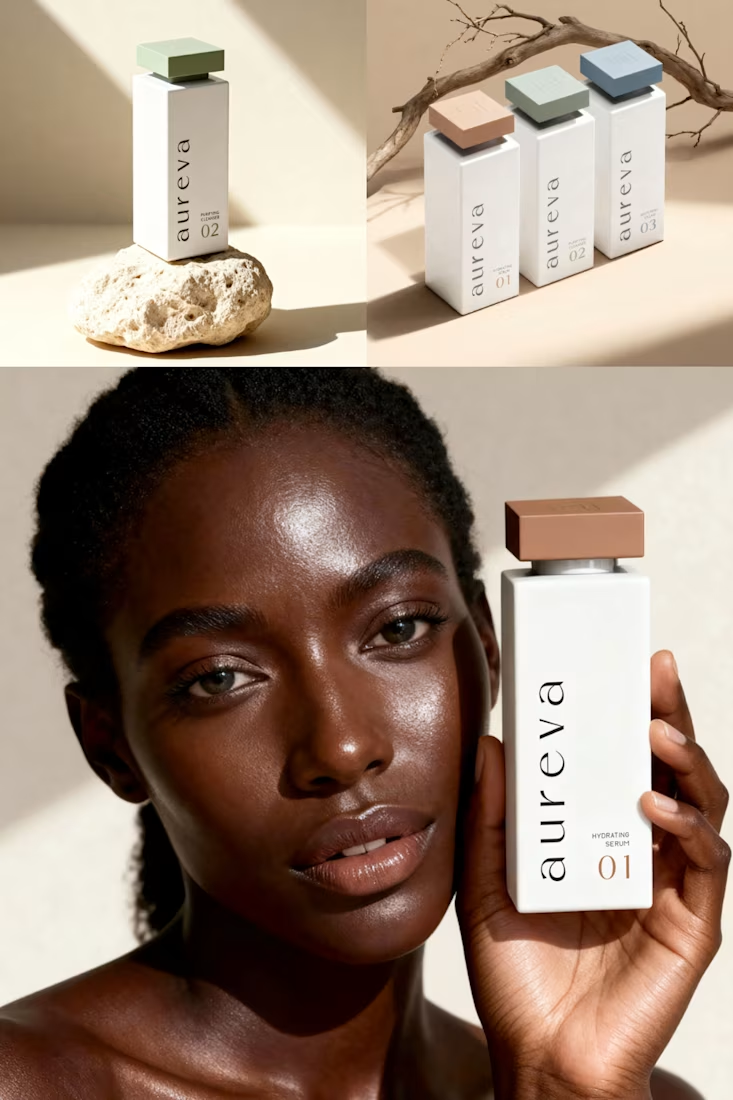
A closer look at Aureva, a Paris-based skincare brand I worked on.
The brief was to create a brand identity and packaging that felt premium yet approachable. I paired distinctive typography with soft earth tones, using color to give each product its own place within the range.
The full case study is now on my profile.

Premium branding