The network for creativity
Join 1.25M professional creatives like you
Connect with clients, get discovered, and run your business 100% commission-free
Creatives on Contra have earned over $150M and we are just getting started
Back to feedPost

Packaging Design & Visual Strategy | Swirle Ice Cream
Designing the packaging for Swirle meant creating a physical product experience that instantly captures attention in a crowded freezer aisle while conveying the craft behind the cream.
The Packaging System
Container Architecture: Engineered clean, high-impact pint layouts optimized for 360-degree shelf visibility and seamless brand recognition from any angle.
Flavor Color-Blocking: Developed a systematic, high-contrast color strategy to differentiate flavors clearly while maintaining strong brand unity across the entire product lineup.
Hierarchical Information Design: Structured ingredient lists, flavor names, and nutritional callous to ensure key details remain effortless to read on curved surfaces.
How does the visual structure and color balance hold up across the packaging series? I’d appreciate your professional feedback and insights on this direction.

The network for creativity
Join 1.25M professional creatives like you
Connect with clients, get discovered, and run your business 100% commission-free
Creatives on Contra have earned over $150M and we are just getting started





Related posts

Hero section of one my new templates. Preview it live to see the animations.
Relay is HTML or React you actually own.
Hand it to your AI assistant and it already knows how the thing is built.
Starting at $29
https://no-code.supply/templates/relay
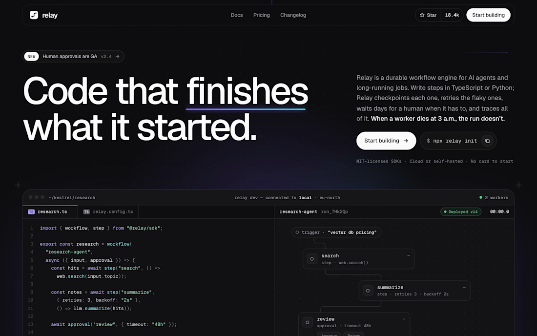

"Code that finishes what it started" is a great headline. Love that it's real HTML/React you own and not locked into a builder.

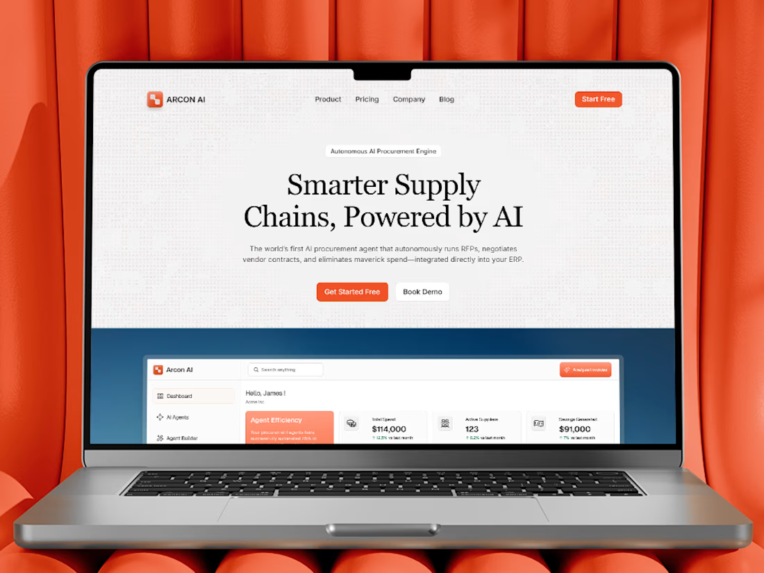
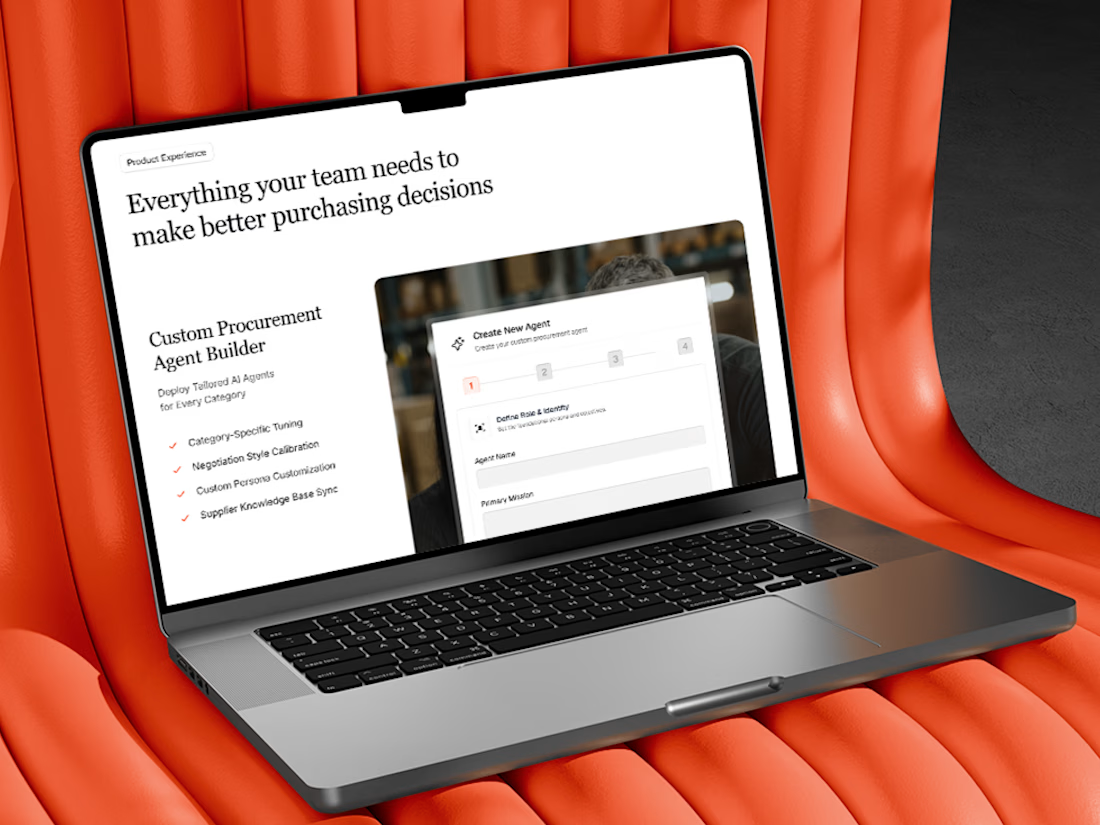
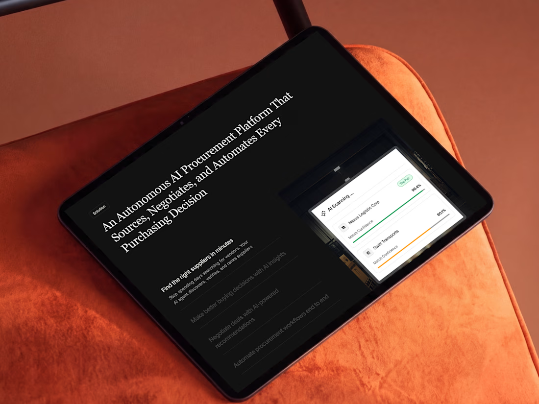
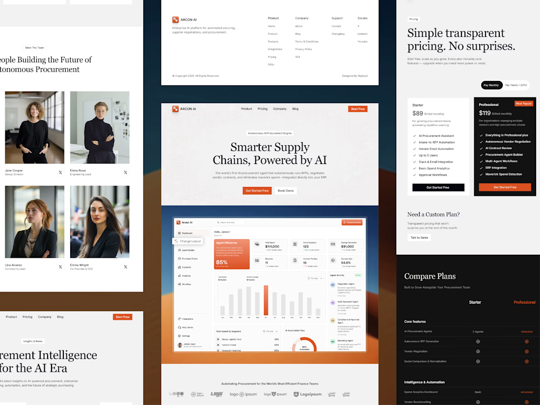
Free AI Framer template we designed for B2B SaaS.
Arcon AI is a premium Framer template built for AI startups, procurement platforms, enterprise SaaS, AI agents, workflow automation, supply chain technology, and B2B software. Designed with a modern enterprise aesthetic, it helps you launch a professional website that builds trust, showcases your product, and drives conversions.
Get it for free: https://www.framer.com/marketplace/templates/arconai/



Lovely work

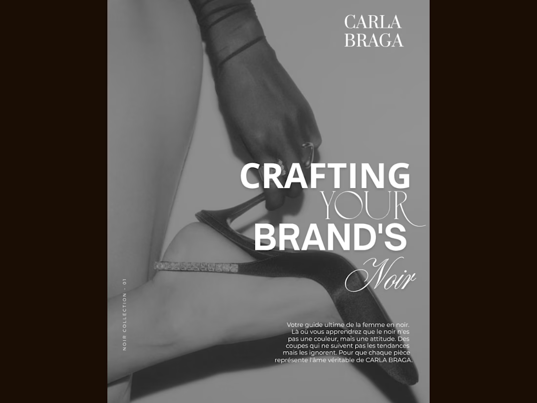
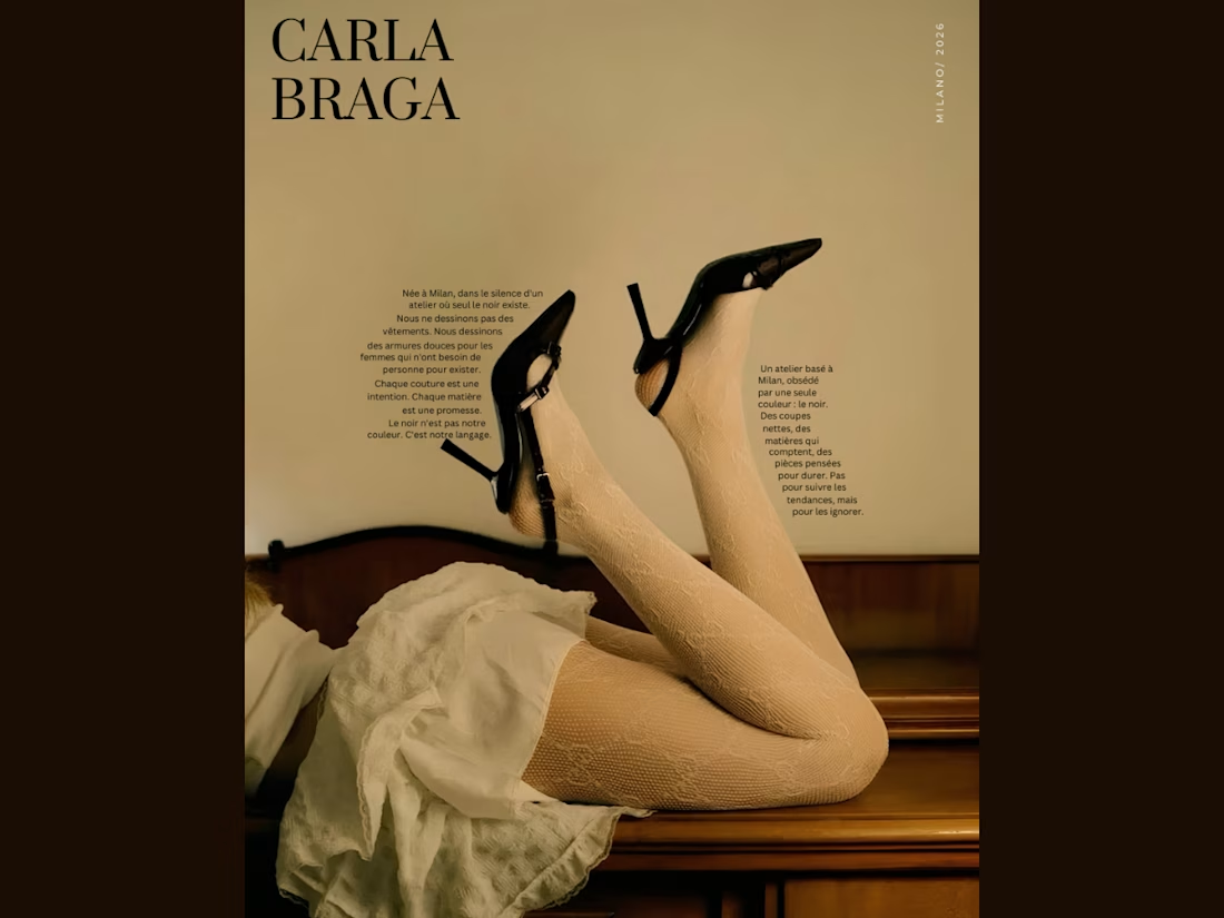
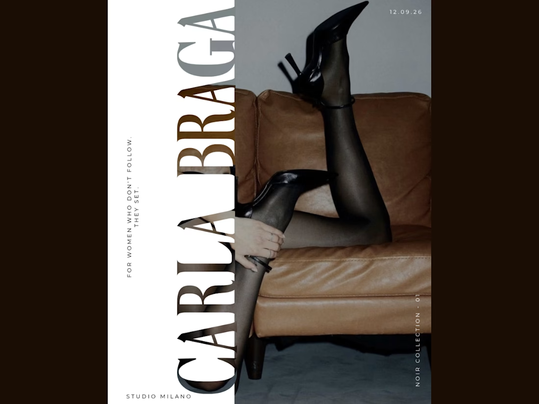
An editorial poster series I designed for CARLA BRAGA, exploring fashion through bold typography, vintage tones, and monochrome imagery. Each layout takes a different approach—from text following the contours of the image to oversized vertical lettering and layered font combinations. Black heels connect the series visually, while warm browns, soft neutrals, and spacious compositions create a cohesive luxury feel. Created in Canva with a focus on typography, contrast, and visual storytelling.

BEAUTIFUL WORK.