The network for creativity
Join 1.25M professional creatives like you
Connect with clients, get discovered, and run your business 100% commission-free
Creatives on Contra have earned over $150M and we are just getting started
Back to feedPost

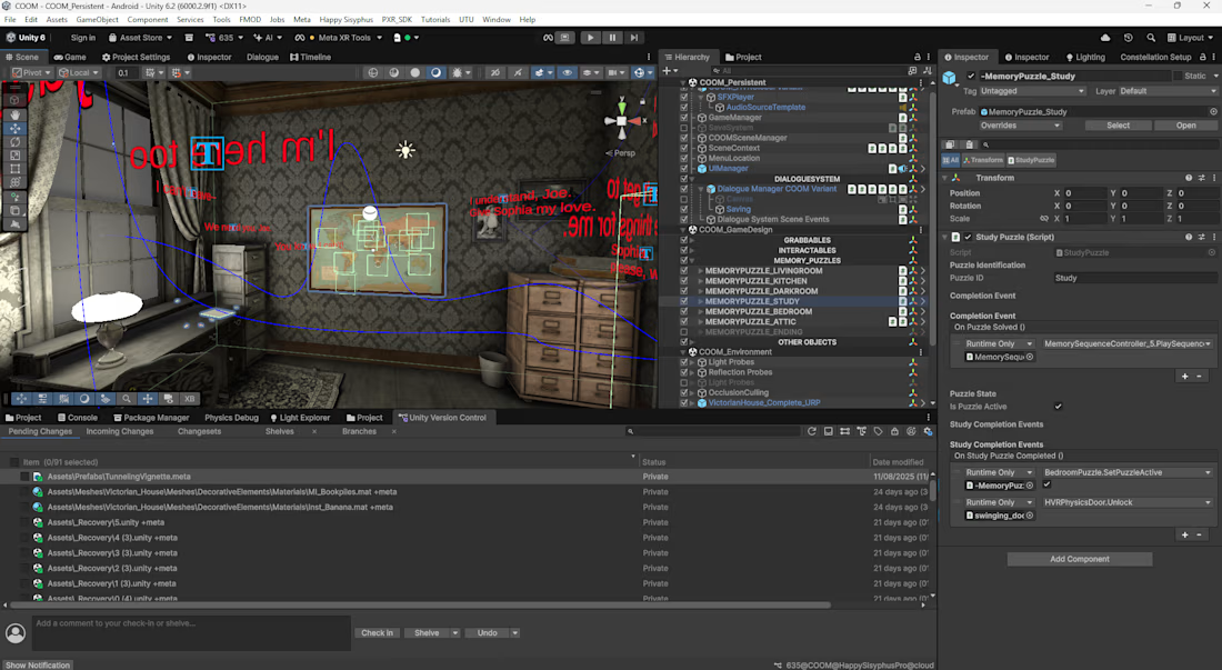
Colors of Our Memories - Upcoming VR Game made in Unity


The network for creativity
Join 1.25M professional creatives like you
Connect with clients, get discovered, and run your business 100% commission-free
Creatives on Contra have earned over $150M and we are just getting started

Challenges
View all


Related posts

The table is haunted, so is the cue ball!
For the @Rive Halloween Challenge here on Contra, I've channeled my inner demons to create a spooky 8-ball pool game called 'Ghoul Table'. 🎱
It was built entirely in Rive using the new CLI, 3D objects, shaders, physics and more... and it ships as a .riv file under 10MB!
What crazy cue ball should I add to the game next? I'll implement the best suggestions!


What if an image grid could behave like liquid?
Just finished Chromatic Grid, a new experiment exploring how a traditional image gallery can become something more sculptural and interactive.
A few things I explored:
→ An hourglass-shaped 3D image grid.
→ Scroll-driven stretching and twisting.
→ Liquid distortions that respond to cursor movement.
→ Fluid reveals and color-to-B&W transitions.
The challenge was making everything feel like one continuous material rather than separate effects.
Built with Three.js, WebGL, GLSL & ChatGPT.
Would love to hear what you think!


🧟 Time to think and solve the Zombie Puzzle Race! 🧠
🎮 Play here: START
You might have seen this logical puzzle in different games or puzzle books. I love making puzzle games, so I decided to recreate this one by hand.
For this challenge, I didn't want to give everything to an AI agent. Instead, I decided to use the full power of Rive together with Rough 2D animation and GPU canvas shaders.
I also used many of the Rive features I've learned throughout my journey:
• Triggers
• Property Groups
• State Machines
• Data Binding
• Scripting
🧟 Game Goal
There are 4 zombies — 3 regular zombies and 1 zombie wearing a cap. 🎃
⚡ Each zombie starts with 100 energy.
🍭 Your goal is to get the zombie with the cap to the lollipop, then bring him back together with his friends to the starting position. The other zombies need to help by sharing their energy with each other.
💥 But there's a catch: zombies can share energy only when they are on the same line.
⚠️ Don't waste your energy — one wrong move can make you lose!
🧠 So... can you find the solution?
Try the puzzle and share your solution!
Good luck, and have a great brain teaser! 🧟⚡🍭


like the art and animation a lot! Good luck!