The network for creativity
Join 1.25M professional creatives like you
Connect with clients, get discovered, and run your business 100% commission-free
Creatives on Contra have earned over $150M and we are just getting started
Back to feedPost

I designed a logo around a millisecond ⏱️📸✨
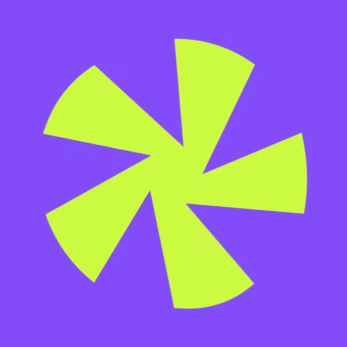
I chose an aperture as the mark for OFF SHOT, and at first that felt like the obvious choice — camera brand, aperture, of course. But what actually pulled me in was the shutter closing moment, that split-second "click." I wanted my mark to feellike that moment, not just look like a generic camera symbol.
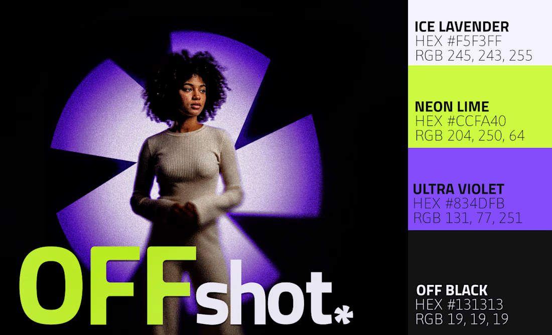
The color decision was harder for me. I went with black + ultra violet + neon lime, which I know is a risky combo, but I didn't want to design another "premium" camera brand playing it safe with black-and-white. I added neon lime specifically because I wanted it to feel young without losing that premium edge.
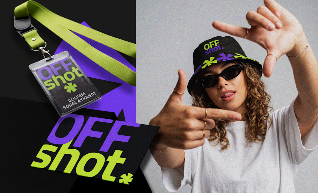
Honestly, my favorite part was making sure everything I touched — the logo, the bucket hat, the business card, the website — felt like it was speaking the same language. That's what I think consistency actually means in practice, not just in theory.
For tools, I used Illustrator for the logo, Photoshop for compositing, Figma for the system and web, and Kittl for quick mockups. I used a different tool at every stage, and honestly, that's what made the whole process so much faster for me Check it out


The network for creativity
Join 1.25M professional creatives like you
Connect with clients, get discovered, and run your business 100% commission-free
Creatives on Contra have earned over $150M and we are just getting started
Trending

Claude
Claude has entered the design space. How are you using it?

Contra University
Learn from expert creatives how to earn more using next-gen AI tools.
Brand Design
The best brand designers are on Contra. Scroll to see what's trending in brand design. What are you building?
creativeaiflow
Creative AI workflows are evolving. What tools do you use, and what are their strengths and weaknesses?
freelancerlife
Freelancer life is wins, pivots, and everything in between. What’s yours right now?





Related posts


dope


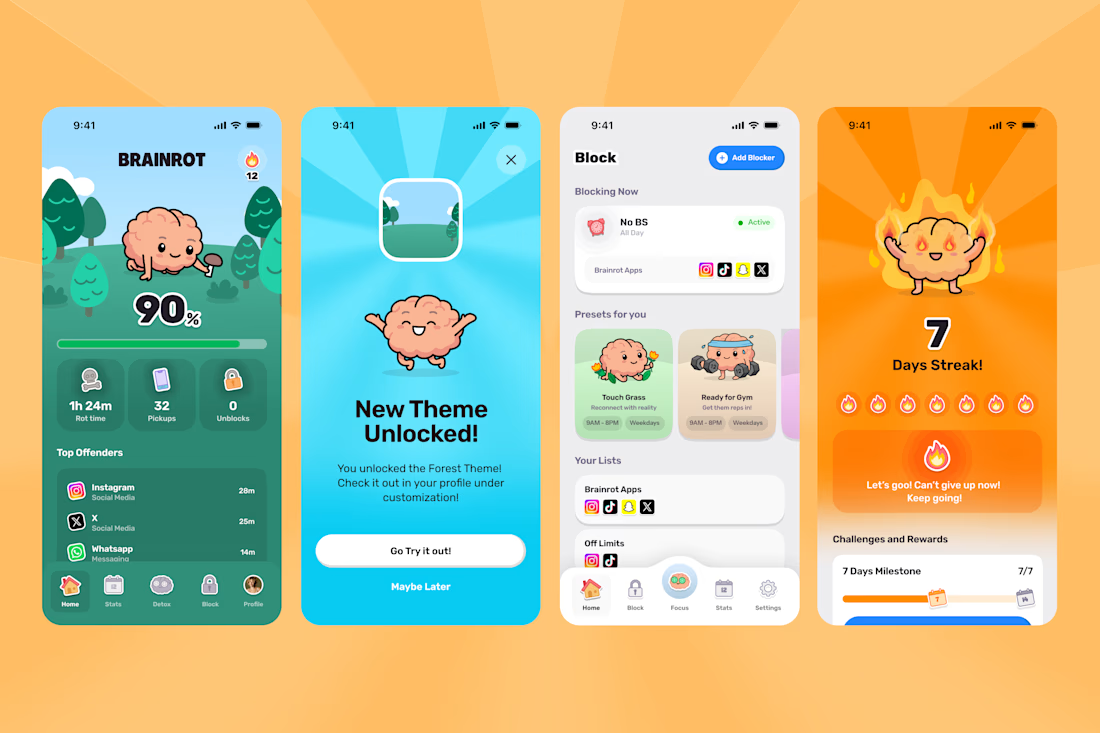
A few highlights from the Brainrot Project!
In 3 months we delivered:
100+ app screens
60 + Illustrations
70 + animations
+ Branding, Appstore Screens, Website and hundreds of Slack jokes.
Couldn't have done it without the legends Mary Delaney and Arsen Airyan!
If your brand or app needs a substantial facelift to stand out in the AI Slop age, let me know!


Congrats man!