The network for creativity
Join 1.25M professional creatives like you
Connect with clients, get discovered, and run your business 100% commission-free
Creatives on Contra have earned over $150M and we are just getting started
Back to feedPost

The Architecture of Loneliness: Why Modern Apartments Alienate the Mind?
As a civil engineer, I usually read building layouts through questions of efficiency, circulation and structural planning. For this piece, I looked at the same layouts from another angle: what kind of behavior do they encourage?
I explored how high-rise corridors and limited communal spaces can affect opportunities for everyday interaction, and compared this with traditional layouts where courtyards, verandas and shared spaces were integrated into daily movement.
The piece asks a simple question: are we designing buildings only for efficient movement, or also for the people who live in them?
Read the full piece:
https://drive.google.com/file/d/1T2LNA1LRz0hHGWJBWa3D9K5f1TSdB014/view?usp=sharing
The network for creativity
Join 1.25M professional creatives like you
Connect with clients, get discovered, and run your business 100% commission-free
Creatives on Contra have earned over $150M and we are just getting started




Related posts

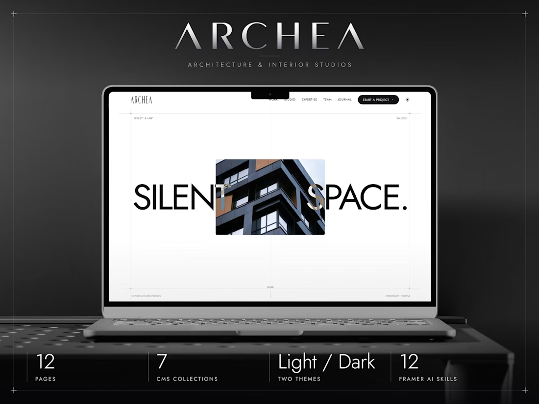
ARCHEA just hit #3 in Architecture on the
Framer Marketplace.
I built it to give architecture studios a quiet, editorial space to show their work. Really happy to see it find its audience.



The services menu from the Adara website, a residential architecture and planning practice in London.
One of our favourite details on this project. A tiny piece of a much bigger build, and it got the same attention as the hero.

The fact that you can view a visualization for each service right away is super cool. Another point to consider is what percentage of users will actually see this visualization, given that the navigation opens in a rather unpredictable way. I don’t mean this aggressively at all,...

A modern brand identity concept designed for the architecture, interior design, and construction industry.
The visual identity is built around a distinctive geometric symbol, combining four interconnected forms to create an abstract interpretation of the letter “N.”
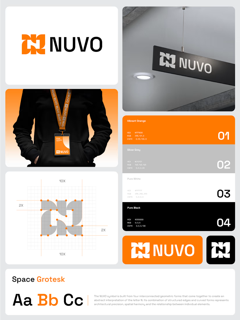

The construction grid with those 2X margins makes the N read as a system, not a one-off mark. Did you test the four-form symbol at favicon or lanyard-badge size, where the gaps between the forms start to close up?