The network for creativity
Join 1.25M professional creatives like you
Connect with clients, get discovered, and run your business 100% commission-free
Creatives on Contra have earned over $150M and we are just getting started
Back to feedPost
My first Framer template is now live on the Framer marketplace!
A sleek and modern Framer template built for apps and digital products that want to stand out.
Check it out below ↓

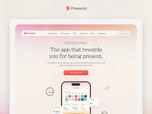

This is solid, it feels both clean and engaging. If someone wanted to create something at this level, what would you say matters most in your process?

Thank you! I think the most important thing with Framer templates is to understand what problem you solve for those looking to buy the type of template you´re creating.
Also, the Framer marketplace holds quite a high standard nowadays, so it´s a very iterative process. Treat it...
The network for creativity
Join 1.25M professional creatives like you
Connect with clients, get discovered, and run your business 100% commission-free
Creatives on Contra have earned over $150M and we are just getting started





Related posts

The best part of this website might be the page nobody is supposed to see.
About 4 months ago, we launched the new website for STORY Design Amsterdam.
STORY is all about giving homes personality, so we wanted the website to have some too.
Including their 404 page.
Naturally, I put the owner's dog on it.
If you end up on the wrong page, you might as well enjoy it.
But the fun details only work if the website itself does too.
Before the launch, most of their website traffic came through Instagram.
Today, around 60% comes from Google.
And now we've taken the next step by adding a little shop, so people can buy their kitchen handles directly from the site.
Next up: a great about us page; photoshoots are already planned.
I don't design websites that often.
But when I do, I don't want to create something that could belong to any business.
It should feel like their business. Do you think I achieved that?

Great work, Bram

Post
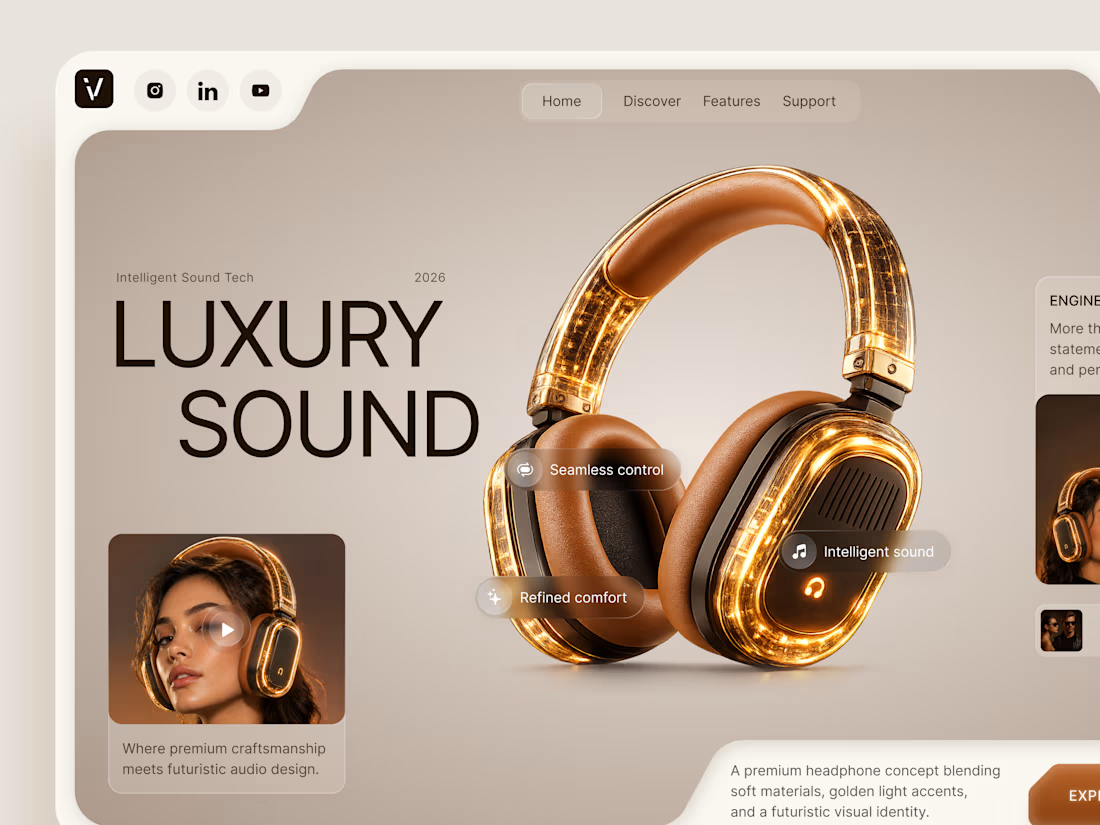
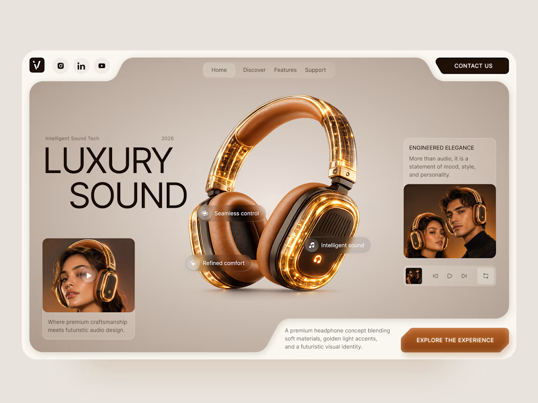
Luxury Sound — Premium Headphones Landing Page 🎧✨
A premium landing page concept for a luxury audio brand, built around a bold headphone design and a refined visual experience
The design combines warm neutral tones, glowing details, oversized product visuals, and minimal typography to create a futuristic yet elegant feel
Special attention was given to:
• Product-first composition
• Premium visual direction
• Feature highlights
• Lifestyle imagery
• Clear CTA placement
• Responsive mobile experience
The result is a clean, immersive product experience that makes the headphones feel like more than tech — they become part of the lifestyle 🔥


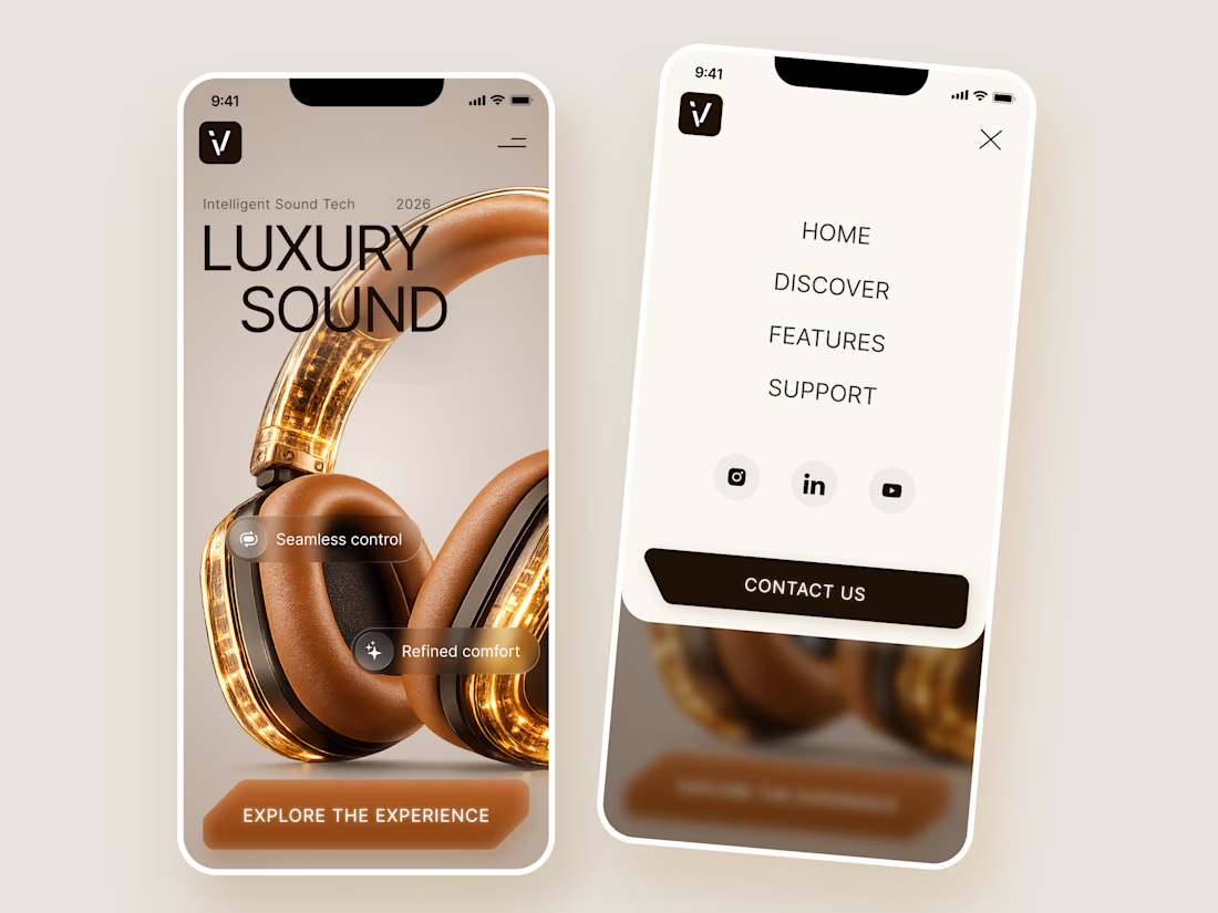

The amber glow on the headphones against that warm beige is lovely. How does the mobile menu handle the product image?

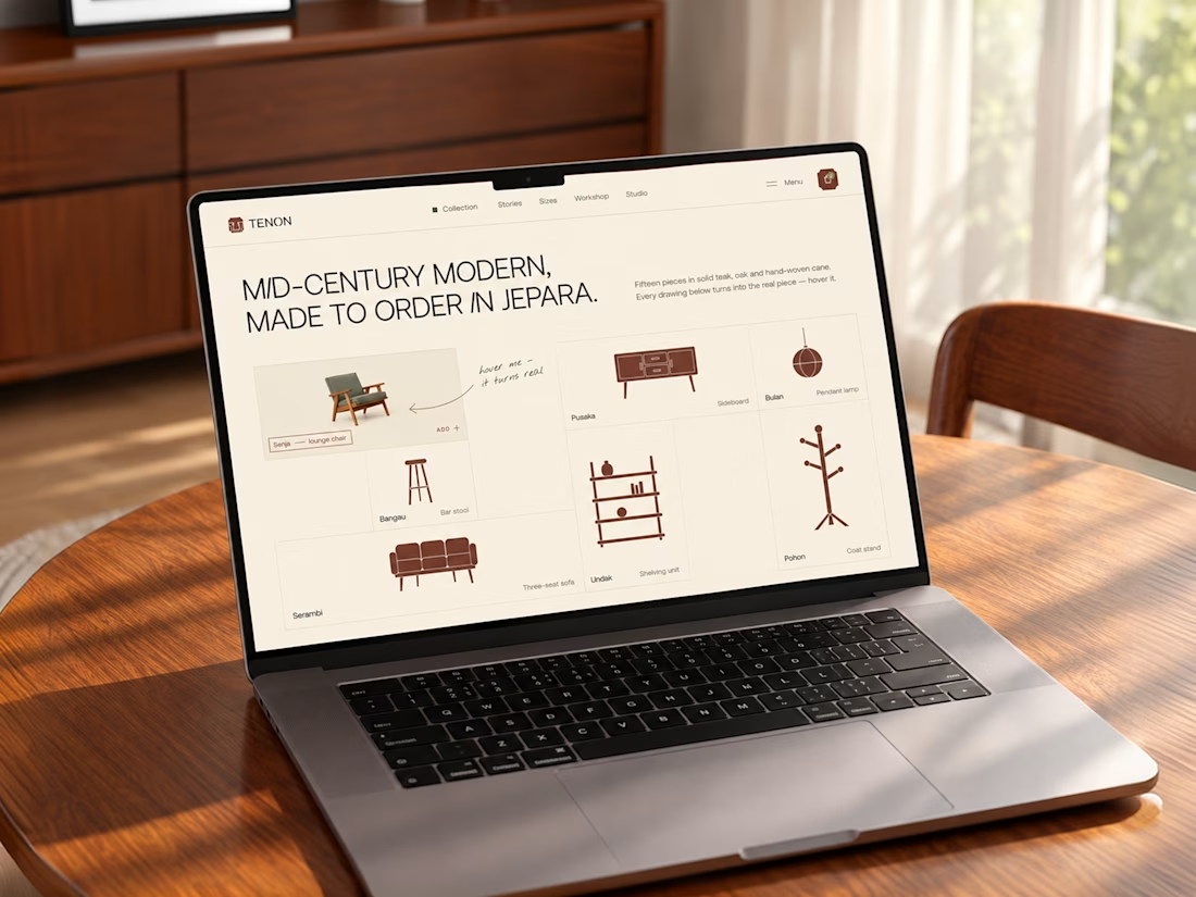
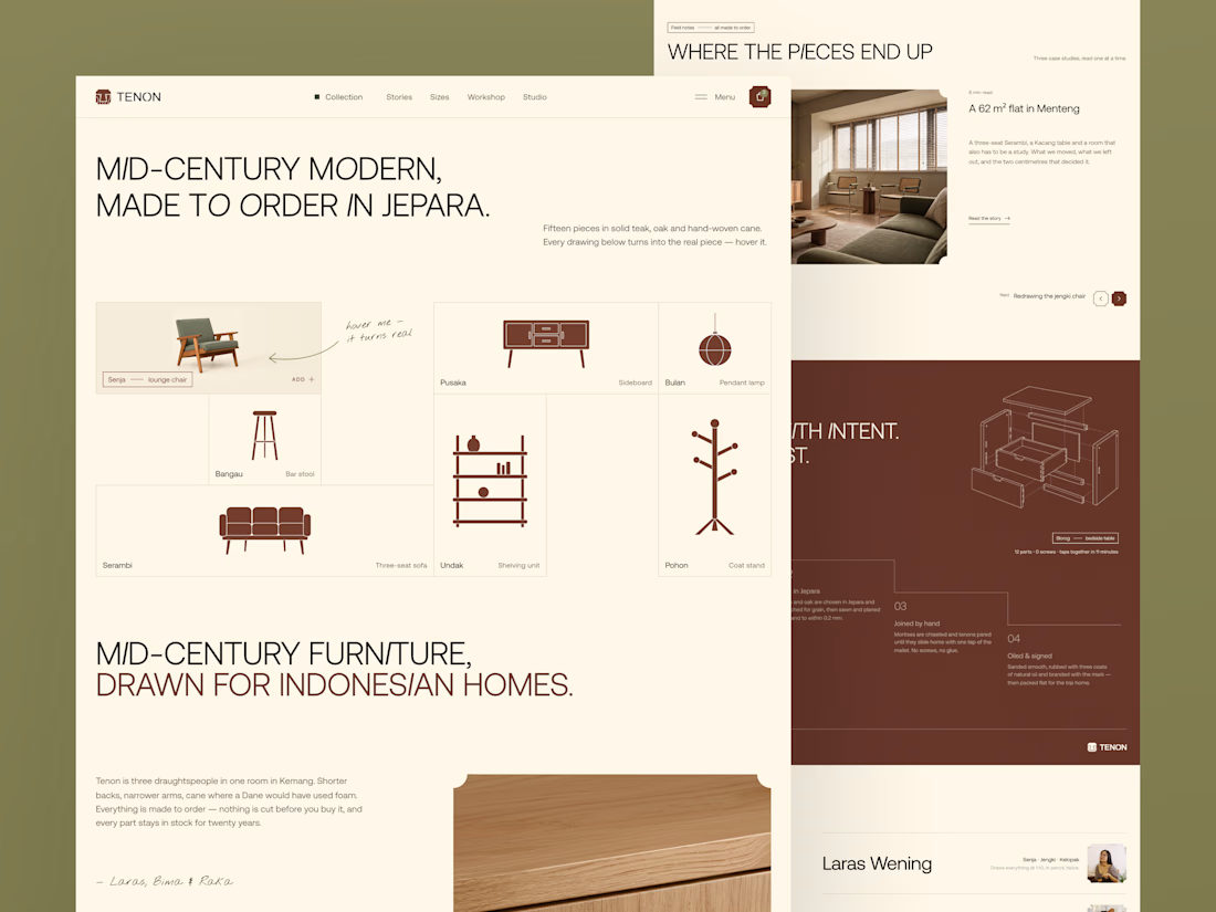
Tenon is Furniture Website Design
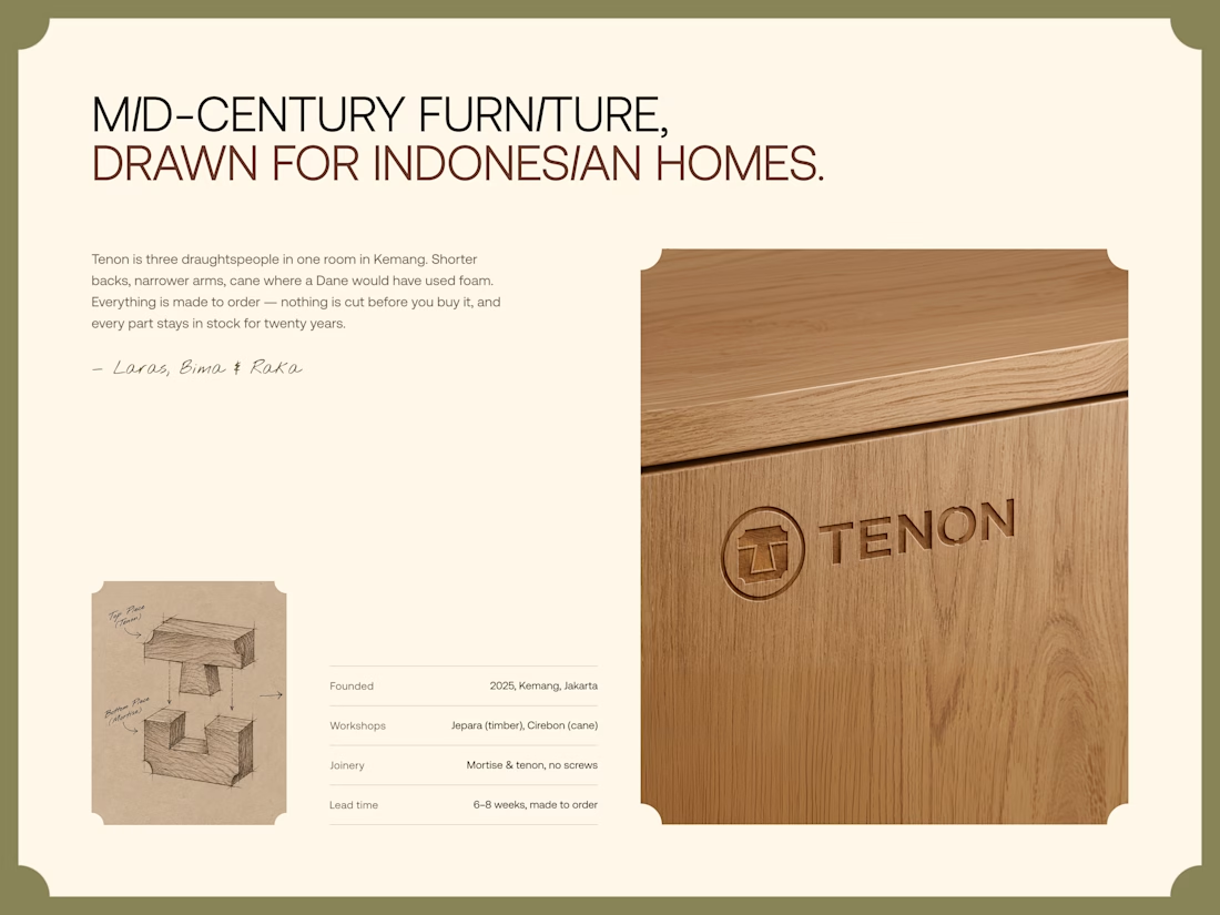
Exploring a digital experience for an Indonesian furniture brand inspired by mid-century modern design.
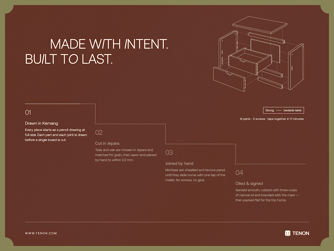
The website brings together product discovery, storytelling, and visual direction to make the digital experience feel as considered as the furniture itself.
Made to order. Made to last.

Love the color choice used