The network for creativity
Join 1.25M professional creatives like you
Connect with clients, get discovered, and run your business 100% commission-free
Creatives on Contra have earned over $150M and we are just getting started
Back to feedPost

Your hero image has about one second to win the click.
On a collection page or search grid, shoppers aren't reading. They're scanning thumbnails. Here's the anatomy I use to design a hero that wins that tiny square:
One product, one angle. Clutter disappears at 200px.
Contrast with the grid. If every competitor shoots on white, a tinted background stands out instantly.
Show scale or use. A hand or a context cue answers "how big is it?" before anyone asks.
Fill the frame. The product should take 70 to 80% of the canvas, not float in empty space.
Test it small. I shrink every hero to thumbnail size before I approve it.
That last step changed more conversion than any retouch. What's the first thing you check on a product photo?
#ecommerce #shopify #productdesign
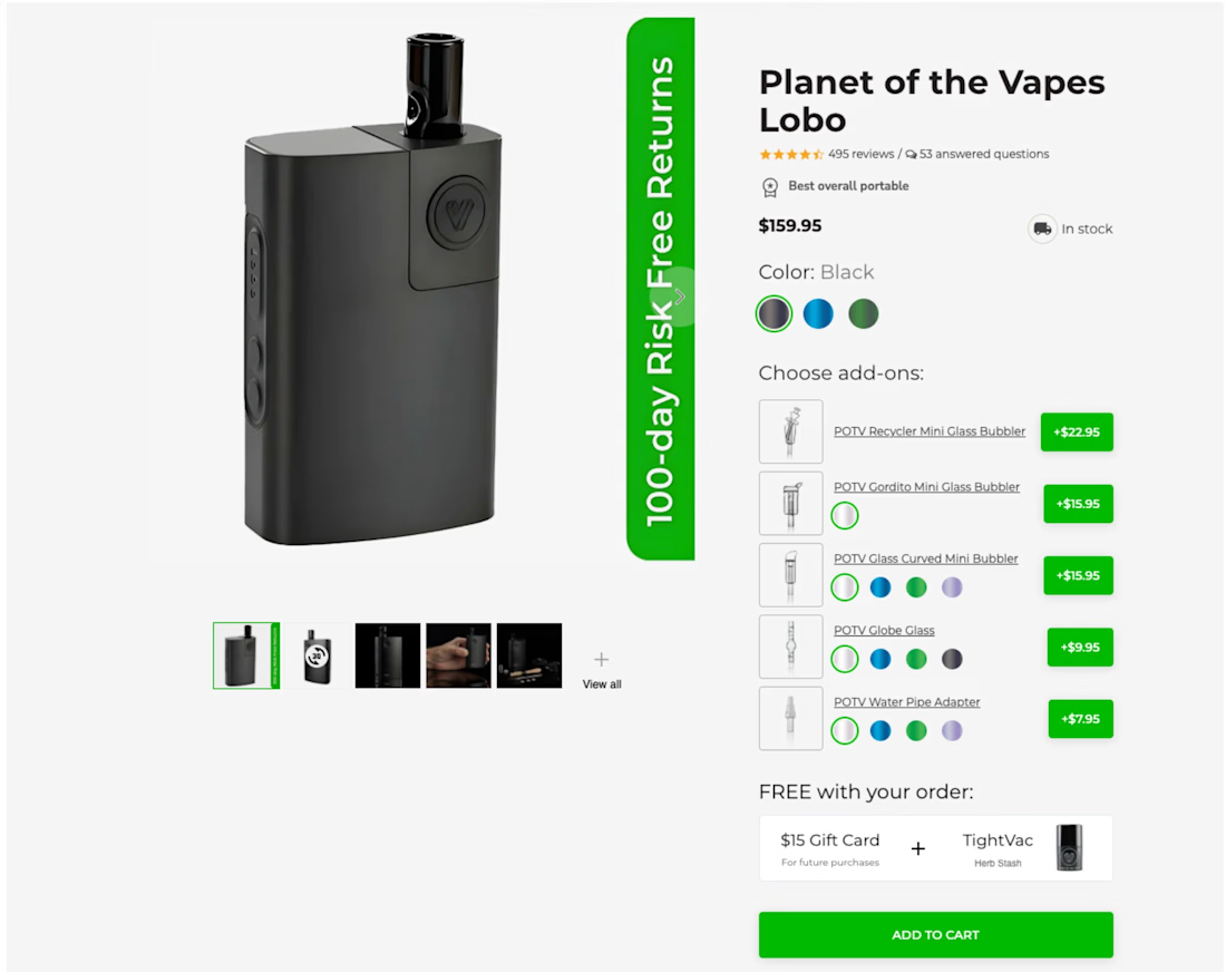

The 200px thumbnail rule is real — one hero angle and zero clutter is basically the only thing that survives collection grids on mobile.
The network for creativity
Join 1.25M professional creatives like you
Connect with clients, get discovered, and run your business 100% commission-free
Creatives on Contra have earned over $150M and we are just getting started



Related posts

Small Detail. Big Effect. 🚀
Sometimes, a better shopping experience doesn't require a complete website redesign.
It's the small details that matter.
Think about:
Clearer product image galleries.
Better product variant selection.
Easy-to-use size options.
More visible Add to Cart buttons.
A smoother product page experience.
When building with Shopify + Replo, I focus on these details to create cleaner, more intuitive e-commerce experiences.
Because great e-commerce design isn't just about how a page looks. It's about how easily customers can use it.
Small improvements. Thoughtful design. Better experiences.
Working on a Shopify store or planning a Replo landing page?
Let's connect!


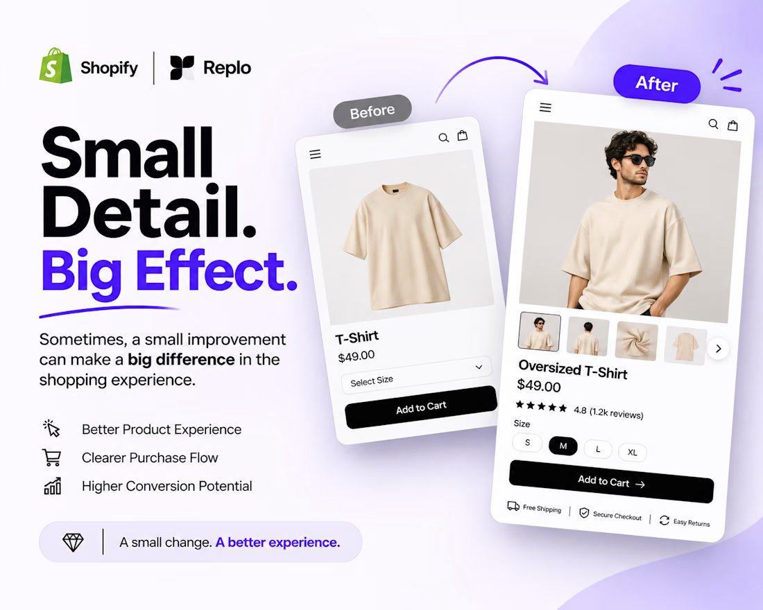

Agreed, small product page fixes often beat a full redesign. Clear variant selection and size options remove hesitation right at the point of buying.

practice youtube thumbnail design


Hero section exploration for Quest, a concept mountain bike store.
Bold type over a full-bleed trail shot, so the first screen feels like the ride itself. Get lost in the moment.

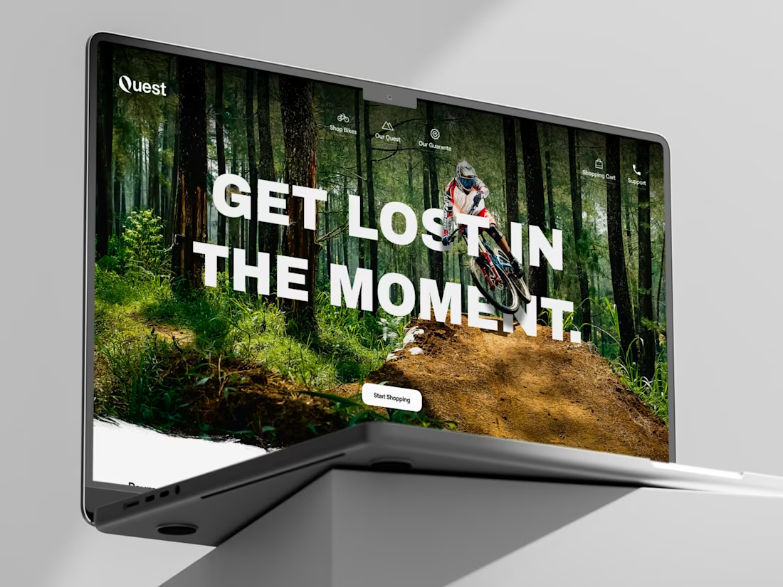

That trail shot works so well.