The network for creativity
Join 1.25M professional creatives like you
Connect with clients, get discovered, and run your business 100% commission-free
Creatives on Contra have earned over $150M and we are just getting started
Back to feedPost

Love everything about this! The font for "Peppa Please" is my favorite part!


(3/3) I'm excited to share the final set of mockups for Peppa Please, a hot sauce brand for those who don't take their food seriously. 🔥
What do you think about this brand? 👇
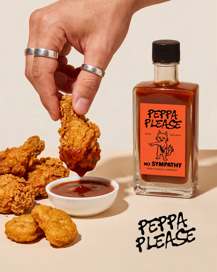
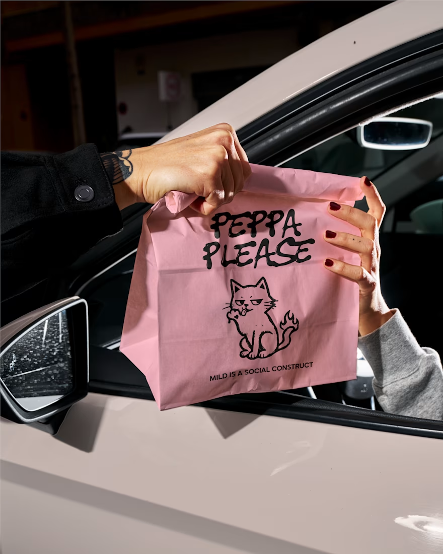
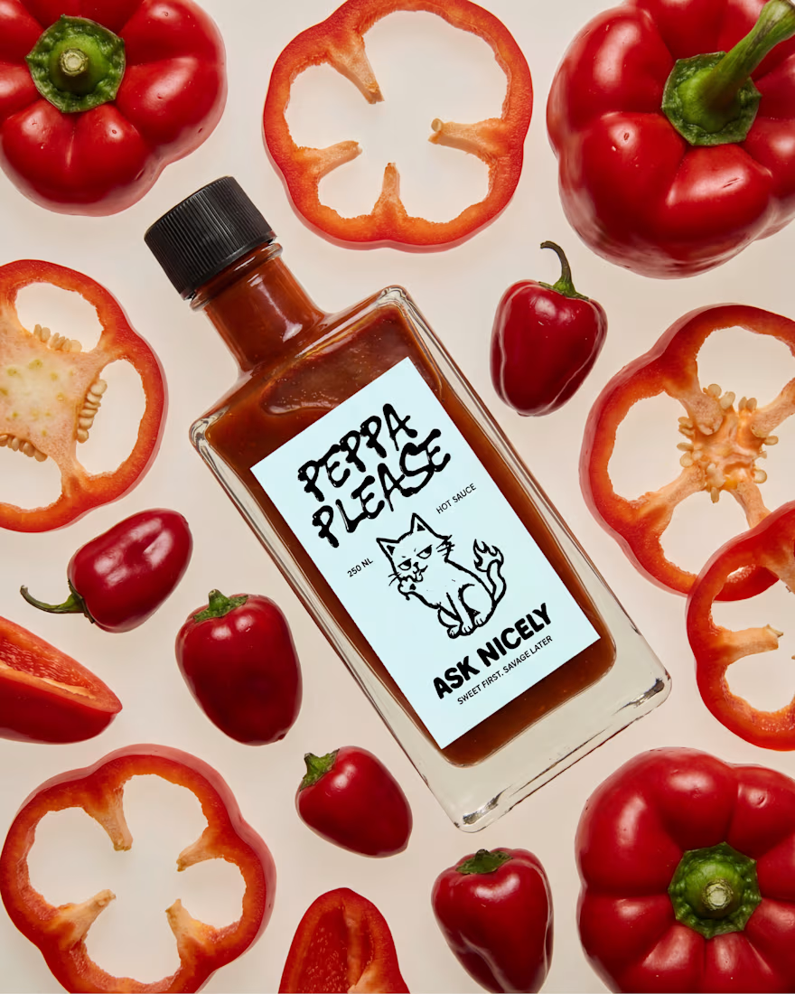

im hungry
The network for creativity
Join 1.25M professional creatives like you
Connect with clients, get discovered, and run your business 100% commission-free
Creatives on Contra have earned over $150M and we are just getting started









Related posts


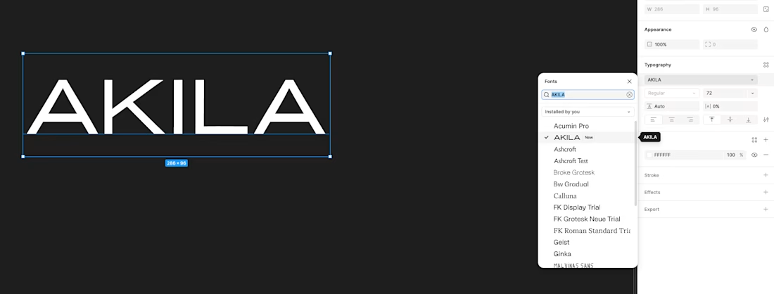
made my own font today

I use CGPT to automate batches of 10 'Editorial' style aesthetic Pinterest pins using a Plugin that will analyze content then create 10 pin concepts (image, SEO optimized title, description, alt tags) then double check the work and schedule the pins out. Love the outputs I'm getting and the time it saves!
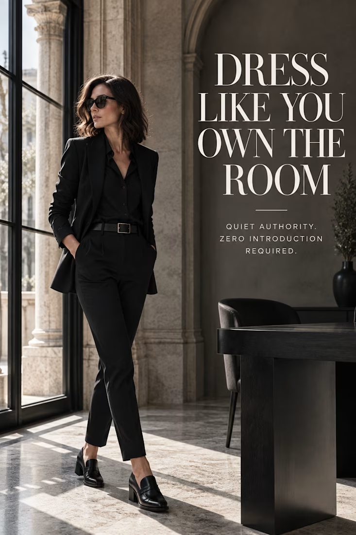
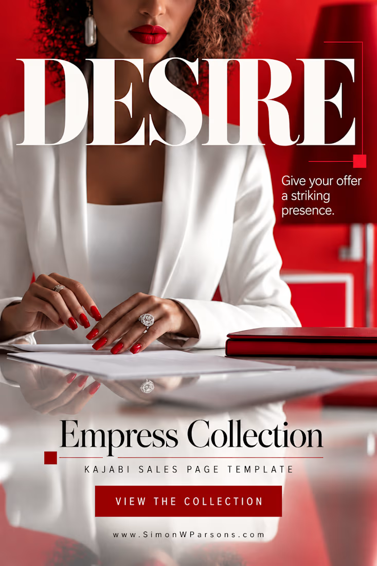


the red nails against the white sleeve pop. how consistent are the pins across a batch of ten?

Amazing👏


Hot take: maybe the best ideas aren't completely new. They're just used somewhere unexpected.
Take something out of the context it was designed for, put it somewhere it doesn’t belong, and suddenly it becomes something completely different.
I went down a rabbit hole of old