The network for creativity
Join 1.25M professional creatives like you
Connect with clients, get discovered, and run your business 100% commission-free
Creatives on Contra have earned over $150M and we are just getting started
Back to feedPost

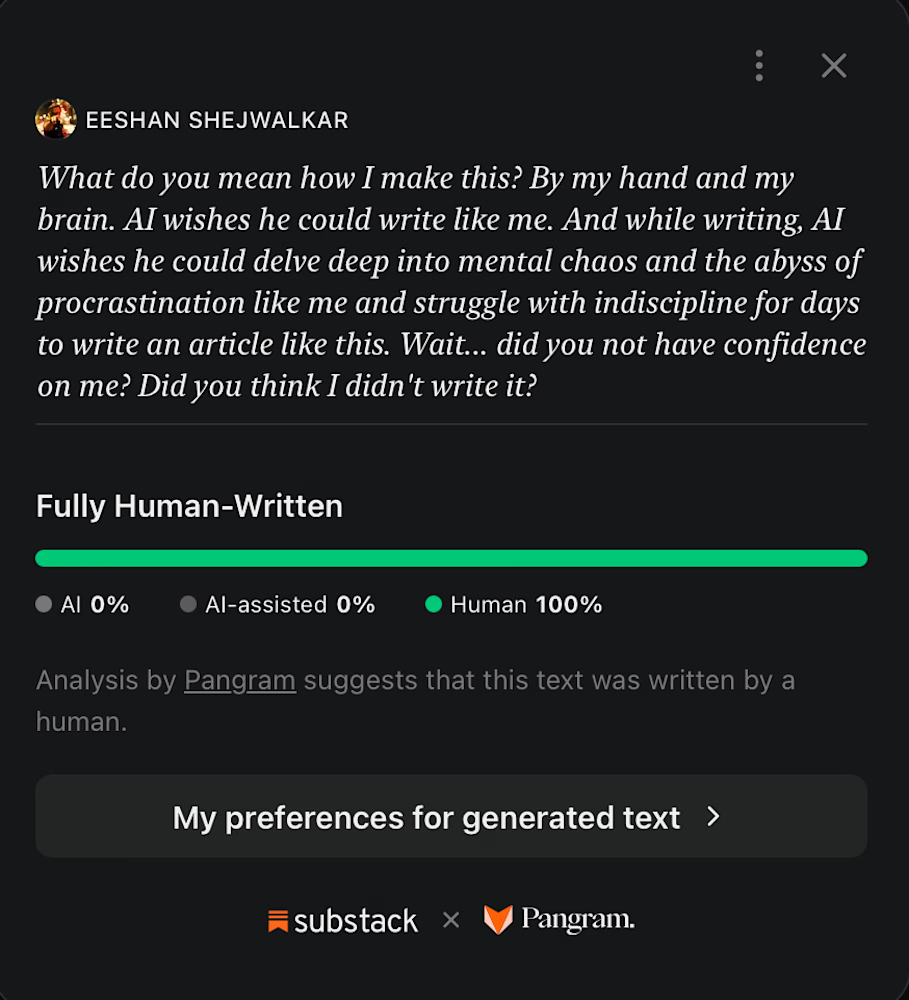
Just so my substack readers know a little bit about my process!
The network for creativity
Join 1.25M professional creatives like you
Connect with clients, get discovered, and run your business 100% commission-free
Creatives on Contra have earned over $150M and we are just getting started











Related posts

Oh, this made my day! ✨ So happy to have my work featured on Contra.

Congrats on the spotlight, Anja! Well deserved.

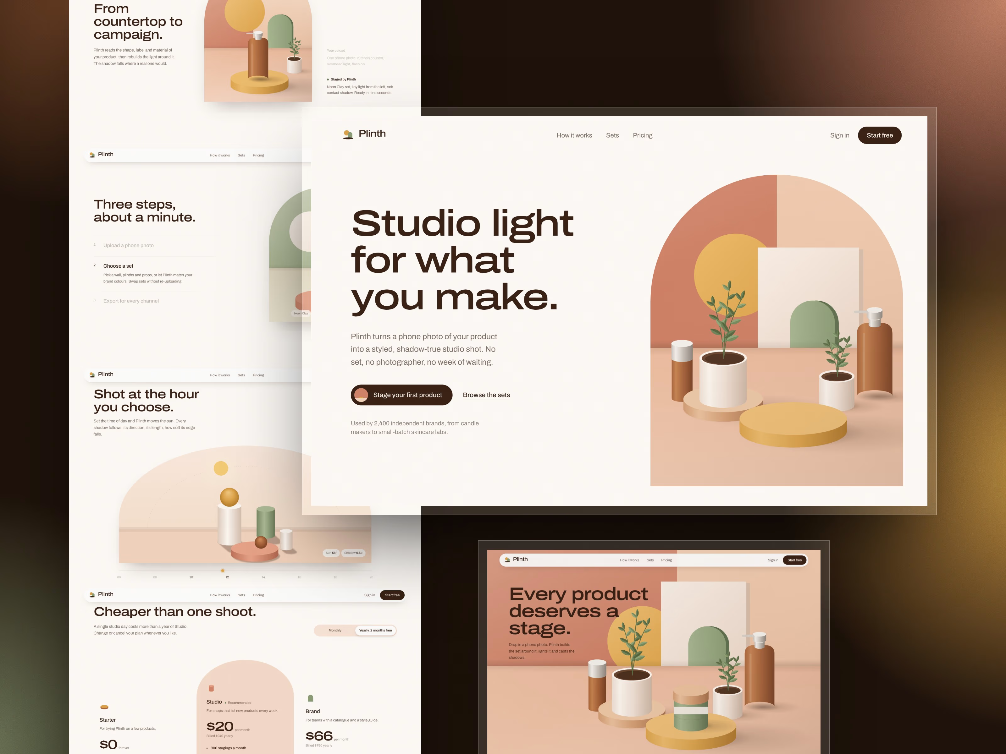
Most "keep it simple" landing pages are easy to forget.
So for Plinth I picked one thing to carry the whole site, a sculpted studio set, and let everything else grow around it.
What that turned into:
🏛 One anchor. The hero is an arch window onto a set of plinths, pots and bottles, all drawn in code. Scroll and the camera pushes through the arch, and a product lands on the empty plinth.
🔁 Visual rhymes. The arch frames every image. The ochre sun comes back as the button hover, the upload ring, the gallery progress marker, and finally sets into the footer.
☀️ A section that proves the point. Scroll sets the time of day. The sun crosses the sky and every shadow is recalculated live: direction, length, softness.
🪵 Depth without noise. Soft shadows from one light source, a fine paper grain, and a cursor that floats like a little sun with its own shadow, then "lands" on anything you can click.
👁 Opacity as hierarchy. Three text levels instead of extra colours, so your eye always knows what to read first.
Even the footer is the studio floor, with the links standing on plinths.
Built with Next.js, Tailwind, Motion and Lenis. It's responsive and respects reduced motion.
It's now available as a template 👇
https://contra.com/products/yopRcpYh-plinth-scroll-animated-saa-s-landing-page-for-nextjs

Stunning

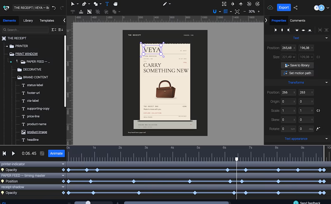
THE RECEIPT turns a simple thermal receipt into an editorial fashion launch announcement.
Built with Codex and SVGator MCP, the template lets creators swap brand identities, product imagery, and copy while keeping the same animation, making it ideal for product drops, collection launches, and promotional campaigns.


this is amazing!