The network for creativity
Join 1.25M professional creatives like you
Connect with clients, get discovered, and run your business 100% commission-free
Creatives on Contra have earned over $150M and we are just getting started
Back to feedPost

I am happy to introduce Minicus, a compressed modular typeface that was inspired by the lettering on a plaque in Amsterdam. The plaque marks the former business of Minicus (Ph.) Zeehandelaar (1883–1943)
https://www.brutaltypes.com/fonts/minicus


The network for creativity
Join 1.25M professional creatives like you
Connect with clients, get discovered, and run your business 100% commission-free
Creatives on Contra have earned over $150M and we are just getting started



Related posts

One pixel grid. A whole brand.
For Appy, a London product studio for impact-driven startups, the wordmark, icons, 3D smile and Appy Pixel, its custom typeface, all come from the same grid.
Appy Pixel won Typography at the Online Design Awards.
Type first or symbol first: where do you start a rebrand?



thats so nice, i loveee

Had a little idea for presenting content differently. Something about the contrast between crumpled paper textures and polished metallic elements felt worth exploring. Ended up really liking how this came together.
What do you think of this direction?

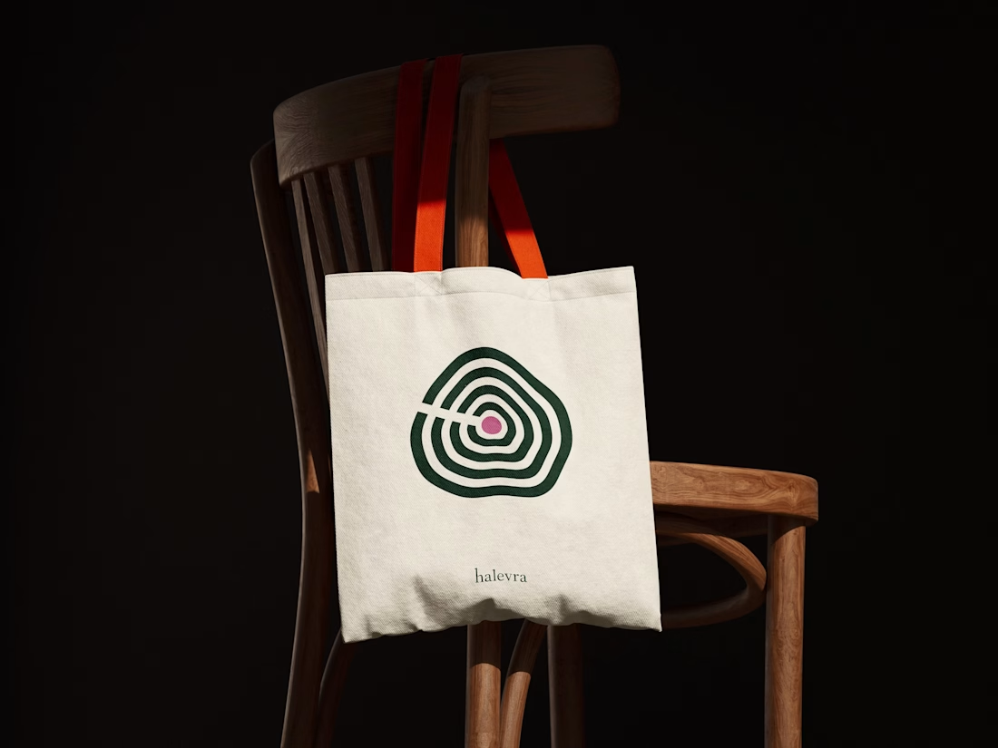
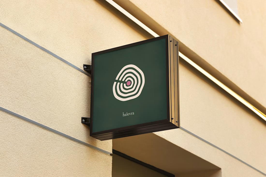
Halevra is a brand identity I designed for a concept longevity and skin clinic in Marylebone.
The mark is a tree’s growth rings. A tree keeps a record of every year it grows, which felt right for a clinic that reads your health early and follows it over time. The plum dot at the centre is the heartwood, and it’s the only colour the pattern ever gets.
For type, Source Serif 4 has the authority of a medical journal without feeling cold. Atkinson Hyperlegible Next was made with the Braille Institute for low-vision readers. Many members would be over 50, so being easy to read mattered more than looking like a spa.
The system covers the logo suite, a seamless pattern, logo motion, brand guidelines, stationery, signage, and web and app assets.