The network for creativity
Join 1.25M professional creatives like you
Connect with clients, get discovered, and run your business 100% commission-free
Creatives on Contra have earned over $150M and we are just getting started
Back to feedPost
designed this dashboard for a saas tool that does a lot. tasks, credits, scheduling, analytics, the works
the whole challenge with a product like this is fitting everything in without it feeling overwhelming the second you log in
so most of the work was hierarchy. one clear action up front, everything else tucked where you'd look for it, not all shouting at once
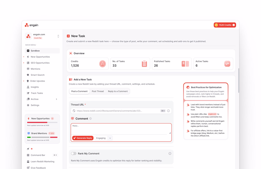
This is a really smart dashboard direction. I like how the design handles a lot of features without making the interface feel crowded. The focus on hierarchy makes a big difference here — the main action feels clear, and everything else feels organized instead of competing for attention.
The credit counter front and center was a smart call. In tools that charge per usage, that number is always the first thing people want to see. Keeps the anxiety low right from login.
The network for creativity
Join 1.25M professional creatives like you
Connect with clients, get discovered, and run your business 100% commission-free
Creatives on Contra have earned over $150M and we are just getting started
Related posts

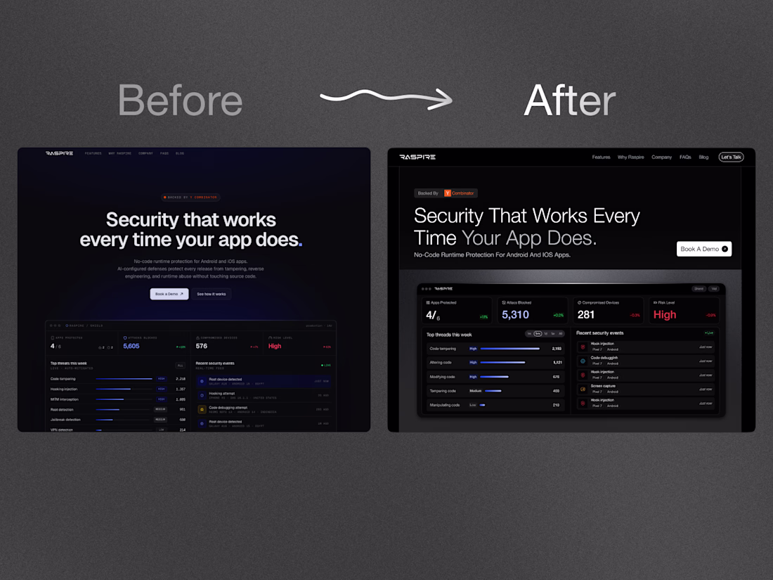
Darker is good but the positioning in lighter makes it better
Redesigned a 🟧 YC-backed startup's hero. Unprompted, no pitch.
Three changes:
→ Dropped the generic "AI blur." Swapped the fuzzy gradient-glow every AI startup uses for a clean, type-led layout. Typography carries the message.
→ Product above the fold. The real dashboard now lands full, no scroll. A founder's best proof is the product - so I show it first.
→ One CTA, not five. Single clear action = cleaner flow = more clicks.
Same product, sharper signal. Most SaaS heroes describe the product - the good ones sell the outcome.
I build sites that convert for founders. Open to new projects💬
Challenges
View allTrending
Claude
Claude has entered the design space. How are you using Claude Design?
Contra University
Learn from expert creatives how to earn more using next-gen AI tools.
MagicPath
The canvas is infinite, and exploration is becoming the workflow. How are you using MagicPath?
creativeaiflow
Creative AI workflows are evolving. What tools do you use, and what are their strengths and weaknesses?
freelancerlife
Freelancer life is wins, pivots, and everything in between. What’s yours right now?