The network for creativity
Join 1.25M professional creatives like you
Connect with clients, get discovered, and run your business 100% commission-free
Creatives on Contra have earned over $150M and we are just getting started
Back to feedPost
I've reviewed dozens of data reports from clients.
Most of them had the same problems.
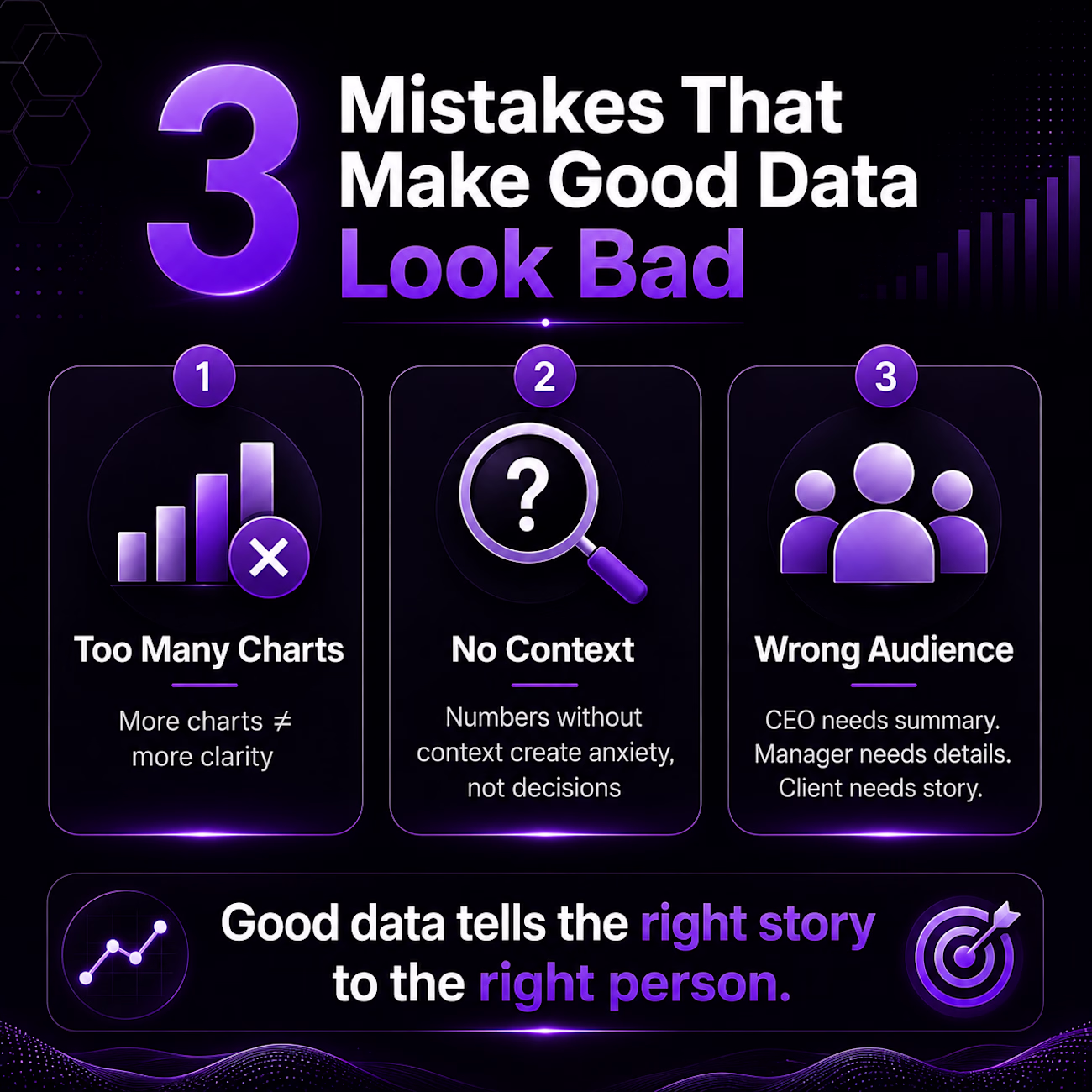
Here are 3 mistakes that make even good data look bad:
Mistake 1 — Drowning in charts
More charts doesn't mean more clarity.
I once saw a report with 14 charts on one page. Nobody read it. Nobody understood it.
One clear chart that answers one clear question beats ten confusing ones every time.
Mistake 2 — Data without context
"Revenue dropped 23%."
Okay — compared to what? Last month? Last year? Your competitor?
Numbers without context don't inform decisions. They just create anxiety.
Mistake 3 — One report for everyone
Your CEO needs a 30-second summary.
Your operations team needs the details.
Your client needs the story.
Same data. Three completely different presentations.
Most people send the same report to everyone — and wonder why nobody acts on it.
Good data visualization isn't about making things look pretty.
It's about making the right person understand the right thing at the right time.
That's the difference between data that sits in a folder — and data that drives decisions.
The network for creativity
Join 1.25M professional creatives like you
Connect with clients, get discovered, and run your business 100% commission-free
Creatives on Contra have earned over $150M and we are just getting started
Related posts
Did you know a tornado formed the year you were born?
Not a real one. A data one.
Type your birth year. Watch the storm react - the speed, the color, the rage of it - all driven by the exact CO₂ levels recorded that year.
🌪️Live Site - https://thedatatornado.figma.site
💻GitHub Repo - https://github.com/isumenuka/Thedatatornado
🔬 The Problem
Climate change is the most documented crisis in human history. Scientists have been collecting data for over 65 years. But most people feel nothing when they see the numbers - because a wall of data doesn't make you care. That is a design problem. The Data Tornado is my answer.
⚙️ How It Was Built
I started in FigJam - mapping the full app structure, severity color system (Stable → Elevated → Critical → Extreme), and the 65-year climate timeline before touching any build tool.
In Figma Make, I loaded my complete design guidelines first - colors, fonts, spacing rules - so every generated output matched my vision from the first prompt. That one step eliminated hours of corrections.
The MCP connector was the most critical technical piece: a custom live pipeline to NOAA's servers, pulling real CO₂ and temperature readings automatically every time someone opens the app. No downloading. No pasting. Always live.
The hero background video was generated entirely in Figma Weave - I set a start frame and end frame, and Weave generated the full atmospheric storm footage between them. The Figma Agent handled precision edits throughout -clicking directly on individual elements, repositioning buttons, aligning sections, without touching anything else.
Supabase powers the share cards, news gallery, and live data caching. GitHub handles deployment.
🛠️ Tools Used
→ FigJam: full app structure, severity system & data flow diagrams
→ Figma Make: prompt-to-code app with custom NOAA MCP connector
→ Figma MCP: live pipeline direct to NOAA's climate API
→ Figma Weave: AI video generation for the hero storm background
→ Figma Agent: precision element-level UI edits throughout the build
→ Supabase: backend for share cards, news & data caching
→ GitHub: deployment and version control
✨ Key Feature - Birth Year Telemetry
Enter your birth year. The app instantly generates your personal climate log -the exact CO₂ concentration the year you arrived in the world, your temperature anomaly then vs. now, your severity level at birth vs. today. It stops being a global statistic. It becomes yours.
Most people go quiet when they see their own number.
What happened on the day you were born? Share your link in the comments!
THIS IS MINE - https://thedatatornado.figma.site/?share=d9844bb7-12d7-4c5a-94e8-ebd84ade9f8b
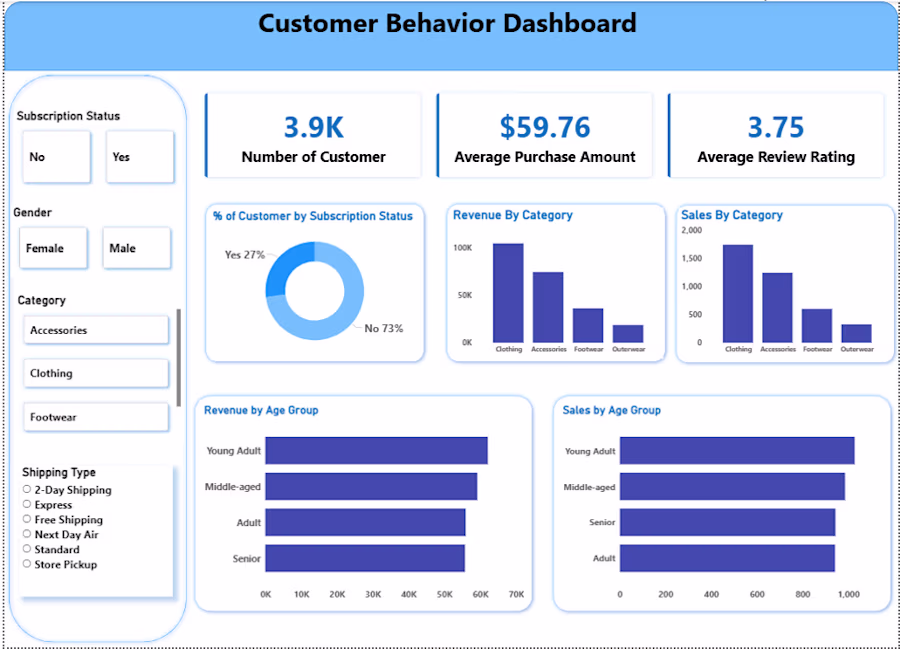
Built a Customer Behavior Dashboard analyzing 3.9K customers, tracking average purchase amount, review ratings, revenue by category, and sales by age group. Created using Power BI with interactive filters for gender, category, and shipping type. This project demonstrates end-to-end data analytics from raw data to business insights.
I've read hundreds of homepages. They all make 1 mistake.
They're written for someone who already believes.
- The headline assumes you understand why this category matters.
- The about section assumes you care about the founder's journey.
- The features section assumes you're already sold on the approach and just need the details.
Real cold visitors arrive skeptical, distracted, and ready to leave in 8 seconds.
UNTIL they land on a reason to stay.
The homepage that converts earns that reason in the first 2 sentences.
It names something the visitor already feels before they could articulate it themselves.
Everything after that is just confirmation and SALES.
The frame shift from 'explain the product' to 'name what the visitor already feels' is the whole game. Most homepage copy is essentially asking skeptical people to opt into a belief system they haven't adopted yet.
Challenges
View allTrending
Claude
Claude has entered the design space. How are you using Claude Design?
Contra University
Learn from expert creatives how to earn more using next-gen AI tools.
MagicPath
The canvas is infinite, and exploration is becoming the workflow. How are you using MagicPath?
creativeaiflow
Creative AI workflows are evolving. What tools do you use, and what are their strengths and weaknesses?
freelancerlife
Freelancer life is wins, pivots, and everything in between. What’s yours right now?